


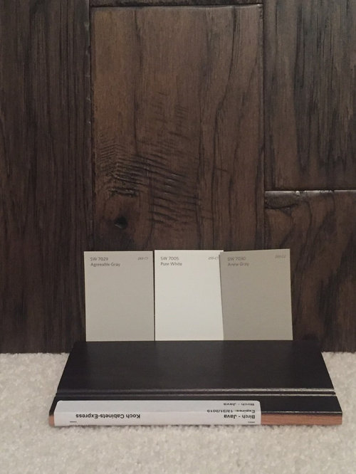
Paint Help - SW Agreeable Gray vs SW Anew Gray
Rachel Meckley
6 years ago
last modified: 6 years ago
Featured Answer
Sort by:Oldest
Comments (52)
 PRO
PROLori A. Sawaya
6 years ago- PRO
Lori A. Sawaya
6 years ago Related Discussions
SW Agreeable Grey and SW Extra white together?
Comments (10)[extra white] cabinets may also look a little greenish against the agreeable grey as its such a large area? I doubt it. Anything can happen I suppose, but most 'just whites' are purposefully created from the yellow and green-yellow hue families because of the way we perceive certain wavelengths - the yellow/green-yellow region of the spectrum, low chroma whites will read as "just white" no strong overtones one way or the other on the color wheel. What about SW 7661 Reflection? I added it to the infographic so you can compare. I have color notations from SW, but I don't know to what standard they measured their colors. So, I always indicate that on images. I scanned Reflection with my colorimeter and did the conversion myself because the SW notation for Reflection put in too far in the green hue family, IMO. I mean it was within a reasonable range, but I trust my numbers more. The umber in the sample of Agreeable is 9 but in the Reflection it's only 1. Does that bring it over closer to the cool side on the wheel? I don't do the formula thing - reading the individual colorant components of a paint color is futile because of this thing called substance uncertainty. Substance uncertainty tells us that due to the physical make-up of colorants, it's impossible to know or predict what will happen when mixed together. Some colorants have big particles, some have small, some are more potently concentrated while others are thin and weaker. And these colorant characteristics vary from brand to brand. The only way to know is to mix the color and let it dry. So, could the factor of umber be the reason why Reflection is a green-yellow and Agreeable is a yellow? Maybe but there's no way to know that for sure. I am trying to find a greyish color that does not have the green or pink undertones. I don't subscribe to blogosphere's concept of undertone either. Undertones are about density of the paint film and how much, if any, of the substrate you can see thru the paint film. It goes masstone, midtone and undertone: Masstone is the thickest density and zero substrate shows thru. Midtone is the Goldilocks of paint film density. It's just right, zero substrate shows thru but the film is spread per manufacturer spread rate specification and is nice and even. Undertone is revealed when the paint (or other medium) is spread thinly so the substrate can be seen and light can reflect thru the thin film, off the substrate, and back up thru the thin film. You have to take some purposeful action to manipulate the paint (or other medium) to reveal undertone. How does one find out where in the wheel a color lives? Never, ever compare paint chips to a white background. White overpowers color swatches and makes them appear more grayed down, not so bright and intense. Underestimating a color’s brightness and intensity is the #1 mistake people make when choosing paint colors. “It’s too bright” is the #1 reason people give as to why they don’t like the color they chose. I use spectral data and math to calculate a color notation, hue family. If you don't know how to use spectral data to get a color notation, determine hue family, then you have to eyeball it. You have to visually assess your target color compared to a set of chromatic hue parents. If you want to discern what hue family a color belongs to sans color measurement data, then you compare it to hue family parents. Compare the uncategorized color to a big chip of red, blue, green, yellow, etc. Color responds to its context. Comparing one color to another is basic context. You do that because it is a that which is like unto itself is drawn kinda situation. Put the child color (your color) next to its hue parent and you can see the similarities and thus determine what hue parent/family a paint color belongs to. It is no different from human kids and parents. See a kid running around at the playground and he looks like any other kid. Put him in context with his family and suddenly you are able to recognize similar features and compare attributes, and it quickly becomes apparent that junior is a chip off the old block. Same thing happens with color. Through the process of comparison, you will see the hue family to which a color belongs. Here's a list from SW and BenM of saturated colors that can serve as hue parents for comparison purposes in order to determine a color's hue family. Download Hue Parents Infographic I think I got all you questions. Hope it helps....See MoreSW Anew Gray at 75%
Comments (8)lol! Is there an echo in here!? Everybody has restated what I've said accurately. However, we have a live human being with eyeballs who has tried 75% Anew Gray and thinks it's pretty, bhopper417 What we don't know: --- The math. If the math doesn't work out perfectly, then it's up to the counter person to use their expertise to define what 75% of Anew Gray means in that instant, for that one customer. 75% Anew Gray from your SW Store might not be the same as 75% Anew Gray from my SW Store. Which is why you will sometimes find one person loving a cut formula and another person disappointed in the results. --- Is it really, truly "just like" Anew Gray or is it a brand new color that luckily turned out to look pretty. And that's the risk, that's the unknown that can only be answered by spending $7.99 on a Color To Jug to get 75% Anew Gray from your SW store. And then you have to cross your fingers that it comes out the same in a larger quantity than the CTG jug. If you're not picky, and close enough is good enough, then the risks of cutting formulas might not be a big deal to you....See MoreWant to share pic of SW Agreeable Gray painter cabinets
Comments (11)We went with SW Alabaster on the walls. Victoria and Albert tub. We did a large mirror above the vanity and I love all the light it reflects. We also used marble baseboards in the bathroom inside the toilet are and it looks so nice! There are some on Houzz who recommend not going with marble on counters with marble on floors and wall, but I love it. I felt the quartz counters may look out of place, it’s a personal preference. I just want those on the fence to know that it can work. I love the marble counters. I would not change a thing about the bathroom. I hope these pictures will help someone just like all the comments and pics I read helped me along the way....See MoreSW agreeable gray vs pure white
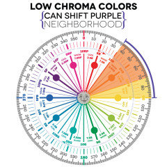
Comments (21)LCH is measured at 6504k. Difference between LCH and LRV You use a spectrophotometer to measure both. The spectrophotometer measures the light being reflected off the surface. Both measures use the same standard luminance D65 (daylight) (defined as k=6504.) LRV is measured using a 10 degree standard observer and LCH uses a 2 degree standard observer. (viewing angle). Remember that these color measurements are measuring the various wavelengths of light reflected off a colored surface. It is measuring the actual attributes that are sent to your retina when you look at a color. The study of human perception of color is ongoing. Our brains are incredibly complex. We don't even know if what you were taught was the color "Red" is seen by you the same way as it is seen by me. We were both taught that we call that color "Red", but there is no way to know how our individual brains perceive that color. We do know that individuals all have different sensitivity to color and that our mood (dopamine levels) influences how much color we see. We also know that we view color in context. White next to black looks much brighter than it does next to cream. Measurements are very helpful, but color preference, sensitivity and context have to be evaluated as well. The reason that colors with a hue in the 70s and 80s may look pink or purple when we have a low chroma is that our brains interpret gray and blue very similarly. Add blue to yellow and you get green. Add blue to red and you get purple. In that orange space you may see more purple or pink tones. Pink beige, orange beige, taupe or violet gray. It may look more beige in one light and more gray in another light or more beige when you are happy and more gray when you are sad, or more beige when next to a grayer gray and more gray when next to a truer beige. This is true for every color around the color wheel. The amount of light and quality of light and other colors can play a huge role in selecting whites....See More
Rachel Meckley
6 years agolast modified: 6 years agoRachel Meckley
6 years ago- PRO
Lori A. Sawaya
6 years ago Rachel Meckley
6 years agolast modified: 6 years agoRachel Meckley
6 years ago- PRO
Lori A. Sawaya
6 years agolast modified: 6 years ago kajanews
6 years agoRachel Meckley
6 years ago
Nisha Bhojwani
6 years agoKatherine
5 years agoRachel Meckley
5 years ago
Wendy E
5 years agoRachel Meckley
5 years ago
Michelle Jadick
5 years agoKatherine
5 years agoWendy E
5 years agoRachel Meckley
5 years agokathleennoonan
5 years agoRachel Meckley
5 years agoKatherine
5 years agoRachel Meckley
5 years agoHU-129146463684
5 years agolast modified: 5 years agoRachel Meckley
5 years ago
Jacquelyn Houghton
5 years agoKaren Mannion
5 years ago
Hui Zhao
5 years ago
Linda Graef
4 years agolast modified: 4 years ago
Nicole R Dsp
4 years ago
C DeV
4 years ago- PRO
Lori A. Sawaya
4 years ago muellerkm
4 years ago- PRO
Lori A. Sawaya
4 years ago muellerkm
4 years agoSuper Lumen
4 years ago
Wendy Jacobs
3 years agolast modified: 3 years agomdefree
3 years agoRebekah Gibbs
3 years ago
Lindsey O'dell
3 years agoJenn Grow
3 years agokathleennoonan
3 years agokathleennoonan
3 years agomdefree
2 years ago
Maria Vaughan
2 years agomdefree
2 years agoMaria Vaughan
2 years agomdefree
2 years ago
Related Stories

GRAYDesigners Share Their Favorite Light Gray Paints
These versatile neutrals can help create a range of moods in any room
Full Story
GRAYChoosing Paint: How To Pick the Right Gray
Which Version of Today's 'It' Neutral Is For You?
Full Story
MOST POPULAR50 Shades of Gray
Gray is hotter than ever, thanks to a hit novel full of risks and dark secrets. Tell us: Which paint shade possesses you?
Full Story
COLORBathed in Color: When to Use Gray in the Bath
Go for elegance and sophistication without going overboard on coolness, using these gray bathroom paint picks and inspirational photos
Full Story
COLORHow to Layer Tones of Gray for Depth and Harmony
Use texture, pattern, contrast and more to create a subtle, sophisticated look with this popular color
Full Story
EXTERIOR COLORExterior Color of the Week: 7 Ways With Warm Gray
See why this hue can be the perfect neutral for any house
Full Story
GRAY10 Off-Grays for When You Want a Richer Neutral Hue
Look to these undertones to give your space the subtle color you crave
Full Story
DINING ROOMSColor Feast: When to Use Gray in the Dining Room
The right shade of gray pairs nicely with whites and woods to serve up elegance and sophistication
Full Story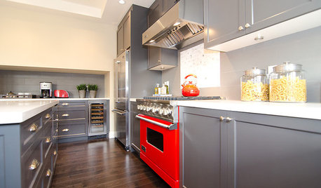
COLORCooking With Color: When to Use Gray in the Kitchen
Try out Trout or shake up some Martini Shaker gray for a neutral-based kitchen that whispers of sophistication
Full Story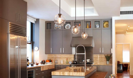
KITCHEN DESIGNObsessed With Gray in the Kitchen
See How to Use This Sexy Neutral to Heat Up Your Cookspace
Full Story


Rachel MeckleyOriginal Author