


Would you use agreeable gray and pale oak together in palette?
Delaney Di
last year
Featured Answer
Sort by:Oldest
Comments (11)

elcieg
last year
barncatz
last yearRelated Discussions
Is there a SW paint that is comparable to Agreeable Gray but lighter?
Comments (33)I was having a terrible problem picking a gray whole house color. I wanted something light and warm. I ended up with Pale Oak. It’s gorgeous in every room. Light and warm off white in a neutral ivory living room with afternoon sun. It never looks pink or purple. Just deeper warm gray or light gray/off white depending on lighting and time of day. It’s very neutral as I have mostly neutral surroundings. You can add color easily. I added a purple vase and some black accents in the living room. Benjamin Moore white for the trim....See MoreStuck between Benjamin Moore Pale Oak and Benjamin Moore Classic Gray
Comments (42)Hi - these 2 colours sit increasingly further clockwise on the Color Strategist Wheel, away from Pale Oak. They will likely apoear a a little cooler by comparison. So in your setting, they are somewhat less likely to shift quite as pinky-purple. Sometimes, just moving a few degrees can make a difference, sometimes you may have to move a whole lot further to mitigate colour shift. These are a both a touch darker (lower Value) than Pale Oak + more colourful (higher Chroma). They have the capacity to appear a little greenish where Pale Oak reads well for you. But maybe less likely to do so where Pale Oak looks a little pink/purple. If either is too dark? Then you need a colour with higher Value. If either is too colourful? Then you are looking for a colour with a lower Chroma. If these still read too pinkish? Then moving further clockwise again could help mitigate that. Viewing large paint chips or samples in your space, with your lighting will help indicate how they are likely to behave for you. #huefamilies #value #chroma...See Moredoes agreeable gray go with mahogany?
Comments (16)I understand if you have had the same color for a long time that you want something different. You love your mahogany furniture. Cream is beautiful with mahogany, but so is taupe (gray beige with purple/pink undertones). It is a completely different look, but both make the mahogany the star. I showed you several Sherwin Williams colors, but if you want to get away from beige and want something unique and wonderful with your mahogany I would order a sample of C2 Archival. C2 paint is made with better pigments and they use 16 different colors vs the 8 or so used by a BM or SW color mixer. In my opinion they nailed the perfect light taupe in Archival. Added below between the two greens. If I didn't have a huge (10') pink brick wall that houses my fireplace and separates my living room and foyer I would have used Archival in my own home, but the pink brick didn't get along with the taupe. The color I used that looked great with the pink brick wouldn't work with your colors. (BM Frosted Toffee.) With your furniture and the countertop and flooring that you chose I would go more taupe / warm gray than beige....See MoreHas anyone used agreeable gray paint with Finally Mine provenza LVP
Comments (6)I know multiple people who have Agreeable Gray on their walls. On some walls it looks more beige and others it looks more gray. I would paint poster boards and move them around the house at different times of day before you commit. I considered all of your colors with my similar color white oak floors and ended up chickening out (after a year and a half of building decisions) and going with SW Pure White, which I love. Good luck!...See More PRO
PROPatricia Colwell Consulting
last yearlast modified: last yearbarncatz
last yearlast modified: last year
Rawketgrl
last year
Lori Sawaya
last yearT Ciardiello
last year
littlebug zone 5 Missouri
last yearkandrewspa
last year
apple_pie_order
last year


Related Stories
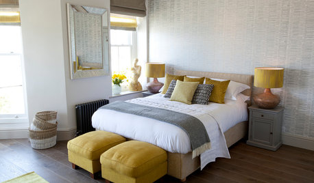
COLOR10 Pretty Ways to Refresh a Gray Palette
Energize your favorite gray shades with pick-me-up accents as fresh as a spring day
Full Story
PRODUCT PICKSGuest Picks: A Pale Color Palette to Quiet the Senses
Set a soothing tone with neutral colors and inspiring artwork for a room that's a real retreat
Full StoryBEFORE AND AFTERSGray Cabinets Update a Texas Kitchen
Julie Shannon spent 3 years planning her kitchen update, choosing a gray palette and finding the materials for a transitional style
Full Story
EXTERIOR COLORExterior Color of the Week: 7 Ways With Warm Gray
See why this hue can be the perfect neutral for any house
Full StoryKITCHEN OF THE WEEKKitchen of the Week: White and Gray and Storage-Packed
Open space, natural light and a palette of neutrals create a bright contemporary kitchen for a growing family
Full Story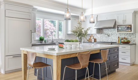
ROOM OF THE DAYRoom of the Day: Soothing Gray Cabinets Update a Modern Kitchen
Custom storage, light woods and a cool palette create an easygoing space for a California family
Full Story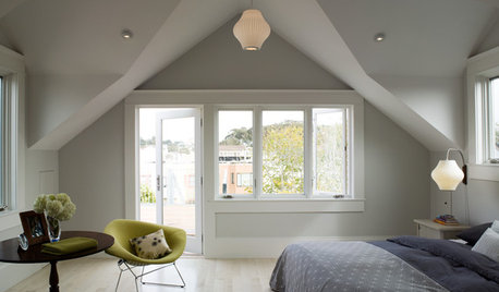
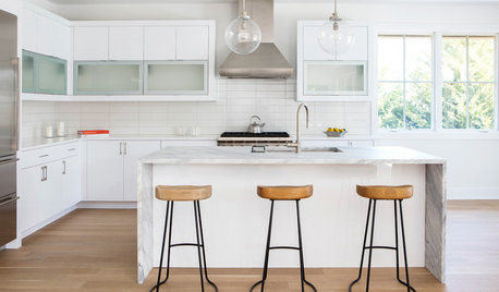
WHITE KITCHENSNew This Week: 3 Gorgeous White-and-Gray Kitchens
Look to this cool palette for a bright yet serene atmosphere
Full Story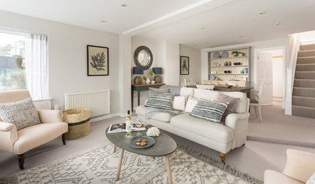
COLOR PALETTES7 Ideas for Using a Gray Carpet in Your Living Room
Soothing and often practical, gray carpeting can look elegant too, especially if you consider these ways to work with it
Full Story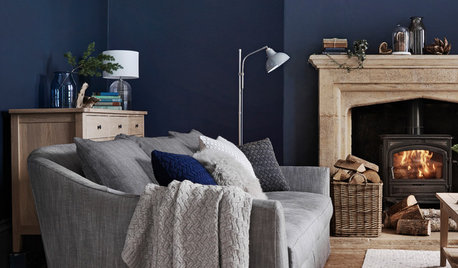
DECORATING GUIDESHow to Combine Blue and Gray in Your Living Room
Let these 10 versions of the versatile color combination inspire you
Full Story


T Ciardiello