


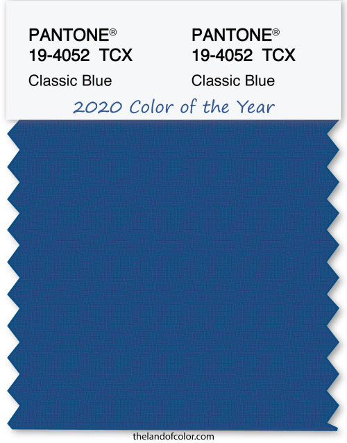
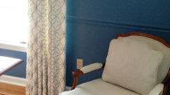
Pantone 2020 Color of the Year
Lori A. Sawaya
4 years ago
Featured Answer
Sort by:Oldest
Comments (34)
Related Discussions
Pantone's Color of the Year: Honeysuckle
Comments (50)Binsd, it always amazes me that people would actually buy a color just because it's in style. Well, I guess I'm in style then! Below is a nice size basket I received as a Christmas gift, and I had planned on leaving it out all year when I find the right spot. It has one handle so it's meant to be hung on a wall. My guest bath has a lot of pink in it, so this will look nice with a few hand towels inside the basket. Yes, I realize it has a Christmas theme, but I don't care! Oh, my Honeysuckle is cream also....See More2012 Pantone Color of the Year is...
Comments (17)Well then my DH the diehard Denver Broncos fan is the height of color forward (so wish there was a sarcasm font) Here is BM Fiesta Orange! IRL it's not quite as cornea searing as it looks with the flash on. And yes I was completely cross eyed by the time I finished this. I consider it a testament to my persuasion skills that it is just the built in desk area, cause he wanted 2 walls orange and 2 walls blue. Now he has me painting the walls BM Hale Blue. Hey it's his Man Cave, and it gets me free reign over everything else house related....See MoreBreaking News. Pantone Color of the Year 2015 is...
Comments (95)That is just skin folding, not fat. I recently watched a "fashion makeover" segment on a morning news show (I was captive--it was in a doctor's office waiting room), and a pretty but very overweight woman was getting made over. They put her in an outfit like Selena's above and said the key was having the waist high enough, so that it above the lumpy fat parts. Okay, they didn't use exactly those words, but you get the idea. The message was everyone can wear the exposed midriff style. Sheesh. So, yes, some are trendy no matter what the trend. Call me an old fogey, I guess. Okay, back on topic. My house has has a shade of burgundy that splits the difference between burgundy and plum and a moss green that runs throughout, except bedrooms and laundry/mud rooms. Other stuff is sprinkled in, but those run throughout the house. The floors are light reclaimed wood, but I think darker floors might actually be more appropriate from an interior design standpoint. However, it's a Texas Hill Country house and the pine is appropriate to the genre. So, I'm on board with Marsala, unless it's the browner version....See MorePantone color of the year 2017
Comments (40)I translated a Russian folk tale (from Russian and German) to English, and I find the Russian style of design very appropriate for folk and fairy tales, but it's a bit much to live with. It's one thing to spend a day a the The Hermitage, but it would be something else to live with it, I think. I'm not a fan of Baroque, whether it is French, German, or Russian, although I do like Italian Baroque - particularly Borromini and Bernini. I'm okay with loud, but I'm not okay with loud and too much. For my own house, I prefer an uncluttered look - otherwise I get dizzy and my energy get sapped by not knowing where to look. I especially like the minimalist architecture of Latin America, and that can be a bit loud regarding the colors, but it is also serene, at least to me. Even a bright somewhat lime green can be serene for me, if use properly....See More PRO
PROLori A. Sawaya
4 years ago- PRO
Lori A. Sawaya
4 years ago  PRO
PROPatricia Colwell Consulting
4 years agolast modified: 4 years agoLori A. Sawaya thanked Patricia Colwell Consulting
Holly Stockley
4 years ago


Related Stories
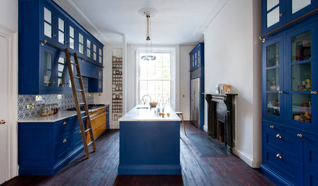
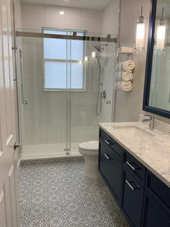
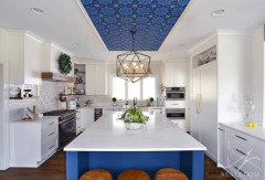
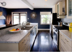
COLORS OF THE YEAR10 Ways to Use Classic Blue, Pantone’s 2020 Color of the Year
This calming hue, pulled from the sky at dusk, is meant to reassure in a tumultuous time
Full Story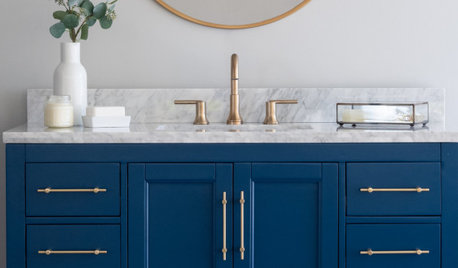
SHOP HOUZZPantone Color of The Year 2020: Classic Blue
Shop here for products inspired by PANTONE 19-4052 Classic Blue
Full Story0
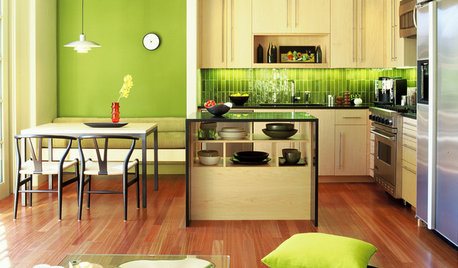
COLORMeet Greenery, Pantone’s 2017 Color of the Year
See how to give your home a fresh start for the new year with this fun, nature-inspired hue
Full Story
LANDSCAPE DESIGNPantone’s 2021 Color of the Year Looks Optimistic in Landscapes
See 9 ways to use Pantone’s pairing of Illuminating, a bright yellow, and Ultimate Gray in your outdoor space
Full Story
COLORHow to Use Marsala, Pantone’s 2015 Color of the Year
Pantone digs deep and goes earthy with its selection. Here are ways to make it work in your home
Full Story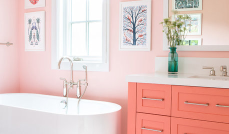
COLORS OF THE YEARAre You a Fan of Pantone’s 2019 Color of the Year?
Living Coral is bold and bright. Here are places to consider using it indoors and out
Full Story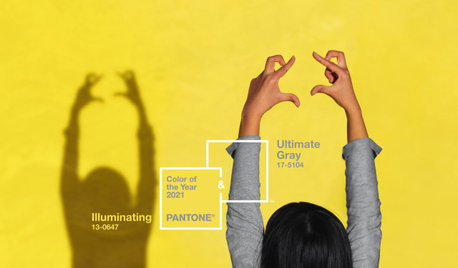
COLORS OF THE YEARPantone Picks an Uplifting Combo for Its Color of the Year 2021
Hello, yellow! Good day, gray! See how to use the two colors predicted to be both hot and cool in the coming year
Full Story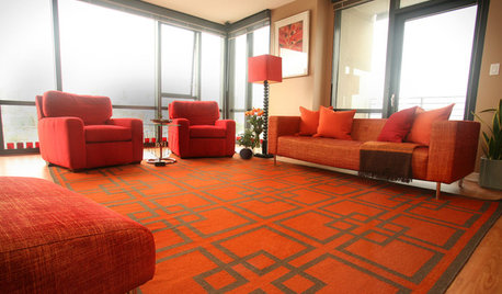
DECORATING GUIDESTangerine Tango: 4 Ways to Use Pantone's Color of the Year
Don't let this bold hue scare you — try warming up any room with this cheerful red-orange color of 2012
Full Story
PINKHoneysuckle: Inspired by Pantone's Color of the Year
13 ways homes can wear this confident shade of pink, Pantone's color of 2011
Full Story
LATEST NEWS FOR PROFESSIONALSRemodeling and Design Pros Expect a Strong Business Year in 2020
Most pros expect growth despite rising labor and material costs, the 2020 U.S. Houzz State of the Industry report shows
Full Story


Holly Stockley