


Closest Sherwin Williams match to Benjamin Moore Swiss Coffee
Kristin S
4 years ago
Featured Answer
Sort by:Oldest
Comments (20)
Related Discussions
Benjamin Moore vs. Sherwin Williams?
Comments (60)My husband and I painted our whole house with Home Depot Behr Ultra Scuff Defense Stain Blocking paint and primer; flat for walls and ceilings, and satin for doors and moldings. We used fine quality paint brushes and rollers. The paint handled beautifully and is quite durable and looks great. We took our time, lightly sanded all doors and moldings first, washed and rinsed all walls and ceilings prior to painting. We did all the correct prep work. I even got a 10% military discount ( I am a retired Air Force Captain). Our house looks great! I have used BM and SW in past homes I lived in. BEHR is just as good. I painted my front door about 10 years ago, also with BEHR and it looks as good as the day I painted it. We since replaced our front door with a high end fiberglass door, and plan to paint it with BEHR when the pollen dies down in the air. I can also assure you that there is no professional painter that would have ever taken the time to do all the prep work my husband and I did prior to painting. We are semi retired and have the luxury to take the time to do a great paint job! I have read countless Houzz threads on botched professional paint jobs in expensive homes. As my Dad always says: if you want the job done right, do it yourself....See MoreBenjamin Moore’s white opulence paint color
Comments (75)It has been a while since the last activity on this thread, and I felt it might be beneficial to give my updated perspective on White Opulence #879 from Benjamin Moore as a paint color for main areas. Having lived with this color for a bit longer now since my last comment, I am beginning to understand how tightly it regulates what other colors can be placed with it for anyone who cares about a homogeneous scheme and also how undeniable the pink tone can be when applied over large surface areas. White Opulence is a tint of red, but it is so light that in ample daylight or under bright white lighting it can "read" as white. In average daylight, it produces a whisper-light pink hue. The effect of this is magnified the larger the area that is covered by it. Using this color on the walls in the main space of a large, open-plan layout with high ceilings, for example, will imbue the area with a light, yet undeniable, pale pink cast in average lighting. It would be a good idea to prepare not only yourself but also any other significant users of the space of the pink tinge before selecting this color because some people truly dislike pink, and it is courteous to work with all regular users of spaces during design planning to try to ensure no one will be overly uncomfortable with the final effect. One thing that hasn't been discussed is how White Opulence can cast a peach tone under warmer lighting colors, especially in the absence of any compensating daylight, meaning nighttime in most home spaces. If peach is a color you want to avoid and you utilize warm lighting -- that is, progressively orange-tinged the further under a 4000K color temperature you go -- then this is a paint color to avoid. The general recommendation is that 4000K is quite cool for home environments, so if you don't know what color temperature your home lighting is, you can probably assume it is warmer than 4000K if you selected average bulbs from your home supplies provider. White Opulence as a red-based white was an attractive choice for my main space because I already had a red accent in a permanent finish and personally prefer the fresh look that a red-white lends versus common alternate choices for main area wall colors like yellow-based beiges or blue-based grays. The problem is that so many home goods available are manufactured in colors that go with beige and gray wall colors rather than the faint red-white of White Opulence that color coordination requires more work than may be expected. Of course, you could decorate using pure white items, but what you really need are options for whisper pink basics which are hard to find. Adding stronger pink or red items is not always the solution either because you cannot feasibly fill the room with accents; you need some basics that blend with the wall tone. Then there is the issue of coordinating White Opulence with colors for auxiliary rooms if you wish to have some variety throughout the home while still maintaining the feel that all of the home's colors work together. Most blues coordinate with White Opulence, but if you have already used red accents in rooms painted with White Opulence, then red is challenging to pair with blue in most instances unless it is a dark, cool blue like navy. Where this has been a dilemma for me has been my hallway colors connecting the main open space to the bedrooms which are all different pastels. The color plan I have will work, and I'll enjoy the variety of colors that I have been able to make flow together, but to be honest, at times I have wondered how much easier the design process might have been if I had picked plain white for the main space. White is the ultimate neutral some might say. At the very least, a basic white for the main area would have given me more freedom in selecting fabrics and other home products for the main space as well as coordinating colors for other rooms. It is all too easy to second-guess decisions that will affect your life long-term. I am using Benjamin Moore's durable Aura formula in a satin finish, so I expect the new White Opulence paint will last decades. Had I selected a plain white or yellow- or blue-based off white, I might be back on this very forum wishing I had gone with White Opulence to add appeal beyond the standard choices. I hope this is helpful to anyone still considering this color....See MoreWhat Benjamin Moore color is closest to Pottery Barn antique white?
Comments (17)I have talked to numerous people at PB and no one has known what paint color "Logan Antique White" is most similar to. I have the Logan collection and the trim in my home is SW Creamy. Creamy appears lighter and pinker next to the Logan furniture. Logan is more similar to SW Dover White, but a tad darker. I have found it requires a color with a lower LRV (below 45 seems best). SW Waterloo and BM Cloudy Sky are examples. Green undertones look best....See MoreTrim Color with Swiss Coffee Kitchen Cabinets
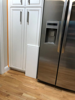
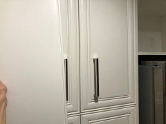
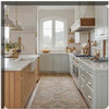
Comments (5)I wouldn't assume that the cabinet maker's Swiss Coffee will be a match to a BenM Swiss Coffee paint chip. I'd want to see a sample first. Because the color appearance depends a great deal on the product. They maybe using a Swiss Coffee chip as the target, but oftentimes it can't be matched exactly. Plus, cabinet products are higher sheen and that shifts color appearance a smidge darker. Swiss Coffee has a healthy bump of Chroma (colorfulness). So much so that I wouldn't categorize it as an off-white. It's a color. That's how I'd treat Swiss Coffee depending on what the cabinet maker's sample looked like. Reframing it that way opens up the idea of using a more neutral white on trim and doors. Like Super White or Chantilly Lace....See More
Kristin S
4 years agoKristin S
4 years agoKristin S
4 years ago PRO
PROLori A. Sawaya
4 years ago- PRO
Lori A. Sawaya
4 years agolast modified: 4 years ago Lyndee Lee
4 years ago- PRO
Lori A. Sawaya
4 years agolast modified: 4 years ago Lyndee Lee
4 years agoscliadakis
3 years agoremodeling1840
3 years ago
Related Stories
COLOR20 Wide-Ranging Colors Touted for 2014
Behr takes its turn in the color-forecasting game with 4 paint collections from superbold to sophisticated
Full Story
COLORNature’s Color Wisdom: Lessons on Blue From the Great Outdoors
Take some cues from the sea and sky to find a blue to match any taste and mood
Full Story
MOST POPULAR50 Shades of Gray
Gray is hotter than ever, thanks to a hit novel full of risks and dark secrets. Tell us: Which paint shade possesses you?
Full Story
COLORMore Top Paint Picks for 2014: New Greens, Blues and Neutrals
Valspar’s new colors aim to lift spirits and express creativity. Here’s how to use 9 of them in lively ways
Full Story
COLORBest Ways to Use the Soft Yellow Color of 2014
You may fall for PPG Pittsburgh Paints’ Turning Oakleaf if you like your hues warm, mellow and cheery
Full Story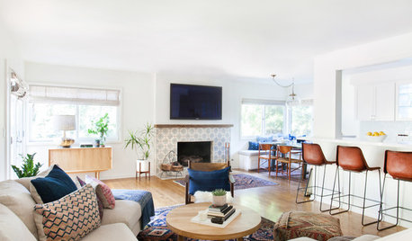
DECORATING GUIDES10 Reasons to Embrace White Walls
Do they strike you as even more boring than watching white paint dry? Consider what makes them the darling of so many
Full Story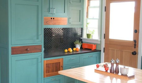
KITCHEN CABINETSKitchen Cabinet Color: Should You Paint or Stain?
Learn about durability, looks, cost and more for wooden cabinet finishes to make the right choice for your kitchen
Full Story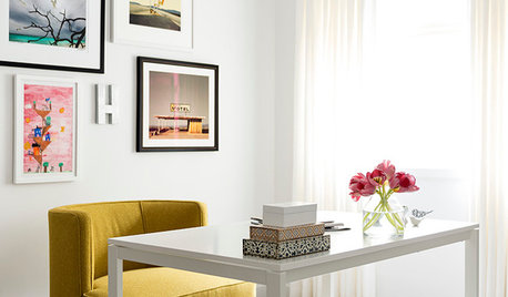
DECORATING GUIDESDesigner Secrets: 10 Pros Share Their Favorite White Paints
Decorating experts look to these hues when they want a go-to white they can count on
Full Story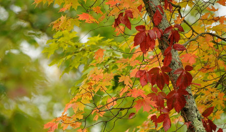
COLORFall on the Wall: Decorating With Rich Reds, Browns and Oranges
For your interiors, take a cue from nature’s colorful seasonal offerings
Full Story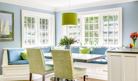
KITCHEN DESIGN91 Kitchen Banquettes to Start Your Morning Right
Slide into one of these stylish breakfast nooks and stay awhile
Full StorySponsored

Lori A. Sawaya