


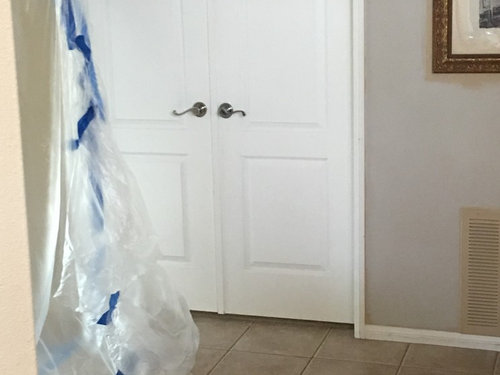
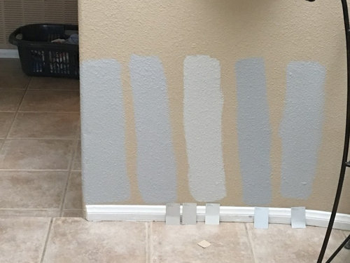
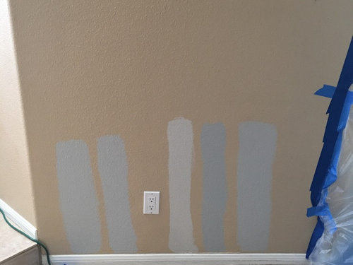
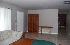
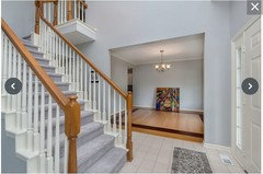
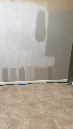
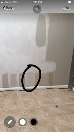
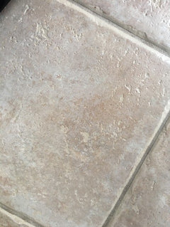
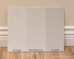
Agreeable Gray against beige tile?
MTW
4 years ago
last modified: 4 years ago
Featured Answer
Sort by:Oldest
Comments (95)

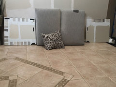
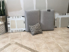
Jennifer Hogan
4 years ago
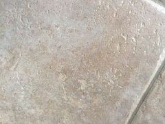
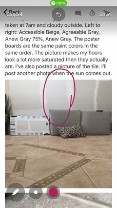
kgfrayne
4 years agolast modified: 4 years agoRelated Discussions
Paint Help - SW Agreeable Gray vs SW Anew Gray
Comments (52)I have anew gray currently in my bedroom on the walls and alabaster on the trim. I think it would be beautiful to have the trim and perhaps the door also sw anew gray and the walls alabaster. Another look depending on the height of your ceilings, you could paint the ceiling anew gray with alabaster walls....See Morerepose gray or agreeable gray?
Comments (113)sorry for the delay everyone, we ended up going with Mindful gray. the others looked too light. this is artificial lighting after just painting it. will post a picture when everything is back in its place and during daylight! :)...See MoreSherman Williams Agreeable Grey is what I'm using to paint entire home
Comments (11)I decided to use it as a whole house color-and I extremely disliked it in the kitchen. Especially didn’t like it with my counters. Maybe once the floor was in and everything was done I would’ve liked it. But we repainted, Repose Gray, and while I’m not sold on it, I don’t feel as though I’m having a panic attack when I look at it. Definitely look at it in different rooms/parts of the day etc....See MoreWhat is a good paint color that is grey & beige
Comments (45)We have both Shoreline and Pale Oak in our home. Paint chips are fine up to a point of winnowing down to the finalists, but I bought sample cans of the ‘contenders’ and painted hunks of discarded drywall (ours was a new home) that were a decent size. I moved them around the target areas at different times of day to see how they performed under changing light conditions. It was very telling. I’m glad I did....See More
jay06
4 years ago
suzyq53
4 years ago
MTW
4 years agolast modified: 4 years agosuzyq53
4 years agojay06
4 years agolast modified: 4 years agosuzyq53
4 years agoJennifer Hogan
4 years ago
Yayagal
4 years ago
lynartist
4 years agolynartist
4 years agolynartist
4 years agolynartist
4 years agoMTW
4 years agolast modified: 4 years agoMTW
4 years ago- PRO
Tischler Wood
4 years ago 
mnmamax3
4 years agolynartist
4 years agoMTW
4 years agolast modified: 4 years agolynartist
4 years agolynartist
4 years agoMTW
4 years agolynartist
4 years ago PRO
PROInner City Skyline
4 years agoMTW
4 years agolast modified: 4 years ago
Abby Mac
4 years agolynartist
4 years agolynartist
4 years agoMTW
4 years agocalidesign
4 years ago PRO
PROOpen House Home Staging & Redesign, LLC
4 years agolynartist
4 years agoJennifer Hogan
4 years ago
Tina
4 years agoTina
4 years agojay06
4 years ago
cpartist
4 years agocpartist
4 years ago
Sammy
4 years agolast modified: 4 years agojacqtopia
4 years agoAbby Mac
4 years ago
Carolae
4 years agoAbby Mac
4 years ago
Tina Morris
3 years ago
Eva Choy
3 years ago80sgirlatheart
2 years ago
cntry672
2 years ago
Edward M Militello
last year


Related Stories

MOST POPULARRethinking Beige in a World Gone Gray
Gray, the ‘it’ neutral of recent years, has left beige in the shade. But is it time to revisit this easy-on-the-eyes wall color?
Full Story
MOST POPULARWhat’s Your Neutral: Beige or Gray?
A designer shares 10 tips for using the neutral shade that works best for you
Full Story
GRAYColor Guide: How to Work With Light Gray
The hottest new neutral can be cool or warm, formal or casual, and feminine or masculine. Talk about versatile
Full Story
COLORHow to Layer Tones of Gray for Depth and Harmony
Use texture, pattern, contrast and more to create a subtle, sophisticated look with this popular color
Full Story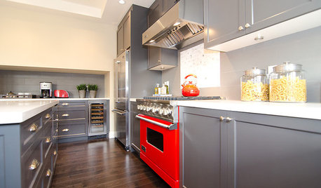
COLORCooking With Color: When to Use Gray in the Kitchen
Try out Trout or shake up some Martini Shaker gray for a neutral-based kitchen that whispers of sophistication
Full Story
DECORATING GUIDESColor Guide: How to Work With Charcoal Gray
The most modern neutral, charcoal gray looks great in dining rooms, living rooms and even nurseries. Here's how to use it best
Full Story
GRAYChoosing Paint: How To Pick the Right Gray
Which Version of Today's 'It' Neutral Is For You?
Full Story
GRAYDesigners Share Their Favorite Light Gray Paints
These versatile neutrals can help create a range of moods in any room
Full Story
DECORATING GUIDESColor of the Week: Decorating With Warm Gray
Tired of tan? Getting gloomy from cool gray? Make warm gray your new go-to neutral
Full Story
MOST POPULAR50 Shades of Gray
Gray is hotter than ever, thanks to a hit novel full of risks and dark secrets. Tell us: Which paint shade possesses you?
Full StorySponsored
Central Ohio's Trusted Home Remodeler Specializing in Kitchens & Baths


jay06