


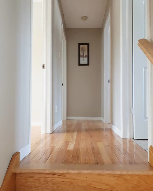
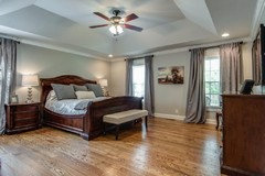
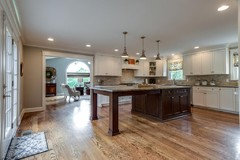
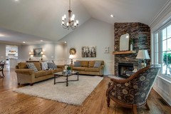
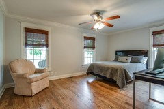
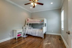
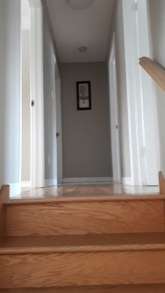
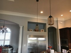
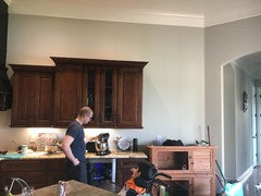
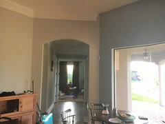
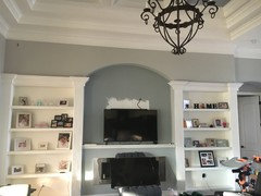
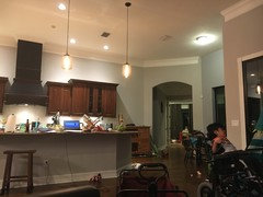
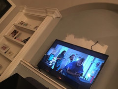
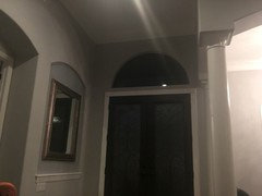
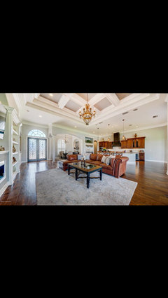
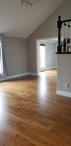
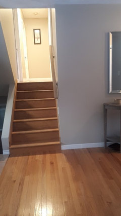
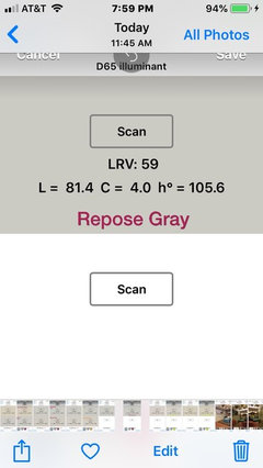
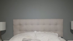
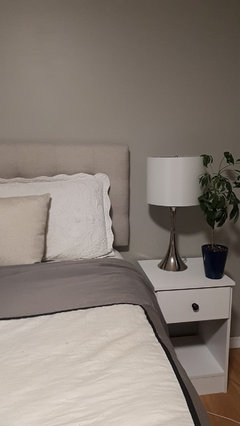
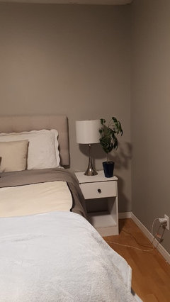
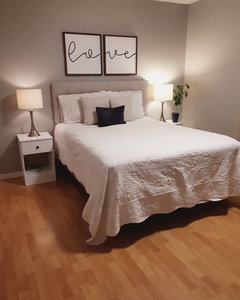
repose gray or agreeable gray?
Girlmom101
5 years ago

Featured Answer
Sort by:Oldest
Comments (113)

angelicatownshend
5 years agoGirlmom101
5 years agoRelated Discussions
Need help with paint color in new open concept
Comments (3)Unfortunately I can't get good pic today of finished floor with room because there are cabinets/ boxes everywhere and floor is covered. Here are some views taken but not sure if they are very helpful. I'll try to post better later if I can today....See MoreNeed help with grey paint!!
Comments (3)Our kitchen cabinets are charcoal Choosing colors for the entire house before it's built is risky. But a lot of people have to do it that way. I'd pull two elements to help guide, help inform the wall colors, your flooring and your cabinets. If the wall/ceiling colors coordinate nicely with the floor and cabinets, odds are you're going to be happy with the result. Because you've created a coordinated 'envelope' of floor/cabs/walls/ceiling to hold the contents (all your stuff). And since you can't test the colors in the actual rooms, I'd go with full spectrum paint colors. BenM has Color Stories they only mix it in Aura. Aura is pricey but price it out per square, not per gallon, in order to compare it to cheaper grades and remember the labor costs the same whether they're applying builder's grade or top tier product....See MorePaint color advice for a low light room, help!!!
Comments (24)Honestly I ditched any sort of gray or grayed lavender in my lower light rooms and went with a beautiful coral - BM 2170-60 Sunlit Coral. It’s muted and complex enough to not be sherbet colored, but warm and inviting and goes beautifully with my other rooms. https://www.benjaminmoore.com/en-us/color-overview/find-your-color/color/2170-60/sunlit-coral?color=2170-60 There are so many beautiful home colors that aren’t gray, especially for north facing rooms....See MoreMixing painted brick with stone on exterior
Comments (34)Wow! That turned out so beautiful! Aren't you happy with the simple roof line. It really shows off the beauty of the house! Which stone brand and color did you use on the porch apron? What color did you use to paint the brick?...See More
Home4Here
5 years agoGirlmom101
5 years ago
shead
5 years agoGirlmom101
5 years agoGirlmom101
5 years agoangelicatownshend
5 years agoGirlmom101
5 years agoangelicatownshend
5 years agoJoanne
5 years agoPamela Hardy
5 years agoangelicatownshend
5 years agoangelicatownshend
5 years agoGirlmom101
5 years agoangelicatownshend
5 years agoGirlmom101
5 years ago
wmsimons85
5 years agoangelicatownshend
5 years agoHome4Here
5 years agoGirlmom101
5 years ago PRO
PROLori A. Sawaya
5 years agolast modified: 5 years agoHome4Here
5 years agoGirlmom101
5 years ago- PRO
Lori A. Sawaya
5 years ago Girlmom101
5 years agolindahambleton
5 years agoGirlmom101
5 years agoGirlmom101
5 years ago PRO
PROFlo Mangan
5 years agoGirlmom101
5 years ago- PRO
Flo Mangan
5 years ago Girlmom101
5 years ago- PRO
Flo Mangan
5 years ago Girlmom101
5 years ago- PRO
Flo Mangan
5 years ago - PRO
Flo Mangan
5 years ago Girlmom101
5 years agoGirlmom101
5 years ago
Steve Daigneault
5 years agoGirlmom101
5 years ago- PRO
Flo Mangan
5 years ago Girlmom101
5 years agoGirlmom101
5 years agoGirlmom101
5 years agoGirlmom101
5 years agoGirlmom101
5 years agoJ C
5 years agoGirlmom101
5 years agoGirlmom101
4 years ago


Related Stories

GRAYDesigners Share Their Favorite Light Gray Paints
These versatile neutrals can help create a range of moods in any room
Full Story
MOST POPULAR50 Shades of Gray
Gray is hotter than ever, thanks to a hit novel full of risks and dark secrets. Tell us: Which paint shade possesses you?
Full Story
DECORATING GUIDESColor of the Week: Decorating With Warm Gray
Tired of tan? Getting gloomy from cool gray? Make warm gray your new go-to neutral
Full Story
DINING ROOMSColor Feast: When to Use Gray in the Dining Room
The right shade of gray pairs nicely with whites and woods to serve up elegance and sophistication
Full Story
MOST POPULARRethinking Beige in a World Gone Gray
Gray, the ‘it’ neutral of recent years, has left beige in the shade. But is it time to revisit this easy-on-the-eyes wall color?
Full Story
KITCHEN OF THE WEEKKitchen of the Week: A Soothing Gray-and-White Open Concept
A smart redesign gives an active family a modern kitchen with soft tones, natural elements and mixed metals
Full Story
ROOM OF THE DAYRoom of the Day: Soothing Gray Cabinets Update a Modern Kitchen
Custom storage, light woods and a cool palette create an easygoing space for a California family
Full Story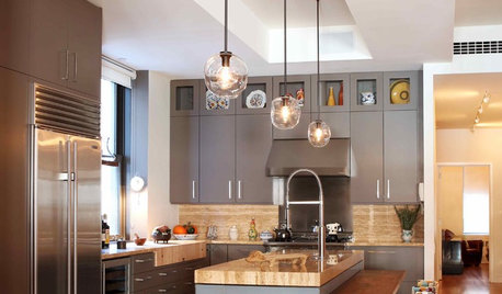
KITCHEN DESIGNObsessed With Gray in the Kitchen
See How to Use This Sexy Neutral to Heat Up Your Cookspace
Full Story
EXTERIOR COLORExterior Color of the Week: 7 Ways With Warm Gray
See why this hue can be the perfect neutral for any house
Full Story
GRAYColor Guide: How to Work With Light Gray
The hottest new neutral can be cool or warm, formal or casual, and feminine or masculine. Talk about versatile
Full Story

springlering