


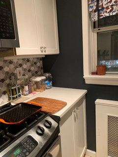
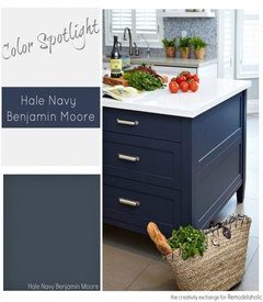
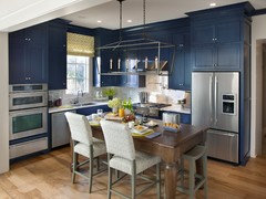
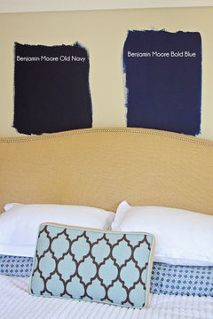
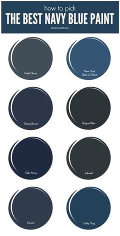
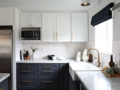
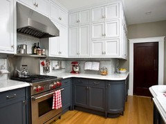
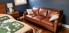
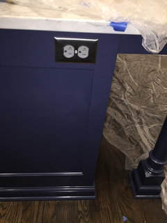
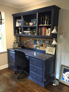
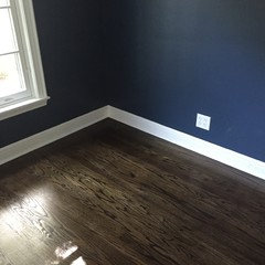
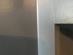
Hale Navy. How it looks in showroom/pic vs insitu.
Anastasia Reid
5 years ago
Featured Answer
Sort by:Oldest
Comments (44)
Related Discussions
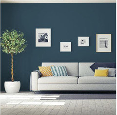
Favorite Navy Blue Paint Color
Comments (16)After seeing the kitchen in the HGTV Smart House, I just picked up navy samples to seriously think about painting my kitchen cabinets dark blue. Here's what I picked:Indigo batik (that's in the HGTV house) It looks slightly different on the two paper chips (go figure) Also SW Commodore The others looked very strange once I had them in my house (Naval; Indigo, etc.)...See MoreIs a white kitchen with navy island too trendy?
Comments (29)IMO, White cabinets & Neutral colors are consider classic & a safer choice to appeal to the masses. Often used as a base for trends. Primary, Secondary & their mixtures seem to be consider more trendy or fashionable. Funny similar to clothing. Primary & Secondary Colors when used come in & out of trend & or therefore use during a specific time frame, "date" a kitchen. For example, 50s = light blue & pink with certain curving geometric shapes 60s hippy times, natural colors like advocado, browns, darker yelloes & flower power shapes. 70s, 80s, 90s, up to now. Trends seem to last 10 years before the internet. Trends seem to be changing more rapidy now due to buying online, searching online, able to buy internationally easier, home tv shows, etc. So with that said to go trendy or with what you like depends on the situation. If putting home on market I suggest appealing to as many buyers as possible, I would do neutrals with trends mixed in. Right now, white shaker is the safest choice to sell a home,imo. It is classic. White also makes the room appear bigger & brighter. That is why I do white on wall cabinets & possibly a different color island in neutrals. I consider natural wood stains & greys neutral. A lot of debate if grey, beige & wood are trendy. Well the reason why, imo, is because those colors often have little amount of the Primary & Secondary colors. Grey, beige, white, wood are neutral. Neutral colors don't usually show up on the color wheel. Neutral colors include black, white, gray, and sometimes brown and beige. They are sometimes called “earth tones.” A neutral when starting to add tones of Primary & Secondary can go out of the "neutral zone" which starts to go into the trend zone. So, with that said, if not reselling right away, I agree with everyone else above, do what you truly love & enjoy it for many years to come. If selling within 5 years, go with a bright neutral classic on the walls & do whatever you want on an island. An island can easily be painted or redone to prepare it for selling home, if needed. Much easier & less $ than having to update a kitchen by redoing of cabinets on walls with countertop or just list it lower on market some. If getting ready to sell, stay neutral & bright. Hope that helps you make the best decision for you ;) It's your home & it's all about you. Btw, I love blues & blue islands. I especially like teals. I love white cabinets on walls with a blue island. I have always liked blues & have always incorporated them throughtout my home one way or another....See MoreCambria vs. MSI Quartz
Comments (30)We are so so close to finalizing the cambria sutherland. Our kitchen set up is soft cream cabinets all around and a hale navy island. we liked the gray tones of the sutherland but looking at the actual stone today, got a bit concerned if it will be too blue? we want a timeless countertop that we dont get tired of looking at. The sutherland looks great but would love actual feedback from anyone if it is more gray with slight blue tone or does it bring out more blue when paired with a blue island? any input will be super super helpful....See MorePics-should we paint our house navy?
Comments (21)Re "My focus would be making it homey vs trying to achieve a historic general store feel." I dont think the 2 are mutually exclusive. Is there any commercial aspect to this OP? If not, no you certainly dont want people thinking its really a business or walking up on your porch trying to get in, but on the other hand it does have a history that should be embraced and not be overlooked - the long time locals certainly wont! So yeah I do think navy, dark grays, all the contemporary "mud" colors--- are much too somber for this building. Does not fit either its history OR its architecture. Those same colors might look great on a big, stately Victorian former boarding house, funeral home or some such - but not your more rustic 1920's facade. Have you connected with local historical society people? No of course pleasing them is not your intention - it's just they might have some thoughts/ideas on it that you havent considered....See More
Anastasia Reid
5 years ago
greenfish1234
5 years agoAnastasia Reid
5 years ago PRO
PROBeth H. :
5 years ago
cawaps
5 years agolast modified: 5 years agoAnastasia Reid
5 years ago
pink_peony
5 years agoAnastasia Reid
5 years ago- PRO
Beth H. :
5 years agolast modified: 5 years ago 
Marci
5 years agomarinaboehm
5 years agolast modified: 5 years ago
stillpitpat
5 years agopink_peony
5 years agostillpitpat
5 years agokelleg69
5 years agoAnastasia Reid
5 years agopink_peony
5 years agoAnastasia Reid
5 years agoAnastasia Reid
5 years agopink_peony
5 years agoAnastasia Reid
5 years agopink_peony
5 years agopink_peony
5 years agolast modified: 5 years agopink_peony
5 years agopink_peony
5 years ago
ajrmcr
5 years agoAnastasia Reid
5 years ago
Seajay Sparkles
5 years agonosoccermom
5 years ago
Amanda Abbott
3 years agoChristine Kaufman
last yearkandrewspa
last year

Related Stories
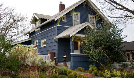
COLORExterior Color of the Week: Go Navy!
It’s daring and dramatic, but also a neutral. And it looks fantastic on almost any home
Full Story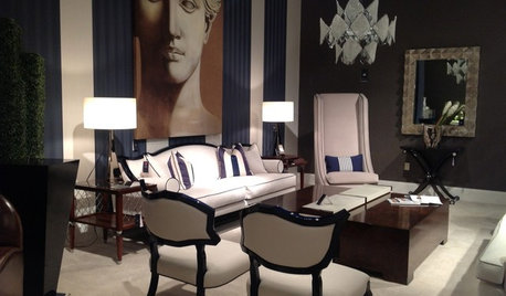
DECORATING GUIDESHot Looks From the Spring 2013 High Point Market
Get an eyeful of some of the colors, textures, materials and more taking a big stand at North Carolina's huge furnishings trade show
Full Story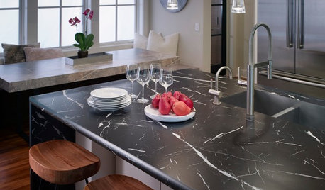
KITCHEN DESIGNNew Looks for Cabinets and Countertops Emerging in 2019
Dark colors, wood patterns and thin surfaces are a few of the trends seen at the recent Kitchen & Bath Industry Show
Full Story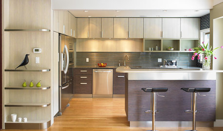
KITCHEN CABINETSGet the Look of Wood Cabinets for Less
No need to snub plastic laminate as wood’s inferior cousin. Today’s options are stylish and durable — not to mention money saving
Full Story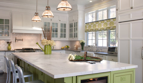
KITCHEN ISLANDS9 Kitchen Islands That Look Gorgeous in Green
Whether soft and sage-y or loud and lime-like, green is a natural choice for an island accent
Full Story
DECORATING GUIDESHot Color Combo: Cool Blues and Warm Brass
It's trending all over, but navy or royal blue with brass or gold just also might become a new classic pairing
Full Story
DECORATING GUIDESColor Guide: How to Work With Charcoal Gray
The most modern neutral, charcoal gray looks great in dining rooms, living rooms and even nurseries. Here's how to use it best
Full Story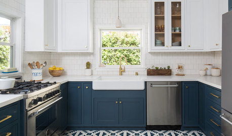
KITCHEN DESIGNThese Kitchens Do Blue Cabinetry Just Right
Tired of all white? Consider a contrast with cobalt, navy, indigo or midnight hues — exact paint colors included
Full Story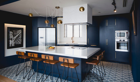
COLOR7 Sophisticated Blues for Your Kitchen Cabinets
Complement a white or neutral room with cabinetry in deep navy, blue mist, cobalt, teal, turquoise and more
Full Story
KITCHEN CABINETSKeeping Cabinet Color on the Down Low
Give just base cabinets a colorful coat for a kitchen sporting character and a spacious look
Full Story


jalarse