


A not so funny thing happened on the way to the bathroom redo
Laura Grosmaire
5 years ago
last modified: 5 years ago


Featured Answer
Sort by:Oldest
Comments (17)
 PRO
PROBeth H. :
5 years agolast modified: 5 years ago
missenigma
5 years agoRelated Discussions
A funny thing happened on the way to the forum
Comments (9)i am touched ... wait.. lets not go there ... i had a neighbor at the old house.. that had one of the undulatas under a black walnut.. like 12 inches from the trunk .. and they did just fine... they didnt water like a hosta gardener would.. so they werent gigantic or anything... thats my knowledge base about such welcome back... ken PS; just plant them .. they arent going to disappear overnight ... you will know if they struggle next spring ......See MoreA funny thing happened on the way to the forum...
Comments (10)I read this yesterday. Today, I put on a pair of nitrile gloves and started seeding buckets full of hot peppers - red jalapenos and the like - to start a mash for fermenting. I'm doing this outside, face up wind in the breeze, having learned my lessons over the years. So after an hour of this, the cell phone rings, so I dig it out of my pocket with the dripping wet gloves, answer it, then return the phone to pocket, thoroughly coating the phone with hot pepper membrane juice, and keep going. Phone dries off, I finish up the peppers, two hours later,. You can see where this is going...........See MoreA Funny Thing Happened on the Way to the Carribean
Comments (6)Pat: My guess is gardeners would probably be a sympathetic audience...unless they were the hoity toity type. You could always approach it sideways and talk about vermicompost first. When they ask you where you buy the VC, you can tell them you've got thousands of working worms that make it for you. Pete: Wow! Lemme know if you need help eating any of those. It's only a 5 hr. drive from Berkeley to Mendocino. lol. just kidding. Enjoy! Andrew...See MoreBarn door for bathroom entrance, but how, with this thing in the way?
Comments (25)Thank You all for your Responses. You all have wonderful and funny comments... My husband did not want to have to take down the pop out at the entrance :( So going through the comments, he liked the Idea of the folding doors. But seeing how tall the entrance is, we may need custom doors. Now I don't know how I feel about a folding door. I feel it will only leave half the entrance to actually walk through. Privacy and smell ,lol, is not something we thought about, but we did have a laugh. So I think , temporarily, we will leave that ugly ass curtain, and since the floors are done in the house, next we will be remodeling the bathroom and just put one big shower. I think I will put a linen closet bout half the size of the stand alone shower. Thus giving us more room for a giant updated shower, because we do not take baths. After we do all that , Then the bathroom entrance is what we will be figuring out. ugh, who would have thought that having a door to the master bathroom would become such a big deal? Whoever builds homes without bathroom doors should take a chunk off the price of the home. for the brain pain and suffering from thinking and overthinking things.. Anyways, Thank You all so much for the tips and Ideas. I will keep everyone updated on Bathroom reno if thats what interests folks. Have A Super Day everyone. Be Safe and Kind to others....See More PRO
PROJudyG Designs
5 years agolast modified: 5 years agomvcanada
5 years ago
Laura Grosmaire
5 years agolast modified: 5 years ago- PRO
Patricia Colwell Consulting
5 years ago 
apple_pie_order
5 years ago- PRO
Beth H. :
5 years ago missenigma
5 years agoLaura Grosmaire
5 years agolast modified: 5 years agoDeb Zilch
5 years ago
stillpitpat
5 years agocat_ky
5 years agoLaura Grosmaire
5 years agoLaura Grosmaire
4 years agolast modified: 4 years ago


Related Stories
BATHROOM DESIGN15 Cheap and Easy Ways to Makeover Your Bathroom
Makeover Magic Can Happen When You Think Outside the Bathroom Box
Full Story
BATHROOM DESIGN12 Things to Consider for Your Bathroom Remodel
Maybe a tub doesn’t float your boat, but having no threshold is a no-brainer. These points to ponder will help you plan
Full Story
UNIVERSAL DESIGN11 Ways to Age-Proof Your Bathroom
Learn how to create a safe and accessible bathroom without sacrificing style
Full Story
LIGHTINGSo You Bought a Cave: 7 Ways to Open Your Home to Light
Make the most of the natural light your house does have — and learn to appreciate some shadows, too
Full Story
BATHROOM WORKBOOK7 Key Things to Establish When Planning a Master Bathroom
If a new en suite bathroom is in the cards, read this expert’s guide to working with the space you have
Full Story
BATHROOM DESIGNSee How Swapping Out Just 3 Things Changes This Bathroom
What a difference a new vanity, rug and wall color can make
Full Story
DIY PROJECTS17 Ways to Decorate With Everyday Things
Characters on the new Netflix series 'Orange Is the New Black' make the most of what they have. Here's how you can too
Full Story
BATHROOM DESIGN10 Ways to Think Outside the Bathroom Sink Box
A Better Bathroom Sink: Go Stainless, Go Big, Go Sculptural
Full Story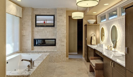
BATHROOM DESIGNSo You Want a Bathroom Television
Whether you want to wash with soap operas or primp with prime time, these guidelines for installing a TV in the bathroom can help
Full Story
BATHROOM WORKBOOK5 Ways With a 5-by-8-Foot Bathroom
Look to these bathroom makeovers to learn about budgets, special features, splurges, bargains and more
Full StorySponsored
Your Custom Bath Designers & Remodelers in Columbus I 10X Best Houzz

Jillius