


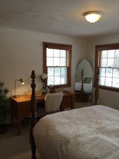
Help!!!!! Benjamine Moore whites!!!!!
lettie63
5 years ago
Featured Answer
Sort by:Oldest
Comments (14)

Suki Mom
5 years agoRelated Discussions
Please help, benjamin moore atrium whtie or white dove??
Comments (2)I have a hard time with the white color ranges. They all seem to be the same and yet so different. I also find it hard to match existing white paint in my home. Have you ever taken a paint swatch home, liked it so you paint the room, and then it is a totally different color than the swatch. I have found a web site that really helped me in choosing the right color. Try this site out and see if it helps you. Here is a link that might be useful: Paint color cheat sheets...See MoreNeed help with paint color: Benjamin Moore White Sand
Comments (0)I am considering painting the walls of my living and dining rooms Benjamin Moore White Sand. For months now I have been in the very slow process of redecorating, changing the effect from a very 90s French Country feel to a more sophisticated, transitional feel. (At least, that is the goal.) Since I have a limited budget, I have been acquiring and getting rid of furnishings through Craigslist. The cheery yellow walls must go! The rug in the living room, and similar ones in adjoining areas, are below. (Other photo below shows rug in a nearby area.) Furniture is oatmeal, taupe, muted green. Overall the feel is fairly muted, with color in the throw pillows and accessories (rust, mustard). See fairly recent LR photo below. (Blue throw on the arm of the chair doesn't stay there, color doesn't work with the rest of the room.) I am considering BM White Sand because it is neutral and allegedly a warm tone, a "greige" with a beige undertone. But, I put a sample swatch on the wall yesterday and it looks a bit cool to me. I had considered BM Edgecomb Grey, but I think I like the lighter effect of White Sand. My real hesitation is the undertone, because the room in question is overall pretty warm. Has anyone used this color? If so, do you consider it warm, cool? Would you recommend it for this room? Thank you!...See MoreBenjamin Moore’s white opulence paint color
Comments (75)It has been a while since the last activity on this thread, and I felt it might be beneficial to give my updated perspective on White Opulence #879 from Benjamin Moore as a paint color for main areas. Having lived with this color for a bit longer now since my last comment, I am beginning to understand how tightly it regulates what other colors can be placed with it for anyone who cares about a homogeneous scheme and also how undeniable the pink tone can be when applied over large surface areas. White Opulence is a tint of red, but it is so light that in ample daylight or under bright white lighting it can "read" as white. In average daylight, it produces a whisper-light pink hue. The effect of this is magnified the larger the area that is covered by it. Using this color on the walls in the main space of a large, open-plan layout with high ceilings, for example, will imbue the area with a light, yet undeniable, pale pink cast in average lighting. It would be a good idea to prepare not only yourself but also any other significant users of the space of the pink tinge before selecting this color because some people truly dislike pink, and it is courteous to work with all regular users of spaces during design planning to try to ensure no one will be overly uncomfortable with the final effect. One thing that hasn't been discussed is how White Opulence can cast a peach tone under warmer lighting colors, especially in the absence of any compensating daylight, meaning nighttime in most home spaces. If peach is a color you want to avoid and you utilize warm lighting -- that is, progressively orange-tinged the further under a 4000K color temperature you go -- then this is a paint color to avoid. The general recommendation is that 4000K is quite cool for home environments, so if you don't know what color temperature your home lighting is, you can probably assume it is warmer than 4000K if you selected average bulbs from your home supplies provider. White Opulence as a red-based white was an attractive choice for my main space because I already had a red accent in a permanent finish and personally prefer the fresh look that a red-white lends versus common alternate choices for main area wall colors like yellow-based beiges or blue-based grays. The problem is that so many home goods available are manufactured in colors that go with beige and gray wall colors rather than the faint red-white of White Opulence that color coordination requires more work than may be expected. Of course, you could decorate using pure white items, but what you really need are options for whisper pink basics which are hard to find. Adding stronger pink or red items is not always the solution either because you cannot feasibly fill the room with accents; you need some basics that blend with the wall tone. Then there is the issue of coordinating White Opulence with colors for auxiliary rooms if you wish to have some variety throughout the home while still maintaining the feel that all of the home's colors work together. Most blues coordinate with White Opulence, but if you have already used red accents in rooms painted with White Opulence, then red is challenging to pair with blue in most instances unless it is a dark, cool blue like navy. Where this has been a dilemma for me has been my hallway colors connecting the main open space to the bedrooms which are all different pastels. The color plan I have will work, and I'll enjoy the variety of colors that I have been able to make flow together, but to be honest, at times I have wondered how much easier the design process might have been if I had picked plain white for the main space. White is the ultimate neutral some might say. At the very least, a basic white for the main area would have given me more freedom in selecting fabrics and other home products for the main space as well as coordinating colors for other rooms. It is all too easy to second-guess decisions that will affect your life long-term. I am using Benjamin Moore's durable Aura formula in a satin finish, so I expect the new White Opulence paint will last decades. Had I selected a plain white or yellow- or blue-based off white, I might be back on this very forum wishing I had gone with White Opulence to add appeal beyond the standard choices. I hope this is helpful to anyone still considering this color....See MoreBenjamin Moore Cloud White close match to Kelly Moore Pickett Fence 46
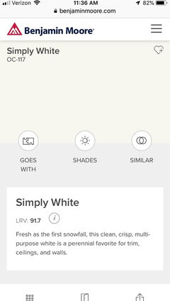
Comments (13)Patricia - I'm not looking to match an existing color in the room, rather want a Benjamin Moore paint COLOR but for Cabinet Coat (Pro. painter said to pick a color from Kelly Moore). Lori - Thank you for the detailed info. We are getting our (South Faced) kitchen cabinet painted. We have Cloud White (OC -130) on the walls, and looking for a white/off white color for the cabinets. Something that is not to stark, too yellow, or too pink! Some of the folks had suggested we match cabinets to the shutter colors (two windows in kitchen), however we prefer not to as it is an older K.M. paint color (Western Acoustic) which has a lot of yellow in it. We did swatches, and the best colors are Simply White /OC-117 and Could White/OC-130, with Simply White being the nicer of the two choices. However, since due to the base of each different paint manufacturer, paint matching can be a hit or miss, the Sales Reps (with over 20 years of experience. at K.M.) said that Pickett Fence was a close match to S.W. Main- Thank you for that info. It's extremely helpful. Will pass on the info. to our paint guy....See More
iamtiramisu
5 years agoSusie .
5 years ago
tartanmeup
5 years agolast modified: 5 years agokyak123
5 years ago PRO
PROJudyG Designs
5 years agolast modified: 5 years ago
Sandra Martin
5 years agodsgts
5 years ago
lettie63
5 years ago
klyons11
5 years agotdemonti
5 years agojg71488
5 years agomissenigma
5 years ago
Related Stories

COLORBenjamin Moore Floats Breath of Fresh Air as Its Color of 2014
Touted as a new neutral, this baby blue can stand on its own or support bolder colors. Here's how to use it
Full Story
MOST POPULARMust-Try Color Combo: White With Warm Off-White
Avoid going too traditional and too clean by introducing an off-white palette that brings a touch of warmth and elegance
Full Story
KITCHEN DESIGNHow to Keep Your White Kitchen White
Sure, white kitchens are beautiful — when they’re sparkling clean. Here’s how to keep them that way
Full Story
COLORDiscover White’s Surprising Power to Energize Every Room
Using white in different ways gives you limitless options for light, color and creativity
Full Story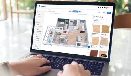
HOUZZ PRODUCT NEWSHouzz Pro 3D Floor Planner Helps You Quickly Create 3D Images
Help clients visualize their remodeled spaces in 3D with Benjamin Moore paint colors and wood, carpet and tile flooring
Full Story0
HOUZZ PRODUCT NEWSHouzz Pro 3D Floor Planner Helps Clients Visualize Designs
The updated tool shows remodeled spaces in 3D with Benjamin Moore paint colors and wood, carpet and tile flooring
Full Story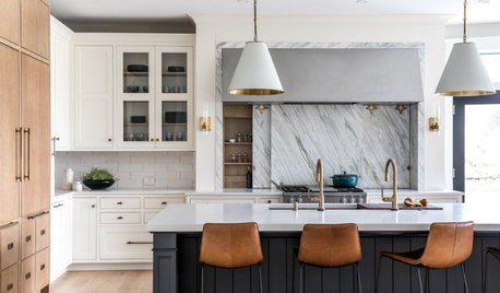
KITCHEN MAKEOVERSKitchen of the Week: White, Wood, Gray and a Backsplash Surprise
A Maine couple with three young daughters ask a designer to help them create a clean space with custom style
Full Story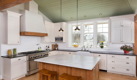
WHITE KITCHENSNew This Week: 3 Gorgeous White-and-Wood Kitchens
See how large and small helpings of wood can warm up white kitchen cabinetry
Full Story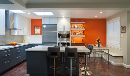
KITCHEN MAKEOVERSOrange, Blue and White Deliver a Retro-Cool Kitchen
Taking down walls helps connect this space to a breakfast nook and frees up room for a large island
Full Story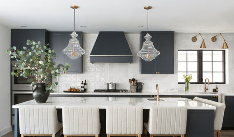
KITCHEN DESIGNKitchen of the Week: Black-and-White Elegance in an Open Plan
A Toronto designer helps a couple update their kitchen with soft black cabinets, marble-look countertops and better flow
Full Story


DLM2000-GW