


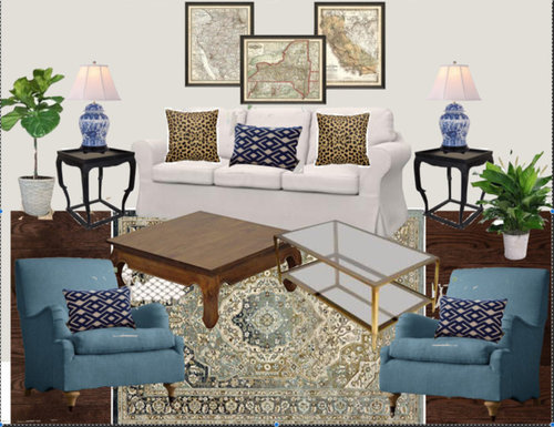
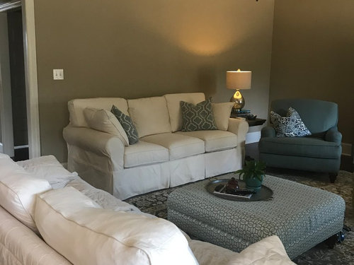
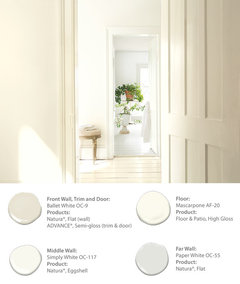
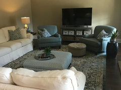
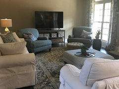
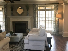
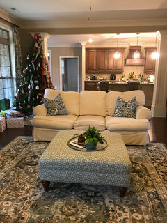
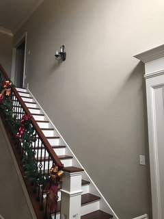
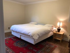
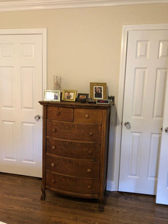
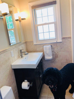
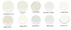
Anyone used or have any input on these Benjamin Moore paint colors?
Serena Butler
5 years ago
Featured Answer
Sort by:Oldest
Comments (37)
Related Discussions
Anyone used Benjamin Moore's "Athena" paint?
Comments (4)I have a beautiful old apartment in Sacramento. It has hardwood floors and some dark accents like a brown brick fireplace. We used Athena in this apartment and it is absolutely gorgeous. It is not pink. The light is from the South and the color is perfect. I grew to absolutely love this color. My younger tenants who are in their 30's love it and they usually buy a grey sofa for the room....See MoreAnyone used Benjamin Moore's "Dove wing" as a wall color?
Comments (4)I used it in a bath with Cloud White trim and really loved it. Very soft and serene. Sorry, no pictures. I don't think it would do well with a really bright white, though. Here's a photo from Houzz (not my house!) Here is a link that might be useful: [Dove Wing walls, white trim[(https://www.houzz.com/photos/dove-wing-benjamin-moore-phbr0lbl-bl~l_50581?fi=48)...See MoreAnyone have Benjamin Moore Clay Beige painted on their walls?
Comments (3)I don't have a picture handy nor did I use Clay Beige in a living room, but I did paint the main bathroom in my summer home Clay Beige. After many attempts at finding just the right color for the room, I selected Clay Beige and I love it. I know this is not the living room information you're looking for, but I thought I would provide you with my two cents--we love the color. It's a neutral with a clay/green cast--goes with many different colors....See MoreDoes anyone have Benjamin Moore Affinity Color Eternity?
Comments (10)Well, I do not have Eternity in my house so I can't provide the kind of answer you're looking for. However, I do have a few thoughts to share that you may - or may not :) - find useful. AF-695 Eternity's hue family is blue. Here is the full hue/value/chroma color notation: 2.31B hue / 7.61 value / 0.23 chroma AF-700 Storm's hue family is yellow. 9.52 Y hue / 6.43 value / 0.12 chroma. Here's a sortable table of color notations for all the colors in the Affinity color collection. I don't do "undertones" especially with regard to paint colors because I think it's an ineffective at best, technically incorrect at worst, way to look at/think about color. For example, one probably would never guess that Storm's hue family is yellow. But it is yellow, on the cusp of green-yellow. And that's exactly why you think it reads as having " no undertones". The majority of whites and grays that people perceive as "true with no undertones" belong to a hue family in the yellow, green-yellow, green range. The Affinity deck is not arranged in any particular, technically precise spectral order. It looks like somebody just eyeballed it. So it's not correct to think that Eternity is "one down" from Storm meaning it's the same color but lighter. In addition to dissuading folks from the misleading pitfalls of "undertones", I also don't recommend cutting formulas. Because as you already know, you don't know what it's going to look like until you do it and once you start down that path, you own the gallons whether you like how they end up or not. The chroma part of the notation tells you how colorful or chromatic the color is. Eternity is already pretty low at 0.23. And its value is 7.61. My guess is lessening the colorant load, if possible at all, is going to shift the color from a "gray" category to a "white" category. Better off to just keep looking for the right light gray vs. monkeying around with cutting formulas, IMO. If you want to understand the Affinity color collection and hue families better, I suggest you reorder the deck according to the color notations. I walk you thru how to do it in this blog post and video: Put the Affinity Color Collection in Hue Family order I get more emails about that post than any other at The Land of Color. Many have told me that simple exercise of reordering the fandeck was life-changing and once they see the Affinity colors in proper hue family order they finally understand my point of view about "undertones"....See More
Serena Butler
5 years agoSerena Butler
5 years ago
dsgts
5 years ago
wmsimons85
5 years agolast modified: 5 years agoSerena Butler
5 years ago
Manon Floreat
5 years agoSerena Butler
5 years agoSerena Butler
5 years agoSerena Butler
5 years agolefty47
5 years agoSerena Butler
5 years agoSerena Butler
5 years ago PRO
PROFlo Mangan
5 years agoSerena Butler
5 years agoSerena Butler
5 years ago- PRO
Flo Mangan
5 years ago marinaboehm
5 years agomarinaboehm
5 years agowmsimons85
5 years ago PRO
PROBeverlyFLADeziner
4 years agolast modified: 4 years ago- PRO
Flo Mangan
4 years ago 
tartanmeup
4 years agolast modified: 4 years ago- PRO
Flo Mangan
4 years ago tartanmeup
4 years ago- PRO
Flo Mangan
4 years ago tartanmeup
4 years ago- PRO
Flo Mangan
4 years ago tartanmeup
4 years ago


Related Stories

COLORBenjamin Moore Floats Breath of Fresh Air as Its Color of 2014
Touted as a new neutral, this baby blue can stand on its own or support bolder colors. Here's how to use it
Full Story
COLOR4 Cool Paint Colors Touted for 2014 — and How to Use Them
Muted but complex, these hues from Farrow & Ball can stand on their own or play supporting roles
Full Story
COLORBest Ways to Use the Neutral Green Color of 2015
Benjamin Moore’s Color of the Year is soft and natural
Full Story
COLORBest Ways to Use Exclusive Plum, Sherwin-Williams’ Color of 2014
Pretty, moody, maybe even a neutral, this toned-down grayish purple can work in any room. Here's how
Full Story
COLORBest Ways to Use the Soft Yellow Color of 2014
You may fall for PPG Pittsburgh Paints’ Turning Oakleaf if you like your hues warm, mellow and cheery
Full Story
COLORBest Ways to Use This Coral Color of the Year
Sherwin-Williams goes for a preppy pop of color in its paint pick for 2015
Full Story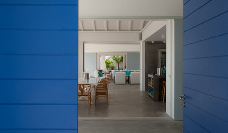
COLORBest Uses for the Saturated Blue Color of 2015
Kelly-Moore’s selection is a classic shade of blue worthy of chunky accents around the home
Full Story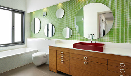
COLORBathed in Color: When to Use Green in the Bath
Splash some spring-conjuring green paint, tiles or accessories around your bathroom for natural appeal
Full Story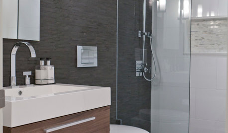
COLORBathed in Color: When to Use Gray in the Bath
Go for elegance and sophistication without going overboard on coolness, using these gray bathroom paint picks and inspirational photos
Full Story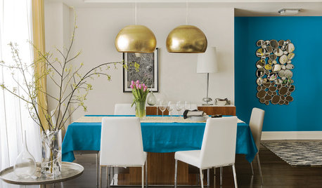
COLORBest Uses for the Boho Blue Color of 2015
PPG Pittsburgh Paints’ Color of the Year is a bold bohemian blue best used in small doses
Full Story

Flo Mangan