


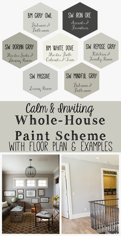
The colour Cream - need design suggestions
sezzkerr
5 years ago
Featured Answer
Sort by:Oldest
Comments (13)
 PRO
PROBeth H. :
5 years agolast modified: 5 years ago
Irene Morresey
5 years agoRelated Discussions
Design Suggestions Needed
Comments (1)YOu do realize this is a VERY tall order here :) Okay, here's a stab or two. You could mix some blue into your pink and red gardens, and perhaps some white blooms and/or some silver foliage into all three. This would give some repetition to the three borders and maybe bring some unity. (I assume that the red border is blue/red, not orange/red. If it's warm red, that's going to be extremely difficult to work with pinks (unless, of course, the pinks are peachy pinks and not lavender pinks. Clear as mud, right?) Since your angel is in the white garden, you could try some powis castle artemisia at her feet. It has lacy foliage, somewhat like ferns, but would tie in with your white border. As to the white border, you could mix in some small white roses: Little White Pet, or Cassie, are two that I have and really love. They only get about 2 1/2 to 3 feet tall and wide. Pet has blue green foliage. Cassie has yellow green foliage. They are both very heat, disease, and pest resistant and bloom all summer. No fragrance, though. You could also add some ornamental grasses to this border: stipa would be very lovely, and its blooms are silvery white. Hope these will help get your creative juices flowing....See MoreWall color suggestions to go w/black/cream toile?
Comments (11)My son has the same wallpaper in his dining room. The rest of the front of the house, except the kitchen, is painted a very pale creamish yellow. Standing a few feet away from the room, it looks like the paint matches the cream background of the wallpaper. It's absolutely stunning to look at!...See MoreNeed your designing skills: help suggest colors/more? Many pix
Comments (13)Amanda, I think the heart pine will give you enough contrast with your other woods that it would be fine for the floor, if you want a wood floor, and it'll certainly go with the Colonial house. If you want tile, which will be colder, though very easy to care for, consider 1'x2' French pavers. They're a light terra cotta, and very traditional in kitchens. The antique ones are very expensive, but there are new ones of the type being made now. For authentic Colonial, I think a gray slate kind of look would be more on point, but it would make your kitchen look dreary, whereas the light clay look of the French pavers would be cheery and should go with your big brick hulk. :) Even though you've spec'd a lot of wood, with the painted section, and the windows, and the brick fire surround, and the flow into the dining room, I think you have enough relief that you can go a bit wild in the kitchen with the woods and get away with it. Especially with all the different kinds and colors you've chosen, which provide you with contrast and interest. You have the whole warm side of the color wheel (i.e., analogous colors) -- to throw some logic at you. :) Floor: yellow-brown (I'd go natural on them. They'll age to a really nice honey color.) Cabinets: red-brown Island top: dark red-brown Beams: charcoal-brown Hood: orange-brown For hue and brightness contrast you have the silver-gray stainless counters and the white cabinets. You can do window treatments whose main job is to bling up your black hole windows at night. There are slat blinds that have art painted on them, for instance. You could do a lacy shade. Or something baroque and flocked. Shades are pretty inexpensive, and can be changed out when you get tired of them. And they don't get into the soup, and hide pretty well when they're up. You can even do clear vinyl and let your kids paint on them for each season, then wash them off and start over. One of the great things about all of your colorblocking is that you don't really need a lot of bling to make the kitchen lively. Add in the detritus of family life and you're there. Plus, you also have hardware (i.e., jewelry) to choose. You can go simple and demure, in a silvery color to go with the stainless counters, but you could do art glass or wild granite knobs, colored resin bar pulls, Anne At Home theme hardware, or whatever suits your fancy. Some hardware looks dumb in some settings, but I think your kitchen can take a lot of interest without feeling overdone. I mean, how much bling do you want?...See Moreneed suggestions on paint color and landscape designs.
Comments (4)No. The windows do not have to stay brown. Everything needs a good painting. What were you thinking?...See More PRO
PROJAN MOYER
5 years agolast modified: 5 years ago PRO
PRO
mimimomy
5 years agomimimomy
5 years agoSuki Mom
5 years ago PRO
PROCarolina Kitchen & Bath
5 years ago
cawaps
5 years ago
Hansen
5 years agocawaps
5 years agolulu bella
5 years ago


Related Stories
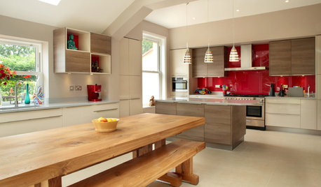
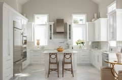
KITCHEN DESIGN7 Colors That Enhance Cream Kitchen Cabinets
If you’re set on cream for your cook space, consider combining it with these hues for a pleasing palette
Full Story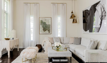
TRANSITIONAL HOMESHouzz Tour: Designer’s Home Is Stylish, Serene and All in Cream
A newly built house in Massachusetts gives an interior designer a blank canvas to create the home of her dreams
Full Story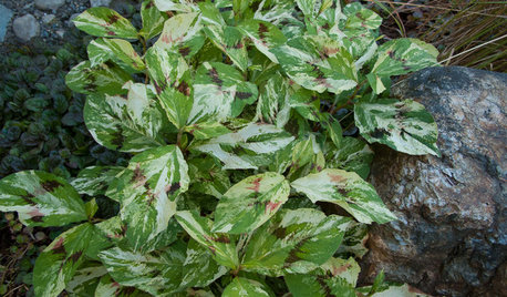
GARDENING GUIDESGreat Design Plant: Painter’s Palette Knotweed Adds Color in Shade
Use bold and colorful Persicaria virginiana for an artistic touch in a darker garden
Full Story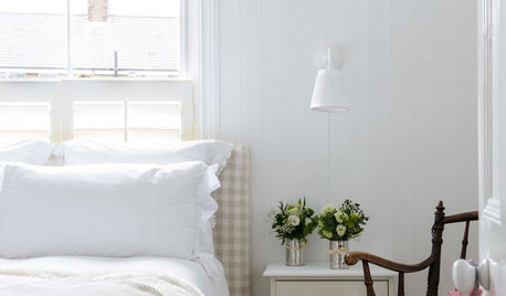
COLORWhite vs. Cream: Which Neutral Paint Color Is Right for You?
Do bright white rooms give you the chills? Are off-whites too drab and boring? Let’s see which is a better fit for you
Full Story
COLORSummer Color Combos: 8 Refreshing Ice Cream Palettes
July 19 is National Ice Cream Day, so scoop up these delectable combinations for sumptuous interiors
Full Story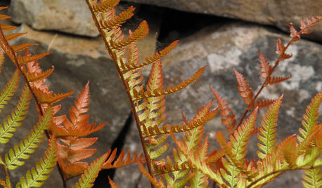
GARDENING GUIDESGreat Design Plant: Autumn Fern Adds Color All Year
Use this evergreen, easy-care fern for soft texture and coppery tints in container gardens and the landscape at large
Full Story
COLORS OF THE YEARDesigners Around the World React to Pantone’s 2019 Color Choice
International design pros offer tips on how to use Living Coral, Pantone’s Color of the Year 2019, in home decor
Full Story
COLORBeige Is Back: Designers Share 10 Beautiful Warm Paint Colors
Enthusiasm for cool grays has waned, and warm neutrals have returned. See which beige and greige tones designers prefer
Full Story
TASTEMAKERSWorld of Design: Where Color Trends Begin
Colors go in and out of vogue. Here’s how they make their way into our home decor
Full Story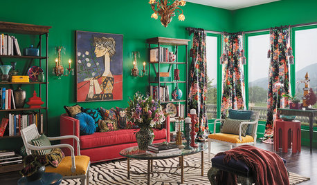
MOST POPULARDesign Trend: Color Maximalism May Be the Next Big Thing
Going all out with bold colors and patterns will be hot in 2019, design experts say. Here’s how to punch up your palette
Full Story


Patricia Colwell Consulting