


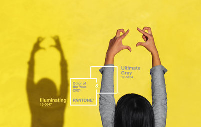
Designers Around the World React to Pantone’s 2019 Color Choice
International design pros offer tips on how to use Living Coral, Pantone’s Color of the Year 2019, in home decor

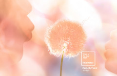
Pantone has announced its Color of the Year for 2019, and it’s Living Coral — a color Pantone describes as “vibrant yet mellow.” The company suggests that coral is a nurturing shade that bridges the natural and digital worlds and symbolizes our “innate need for optimism and joyful pursuits.”
Houzz pros from around the world offer advice on how to use this coral shade in your decor — and, just as important, how not to use it. And while opinions vary as to where coral belongs, one thing is clear: This versatile hue is all about what you make of it.
Also: Read more about how to use Living Coral in your home
“The color isn’t for everyone, even though we’re definitely seeing it make a comeback,” Italian architect Tommaso Giunchi says. “From my point of view, the best and trendiest colors right now are green and blue with some gray in them. Coral is hard to match with gray shades, so it’s not so easy to use it lightly — it has to be a statement color.”
French interior designer Anne Azoulay says, “Coral is a departure from the current decor schemes that favor deep greens and blues, or moss and lichen greens, and desaturated colors containing touches of black. It’s a beautiful color for people ready to dare originality. For all those who like to go with trendy colors, coral is interesting on small accessories, which are easy to swap out.”
Find an interior designer near you on Houzz
For Russian designer Irina Kovylina, context matters. “Historically, we in Russia have always loved this shade of red in coral beads. And this imaginative series of associations — with coral beads, Pavlovo Posad shawls, scarlet flowers [staples of Russian fairytales] — fit well in a country house or even a log cabin,” Kovylina says.
She doesn’t think the color fits as well in modern Russian urban interiors. “It’s not about how ready customers or designers are for coral. It’s all about how appropriate it is.”
French interior designer Alexandra Gorla sees the color playing a distinctive role in interiors. “For me, the advantage [of coral] is to bring intimacy to a place. As people are currently looking for a more cocooning interior, this quality can help promote it.”
Colors and Textures to Pair With Coral
The starting point for using coral in an interior is finding good pairings, and natural influences are a good place to start. Interior designer and Houzz Russia contributor Irina Krasheninnikova says, “I always learn from nature — it is a brilliant colorist and the best teacher.” She cites such combinations as coral and gray-brown (rowan berries on bare branches), coral and green (roses and foliage), and coral and honey (barrels of ripe apples).
Japan’s Mayumi Amimura says pairing coral with colors and textures from nature, such as green and wood, calms down the energetic shade and creates a relaxing atmosphere.
“I would mix coral with aquamarine or a pale green close to the lime tree,” France’s Gorla says. She also suggests warming it up with brown or ochre or harmonizing it with rose. “It could also work with purple. And if you want to combine it with blue or green, go with blue steel — which has gray mixed in — and khaki,” she says.
Russia’s Kovylina suggests that coral can be combined with aquamarine or turquoise because of the associations with the ocean and because they are complementary colors.
Gorla doesn’t favor that combination. “I have been asked several times to combine coral and turquoise in children’s rooms, but we’ve seen it so many times and I don’t find it contemporary,” she says.
Simpfendorfer says coral could work with olive. The designers at Hortlund & Co. like to pair it with brass, brown, black, leather, wicker and wood.
Italian interior designer Lia Lovisolo says to avoid combining coral with yellows. “Coral and turquoise is always a beautiful pairing, whether it is fashionable or not. It’s perfect with light woods.” She also likes it combined with greens — sage, emerald, water — as well as beige and powder pink.
Amimura says to be careful pairing coral with warm colors like red and orange, which would make it feel too warm. “Even if you love warm colors, using too much of it will strengthen the effect and you might not be able to relax.”
“Coral is an easy, natural fit with fresh white, soft grays and a small amount of black, along with lighter [woods], but it is particularly interesting when paired with pale blues and dirty purples too,” Simpfendorfer says.
“I can imagine this color with a light neutral gray, and most likely as a geometric pattern — the geometry reduces its ‘sweetness.’ It can be wallpaper or fabric,” Russian designer Daria Kharitonova says.
“I can imagine this color with a light neutral gray, and most likely as a geometric pattern — the geometry reduces its ‘sweetness.’ It can be wallpaper or fabric,” Russian designer Daria Kharitonova says.
“I would use it in a warm harmony, with fairly light colors like off-white, gray, greige or taupe,” France’s Azoulay says. “Or, in a more contemporary way, with very dark colors that would reinforce the whole composition’s graphic design: an almost black gray, a dark blue or a green, even black.”
Gorla prefers to stay away from pairing coral with muted tones. “I would not mix it with dull shades or colors, like pastels, that detract from it.”
Gorla prefers to stay away from pairing coral with muted tones. “I would not mix it with dull shades or colors, like pastels, that detract from it.”
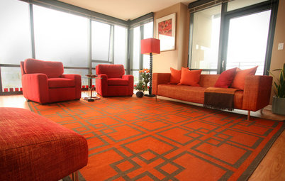
Use Coral as an Accent or as a Feature
Simpfendorfer says that using coral unapologetically will make it the focus of a room. Think a pair of linen-covered sofas; painted wood chairs around a dining table; a long, low TV console; a wall of custom cabinetry. “Don’t be shy! I’d paint a [wood] floor in coral too. It’s the kind of color that could be fantastic as a front door — painted both sides, of course.”
Some designers advocate focusing on accents first. “It can work well everywhere,” Lovisolo says. “It all depends on how much is used. I do not have this color in my house, but if I had to introduce it I would use it in velvet to cover a sofa or an armchair.”
Colorist and Houzz Japan contributor Akitsu Katsuura says that although coral looks soft compared with red, it’s important to keep in mind that it’s still a fairly strong color. “For coral, using the right amount is key.”
“Coral is a very strong color,” Giunchi says. “I haven’t been using it a lot, as my feeling is that people could get bored of it pretty quickly. I like to use strong colors like this for small decorative objects or pillow covers, as they are easier to change up after a while. I’ve used it once in a bathroom but only to match the existing tiles, as the homeowner didn’t want to change them.”
Azoulay agrees. “As people are often afraid of getting tired of a color, they may prefer to use coral on small accessories that are easy to change up, like textiles — cushions, bed linen, carpets, even curtains — and also lamps.”
For Kharitonova, shade comes into play. She says that Living Coral “is quite a dense shade, a color I wouldn’t use as a surface, but it would be cozy as an accent. In my view, if you were to give a light gray headboard a [coral] border, add a couple pillows, then the effect will be fresh and not clichéd. But if you take a less dense coral tone that’s lighter and more transparent, it can be used in large quantities.”
Which Kinds of Accents Are Best?
There are lots of options for adding coral touches to a room. “An easy way to integrate and play with a bright color in a room is to start small and simple, such as through accent pillows and throws,” says Jennifer Ott, architectural color specialist and Houzz U.S. contributor. “These pieces offer a dash of color that isn’t overwhelming, and they aren’t a big commitment since they are affordable enough to swap out down the road if you get tired of the color.”
Shop for coral pillows and throws on Houzz
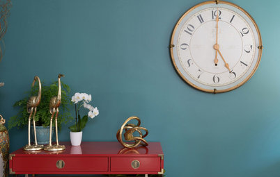
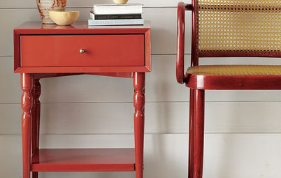
“Textiles — carpets, cushions, armchairs and so on — lend themselves well to this color,” Gorla says. “And instinctively, I would also combine it with ceramics, whether painted or white, because coral and ceramics remind me of the south. Finally, coral combines well with transparent glass.”
Simpfendorfer also sees the color as perfect for textiles. “Coral is easy to use in dinnerware and table accessories, and I’d also consider using it in bed linens — in actual real, crumpled, natural linen — nothing shiny or too smooth.”
“Taking in small amounts of coral as accents in the room with cushions and throws adds the right amount of warmth to a room,” says Amimura, a designer with expertise in the healing effects of color.
“Try using coral as an accent tone to enhance duller shades,” Lovisolo says. “You can use it with accessories, by contrast, as an accent color that binds together different elements of the composition.”
Ott suggests using it to underscore other features. “Because Living Coral is such a striking color, it can be called into service to bring attention to interesting architectural elements in your home,” she says. “Keep in mind that if you attempt to make everything in a room stand out, then nothing does. So use the vivid hue thoughtfully, on only those elements worth the attention.”
Find a painter in the Houzz pro directory
“It can also be a way of strongly delimiting a space,” Gorla says.
Azoulay sees coral working well as the center of attention. “I could also use it in the middle of the room, on a trellis or a bookcase, for example, which would be the strong element of a space. And of course with small touches, in accessories — cushions on a gray sofa, blue or dark green, some touches in a carpet.”
Azoulay sees coral working well as the center of attention. “I could also use it in the middle of the room, on a trellis or a bookcase, for example, which would be the strong element of a space. And of course with small touches, in accessories — cushions on a gray sofa, blue or dark green, some touches in a carpet.”
Ott recommends an expanded version of the same approach. “One or two walls painted in a saturated coral hue is a great budget-friendly way to pack a punch with this color,” she says. “Just think about keeping the other wall or walls light and neutral, especially if you are using this color as an accent in a bedroom.”
Alla Shumeiko has used this color on striking curtains in an otherwise gray-toned room. “They were very thin linen curtains in coral. Sunlight passes through them and paints the gray wall in a cozy shade. The idea of using this as a secondary shade was based on the decor of the bedroom en suite — we have a coral ceiling there.”
Where in the Home Does Coral Look Best?
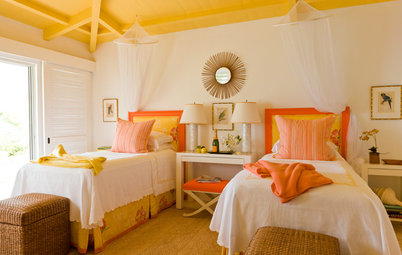
Bedroom. Shumeiko isn’t the only one who sees coral as a great fit for a bedroom. “I can imagine coral on a bedroom wall, where the window frames and the base of the wall are underlined by an anthracite — almost black — and with a beautiful black-and-white photo in a frame,” Azoulay says.
“Indeed, it shares with red the quality of making walls appear closer,” Gorla says, “and it makes it possible to create a more intimate space in a long room, by visually resizing spaces.”
Azoulay suggests using coral on bed linens or curtains in a bedroom with light, warm colors such as off-white, greige or taupe.
Wall coverings expert Yana Svetlova recommends using the color as an alternative to pink in a teenager’s room, as pictured here. Coral is the accent wall, with the other walls a calm beige.
Krasheninnikova recommends avoiding the shade in spaces for younger children: “Children are often very emotional, and such an abundance of active color will be too exciting.”
Krasheninnikova recommends avoiding the shade in spaces for younger children: “Children are often very emotional, and such an abundance of active color will be too exciting.”
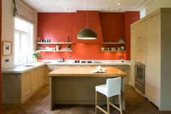
Kitchen. When it comes to wall color, Simpfendorfer says coral is a contender in the kitchen. “Its warmth and golden undertone make it versatile, so it works well with food, but it’s also a relaxing color despite its strength.”
Katsuura agrees. “Coral’s reddish tone can help boost the chef’s motivation in the kitchen. However, since the kitchen is rather a small space, it is better to use just a small amount of it. Otherwise it will be too much.”
Katsuura agrees. “Coral’s reddish tone can help boost the chef’s motivation in the kitchen. However, since the kitchen is rather a small space, it is better to use just a small amount of it. Otherwise it will be too much.”
Katsuura suggests a clever trick. “How about using coral as a color inside the cupboard? The warm color will promote appetite, the dishes in the cupboard will look like a shop display and create a special feeling. Inside the cupboard might not be a prominent place in the house, but it’s a good place to start if you want to start using coral.”
But not everyone agrees. “I think it is better suited to a small room, such as an office or a bedroom, rather than a living room or kitchen,” Azoulay says.
But not everyone agrees. “I think it is better suited to a small room, such as an office or a bedroom, rather than a living room or kitchen,” Azoulay says.
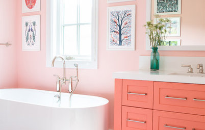
Bathroom. Amimura says coral can add a touch of happiness and warmth to rooms. “Adding coral to a ‘colder’ part of the home, such as powder rooms and dressing rooms, would help add warmth. However, using coral all over the room might be too much.”
Expert Ursula Kohlmann, painter and owner of Verwandlung Remmers Malerwerkstätten, says
that “coral is a great color for a bathroom. It puts you in a good mood in the morning. In living rooms, it’s a good idea for the less brave to paint one or two accent walls in coral — for example, the wall behind the couch or the dining table — and the rest of the room in a gray-beige color. In dark rooms, coral is perfect for creating a bright, warm and cozy overall effect.”
Amimura says, “I would recommend using coral in bathrooms. Coral can create a relaxing bathroom and help us revive our energy.”
The pros at Hortlund & Co. say one of the best rooms for coral is a dreamy bathroom, combined with white Carrara marble and artwork on the walls.
Living and dining rooms. Gorla says coral works well in living areas. “We can use it on the wall of a living room or a dining room, to impress those who enter the room with a wow effect. Or it could be used to showcase furniture, [maybe] a unique piece, like a beautiful coral sofa.”
Amimura suggests using coral in cushions or plaid on a dark sofa or incorporating touches in a carpet.
Amimura suggests using coral in cushions or plaid on a dark sofa or incorporating touches in a carpet.
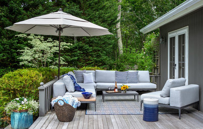
Outdoors. In Mediterranean countries, coral is a natural for outdoor spaces, such as on a balcony or poolside, Azoulay notes.
“I imagine it outside, on the walls of a terrace to evoke Spain and the warm countries,” Gorla says.
“I imagine it outside, on the walls of a terrace to evoke Spain and the warm countries,” Gorla says.
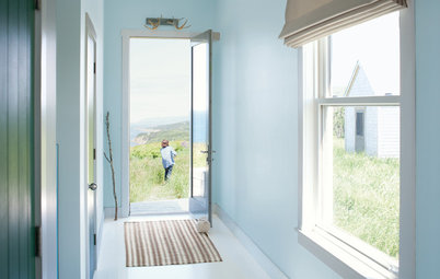
Anywhere — as long as there’s a wow effect. “One of my favorite places to use a daring hue is on the front door,” Ott says. “To me, this is the best use of the lively hue, to welcome visitors to your home.”
Lovisolo likes it for doors and windows, for lighting effects, or for facades or portions of an exterior.
Front and Center Color: When to Paint Your Door Orange
Lovisolo likes it for doors and windows, for lighting effects, or for facades or portions of an exterior.
Front and Center Color: When to Paint Your Door Orange
Tips and Tricks for Using Coral at Home
As with most colors, a few tips and tricks can help coral look its best.
“The trick with using coral well is in the choice of gloss level,” Simpfendorfer says. “It is most desirable when kept in a matte or low-gloss finish. When in high gloss, it can take on a quite synthetic appearance — which could be fun, but it’s not as sophisticated.”
“By choosing a matte paint that reflects the light very softly, you can create a more gentle and calm space with a coral color,” Katsuura says.
More on Houzz
Are You a Fan of Pantone’s Color of the Year 2019?
Browse and save home design ideas
Find a home pro to help with your project
Shop for home products


Sponsored
“I see coral as being a related color to emerge from the massive resurgence of interest in red bricks, which is something that we’ve been tracking,” she says. “It’s like a washed, worn, classic brick color. Really livable and familiar.”
Pros Mikaela Törnegren and Linnea Finoli of Swedish home styling firm Hortlund & Co. see the shade as experiencing something of a comeback. “Coral was a super hot color in the 1980s, and now it’s back on everything from walls to accessories,” the firm says. “It’s a flexible color that can feel edgy, modern, elegant and peaceful at the same time, depending on how you use it.”
10 Reasons to Love Coral