


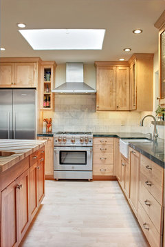
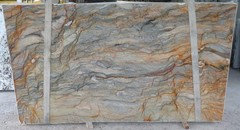
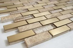
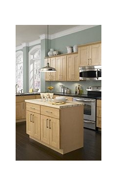
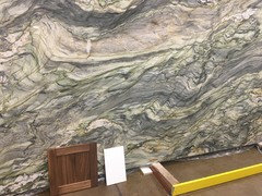
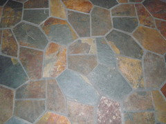
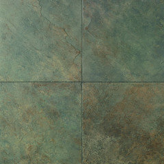
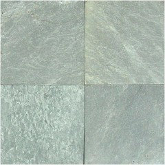
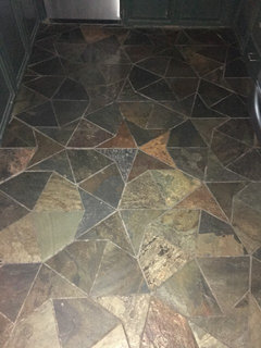
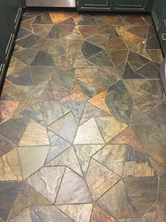
Stuck on color... or lack of it.
5 years ago
last modified: 5 years ago

Featured Answer
Sort by:Oldest
Comments (29)
 5 years ago
Related Discussions
Lack of Color
Comments (6)Scabiosa, calylophus, purple skullcap, perennial geranium aka Cranesbill, Texas Mock Orange, four nerve daisy, marcus salvia, salvia greggii, nearly wild rose have been blooming for 1-3 weeks and should continue thru at least part of the summer, off and on. Phlox pilosa, California poppies, larkspur and Stella daylilies are about to pop now. For later I have flame acanthus, pavonia, russian sage, creme broulee coreopsis, black and blue salvia, rain liles, and oxblood lilies. I have something blooming from March till frost and later with this mixture....See MoreStuck with a color scheme
Comments (2)I think we are going to need pictures. Also why can't you change any of it if it bothers you? What is this? a wall installation put up for installation purposes. Some inspiration pics I am getting a Ralph Lauren Vibe......See MoreHelp! Love my kitchen but it's stuck in the 80"s. Running out of time!
Comments (23)Thanks for all the thoughts. The electrician and I decided on LED cans around the perimeter and finish the light box with more cans or uplighting strip. (The ceiling can't be raised because of duct work). I don't need more storage or counter space so starting over doesn't appeal to me. I really have loved the kitchen so it works for me, but agree that the next person could start from scratch. For this old lady, I love the forgiving tile as the house sits on a lake and the brown granite that enhanced the oak-trimmed mountain rustic home when gray and black was all that was available. The cabinets were high end CRYSTAL cabinets with real wood, so I'm okay with keeping them - probably better quality than many newer. It's the laminate doors and drawers with oak trim and oak wooden handles that I'd like to replace (not repaint). I have a local cabinet maker coming to bid a simple, flat panel door and drawer in light wood or taupe/gray paint. Appliance garages are history! Maybe glass doors or wood shelving instead of the uppers above the garages? Never gave much thought about the bar sink, but agree the mirror and faucet gives it a vanity feel. The coffee station that is housed in the appliance garage, could be relocated there. And I'll be shopping for a paint color for a softer, modern look. Any other thoughts?...See Moreneed color help - stuck on hold
Comments (7)After I slept on it, I decided to finish it without the red. I will take out the bright red blocks (only two) and either finish it with a piano key border or, if I don't have enough fabric, then something close to one of the colors in the quilt already. I don't think I will be happy with the bright red as it won't really look like the one in the photo. This will not be the same, but will be pretty. It satisfies my want to make a card trick quilt. Who knows, I may try again on this one. I'll find the shirting first, before I start collecting fat quarters. Someone on the other site mentioned the scale of the prints - that the ones in the photo were larger than the ones I chose (my cousin had so many, she probably had larger scale ones, I just didn't realize the impact it would have on the quilt). I'll make sure than the red blends well with the other reds in the quilt, too. Thanks for your help these last few years. I learn more with every quilt. bkay...See More PRO5 years ago
- 5 years ago
 PRO5 years ago
- 5 years ago
 5 years ago
 5 years ago
 5 years ago
- 5 years agolast modified: 5 years ago
 PRO5 years agolast modified: 5 years ago
 5 years ago
- 5 years ago
- 5 years ago
- PRO5 years agolast modified: 5 years ago
 PRO5 years ago
 5 years ago
- PRO5 years agolast modified: 5 years ago
- 5 years ago
- PRO5 years agolast modified: 5 years ago
- PRO5 years agolast modified: 5 years ago
- 5 years ago
- PRO5 years agolast modified: 5 years ago
- PRO5 years agolast modified: 5 years ago
- 5 years ago
- PRO5 years agolast modified: 5 years ago
- 5 years ago
- PRO5 years agolast modified: 5 years ago
- PRO5 years agolast modified: 5 years ago


Related Stories
COLORSpeed-Dial Color Selection to Get the Best Result
You’ve belabored your color decisions and are still stuck. Here is how to evaluate your space and make choices that are right for you
Full Story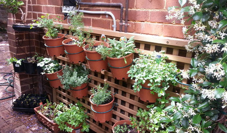
FARM YOUR YARD14 Crazy Places to Grow Edibles
Some Houzzers may lack ground for gardening, but they’re never short on imagination
Full Story
DECORATING GUIDESDecorate With Intention: Great Vision, Small Budget
Can you just picture how you want your home to look but feel stymied by lack of funds? These suggestions can help
Full Story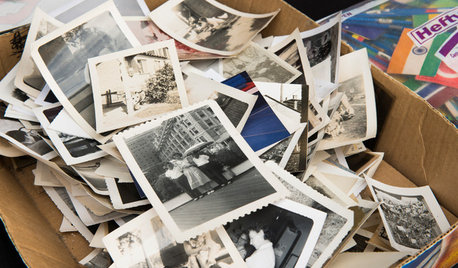
ORGANIZINGYou Can Do It: 6 Steps to Organizing Your Loose Photos
Are your old pictures stuck in dusty boxes? Here’s how to get them in order — and ready to tell your family’s story
Full Story
DECORATING GUIDESHow to Mix Colors and Make It Work
Don’t want to confine yourself to neutrals but lack the confidence to embrace colors? Check out this pro advice
Full Story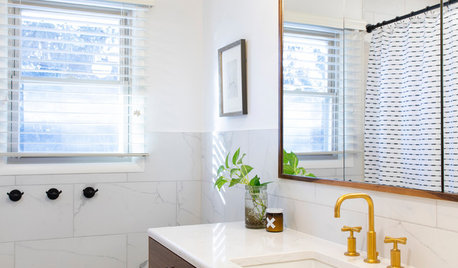
SMALL SPACES5 Solutions to Small-Bathroom Problems
Whether your room lacks a separate shower, adequate storage or a sense of spaciousness, there are remedies at hand
Full Story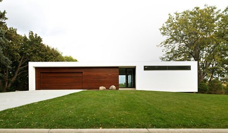
ARCHITECTUREWhy Authenticity in Architecture Matters
Is your home's exterior making a promise it doesn't keep? Learn why integrity and consistency are essential for architectural success
Full Story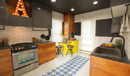
BEFORE AND AFTERSMixing Vintage and Modern in an Urban Family Kitchen
See an ad hoc kitchen become full of character, hipness and — above all — function
Full Story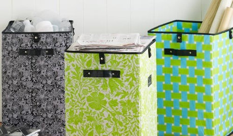
PRODUCT PICKSGuest Picks: Trash Talkin’
With wastebaskets as attractive as these, you may want to let them out of the corner
Full Story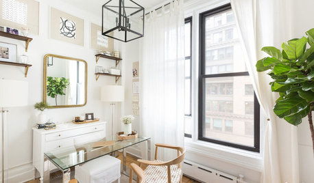
REMODELING GUIDESMarch Motivation: Advice for Rebooting Your Home Projects
Here’s why progress may be lagging on your remodel, refresh or repair projects — and how to get them going again
Full Story


JAN MOYER