


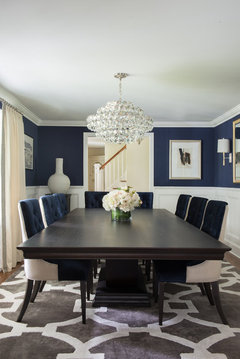
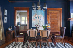
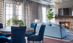
Navy blue paint throughout interior house...How much is too much?
Johnny Moore
5 years ago


Featured Answer
Sort by:Oldest
Comments (13)

littlebug zone 5 Missouri
5 years agoRelated Discussions
How much is too much toile?
Comments (13)What I've heard is that the traditional way to use toile is to have it be the only print in the room but use it heavily. That's why I initially did not like toile because whenever I saw it in photographs the walls where wallpapered in the same toile as the draperies and pillows and bedding were made of. Now I've gotten used to that look and I can appreciate it more but I think it's an acquired taste. Now I love the look of toile wallpaper enveloping a room with matching draperies. Where I think it goes to far is when the bedding is made of the toile. Now the eye has no place to rest so I think it looks better to have a white matelasse coverlet cover the bed (another large surface area) and have just a couple toile pillow shams to tie in with the walls and drapes. There can be a coverlet in the toile color folded at the foot of the bed. But the chair fabric and the comforter should be a solid white IMO. I'll never forget a room I saw once done up by Ethan Allen. The walls were papered in black and white toile with matching draperies (so the wallpapering company has to hook up with the fabric company and make the same print). There were two Bergere chairs with ottomans in a seating area of the bedroom, both had dark wood with solid white upholstery. Between the two chairs was a round table draped to the floor with a solid black matelasse tablecloth and a white square topper. The wood on the bed frame was dark and they had a white coverlet on the bed with toile pillows and another coverlet folded at the foot of the bed, I think it was solid black. So the room was a medly of black and white. It was very jarring and the contrast of black against bright white was a bit much for me. It was memorable that's for sure. I don't know if many people have the guts to put toile wallpaper on their walls (!) but even if you didn't I think I'd still chose to either have the pillows shams in the toile or the comforter in the toile, but not both together. There can also be a padded headboard in the toile. The idea behind it is that you can get away with a room saturated in toile because it's the only print in the room. It's hard to tell the drapes from the walls because it all blends in. I can't remember if they included a black and white checked fabric, I don't think they did because of the walls. That's another option I've seen used many times, have a second print in a non-floral, non-toile design to coordinate with the toile...usually that's a check in the same two colors as the toile. I have the same question as stargirl, when is there too much toile in a HOUSE...how many different rooms can you get away using a different toile?...See MoreAre the rug and drapery too much?
Comments (82)Perhaps the white is too stark because you're not used to it? I would copy the color of your kitchen cabinets...This, maybe? This is stark white, but just showing for the visual... Or, try my original suggestion of a plain indigo blue (these are annoying tab tops, but it's just for the visual...)...See MoreGalley Kitchen - two tone cabinets too much?
Comments (35)Green and blue are my favorite colors, so I am biased, but both are very calming and good choices for cabinets. I don't think they will make you feel claustrophobic in your kitchen. I have been in small galley kitchens with all dark wood uppers and lowers and they did not feel claustrophobic because they had a window , and yours has three! Whether you choose blue or green is totally your choice. Why not order some samples of the colors you are considering and paint up several pieces of poster board in the various colors you are considering and get some painters tape and double the tape around on itself and stick the poster board to the cabinets for a few hours while you are home and see what you prefer at different times of the day. Blue, green? PPG Night Watch? PPG Royal Hunter Green? PPG Daring Indigo? PPG Dragonfly? The PPG colors with your choice of hardware and white walls and counter are reminiscent of a crisp military uniform. For a backsplash you can try something a little different, a 4" x 4" square subway tile, it is a fresh look, and you can do it as a running bond or a straight set. And if you want something different over the stove you can do them on a diagonal. ....See MoreAre three "colors" too much?
Comments (12)I’ll be the naysayer! I think TWO colors are generally one two many, and everyone putting in these two tones kitchens is going to dreadfully regret them in 3 ish years. They’re overdone, and rarely done well. The best ones on houzz are lovely, but the lay person photos typically look like two (or three!) separate kitchens mashed together. If you aren’t hiring a true interior designer plus architect plus kitchen designer, and spending at least $100k, then I wouldn’t do this!! And honestly, I’m typically someone who doesn’t think you need any of those experts to design a kitchen..... Perhaps more importantly, this is a trend that will date your kitchen and be exceptionally expensive to change. Much more than if you have a single color or wood tone, or door style. In five to ten years, you can easily change your lights, hardware, and as time goes by your backsplash, appliances, and even your countertops. But as people on this site advise all the time, if you plan to repaint cabinets, it’s almost as expensive as new cabinets - so most don’t bother unless they’re doing a full Reno. So if you tire of these cabinets in five years — as I predict most people will - you are stuck with them! Sorry, rant over!!!!...See More
latifolia
5 years agonjmomma
5 years agonjmomma
5 years agonjmomma
5 years ago
Johnny Moore
5 years ago PRO
PROFairway Style Living
5 years ago
Geneviève
5 years ago
lynartist
5 years agolynartist
5 years ago PRO
PRONandina Home & Design
5 years ago PRO
PROOak & Broad
5 years ago


Related Stories
HOUZZ QUIZHouzz Quiz: What Color Should You Paint Your House?
Is white right? Maybe dark blue-gray? Take our quiz to find out which color is best for you and your home
Full Story
MODERN ARCHITECTUREColor Energizes Modern House Interiors
See how selective splashes of color can emphasize architecture and activity areas throughout a modern-style home
Full Story
CONTEMPORARY HOMESHouzz Tour: ‘Interior Surrealism’ in a San Francisco Row House
A designer works with a daring homeowner willing to make playful, bold decor choices that allude to surrealist paintings
Full Story
LIVING ROOMSDesign Dilemma: Share Ideas for a Navy Blue Room
Help a Houzz Reader Work With a Bold Choice for the Living Room Walls
Full Story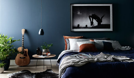
COLORJoin the Navy: Deep, Dark Blue Is a Team Player
An elegant mate to wood and warm metals, navy works wonders inside and out. See how to get onboard with its popularity
Full Story
COLORDesigner Picks: 12 Soothing Light Blue Paint Colors
These sky-blue paint colors evoke a sense of calm and cheerfulness. Designers tell us why they love them
Full Story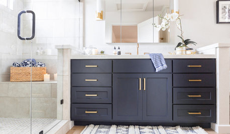
BATHROOM MAKEOVERSBathroom of the Week: Breezy and Open With a Navy Blue Vanity
A designer updates a California couple’s master bathroom with fresh style and a new layout that brings in more sunshine
Full Story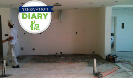
REMODELING GUIDESRanch House Remodel: Installing the Interior Finishes
Renovation Diary, Part 5: Check in on a Florida remodel as the bamboo flooring is laid, the bathroom tiles are set and more
Full Story
BEFORE AND AFTERSChic New Interiors Take a Ranch House Beyond Typical
Sophistication is the name of the game for this California home — and the designer played it skillfully with finishes and furnishings
Full Story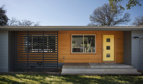
EXTERIOR COLORChoosing Color: 1 House, 5 Exterior Paint Palettes
See how color variations change the look of this midcentury ranch-style home
Full StorySponsored
Leading Interior Designers in Columbus, Ohio & Ponte Vedra, Florida


apple_pie_order