


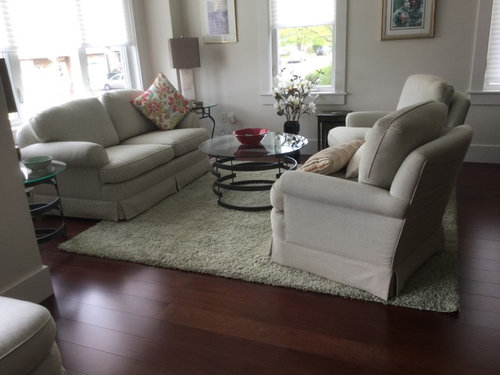
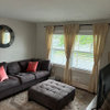
Help using taupe and cream
Peggy Scott
5 years ago
Featured Answer
Sort by:Oldest
Comments (10)

katinparadise
5 years agoRelated Discussions
Substitution for cream cheese? Use Sour Cream?
Comments (4)If you take sour cream and put it in a cheesecloth and let most of the water leak out, you essentially have cream cheese. Except that yours doesn't have starch, guar gum, or any of the other stabilizers/additives. So that's a great way to do it. Or you can use yogurt and do the same thing. Whatever you don't use, you can form into little balls and submerge in olive oil with some herbs....See MoreHELP! Should I paint my cabinets black or cream or taupe?
Comments (38)"I sure hope you like black. There are some of us who would not even consider it." I take no personal offense at that statement, but it's very narrow. Isn't that what makes the world more interesting...diversity? My previous kitchen was beautiful with matte black painted maple lower cabinets. I had no uppers...just art hanging in that space. the cabinets weren't heavy looking, nor did they make the room too dark. It was a beautiful space.....and understated...quite like the proverbial black cocktail dress, a classic. I had tons of natural light...one solid wall of windows and my wood floors were oak with no stain so they weren't dark. I would agree it depends on the kitchen, style of house, countertop, lighting, etc. Decora cabinets used to send potential clients over to see my kitchen anytime someone was considering black. I wish I could post photos, but I only have the real estate tour and you can't snag stills from it. The house sold in 45 days during the worst of the housing crunch. The buyers specifically said they loved the kitchen at the act of sale. So there are also those of us who would and have chosen black. Like everything else...it depends on the big picture....See MorePaint - the perfect light neutral gray taupe or cream color HELP
Comments (20)Hi - We just painted our entire first floor in Farrow & Ball "old white", which is a taupe-y grey. In some light, it also has a very slight hint of sagey green, but not so much that you'd think it's a green color. It definitely looks more taupe-y than anything else, and we've gotten lots of "oohs and aaahs" over it, even from the subs. We have dark wood floors and white trim and baseboards (which is done in F&B "Pointing" as are our ceilings). In the office and master bedroom, we used F&B "light grey", which is also a wonderful color but definitely darker and may not feel light enough for the main areas in your home, depending on what your natural light is like (and obviously, depending on your taste for dark vs. light). Farrow & Ball has such wonderful big hand-painted swatch cards, and I would highly recommend purchasing them...they're a hefty $50, but definitely worth it and WAY better than the little brochure they'll send you for free, which has tiny little bits of color that give you just enough of a feel to want to see more! If you're interested, I can take photos of these rooms, but we're moving in on Friday (after an 8-month whole house renovation), and we're in the throes of last-minute chaos with electricians hanging fixtures, painters doing touch-ups and punch list stuff. Our contractor put rosin paper down on the floors so they won't get messed up, and so the tone of the red rosin paper may influence what you'll see as the color of the walls. Here's a tip for you - if you go to Google and press the tab for "Images" and type in the name of the paint that you're considering using, you'll probably see photos of rooms from magazines that used that color. It's very helpful. When we were considering using F&B's "Middleton Pink" for my teenage daughter's room, we were worried that it would be too little girl-ish, but when she saw the image of several rooms painted in Middleton Pink, she liked it and so we went with it (unfortunately, later on, after it was on the walls, I made the mistake of mentioning that it wasn't a very sophisticated color. DUH! WRONG thing to say to a teenager). Anyway, Google Images was very helpful! Good luck with your search. I went through the identical struggle on the neutral grey taupe about six months ago so I know how difficult it can be! Susan...See MoreHardie Plank Help - Anyone Used Monterey Taupe
Comments (18)Winnie - thanks and yes it is MT. Hardie on top and color matched paint on bottom. I also agree looks more gray, which works better with stone so I was pleased. I think looks more gray because I don’t have a lot of direct sun with trees and also the paint on brick goes darker....See More
Peggy Scott
5 years agoPeggy Scott
5 years ago
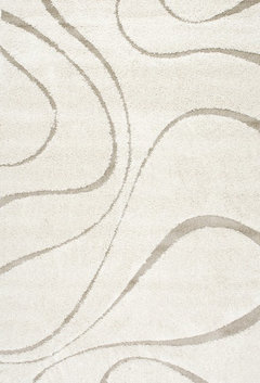
decoenthusiaste
5 years agoUser
5 years agoPeggy Scott
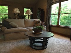
5 years agokatinparadise
5 years agodannirose
5 years agodannirose
5 years ago
Related Stories
EXTERIOR COLORExterior Color of the Week: Tasteful Taupe
When you want to skip the peachy beiges and ubiquitous creams, consider this rich cool brown neutral instead
Full Story
COLORColor Feast: When to Use Red in the Dining Room
It awakens appetites and spurs conversations, but too much is like a second helping of pie. Find the perfect balance of dining room red here
Full Story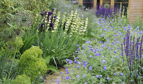
PLANTING IDEAS5 Ways to Use Pastel Plantings in Contemporary Gardens
Learn how pink, lilac, lavender, cream and peach can bring a soft beauty to your landscape
Full Story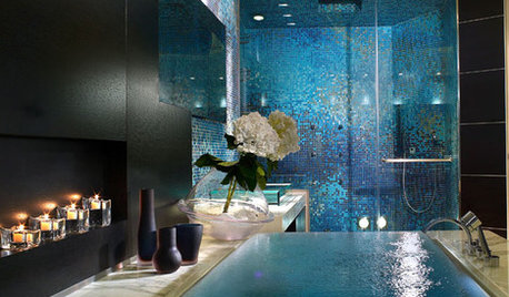
COLORColor Magic: Tap Into Psychology to Better Use Blue at Home
OK, it's backed more by science than magic. But see how expert research can help you create powerful, even bewitching, interior effects
Full Story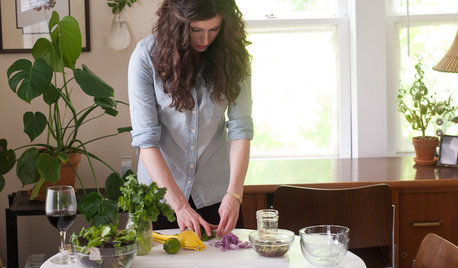
KITCHEN DESIGNKitchen of the Week: Small, Creatively Used Kitchen
A food blogger whips up recipes out of a tiny Oklahoma kitchen — and sometimes spills over to the dining room table
Full Story
COLORBest Ways to Use the Soft Yellow Color of 2014
You may fall for PPG Pittsburgh Paints’ Turning Oakleaf if you like your hues warm, mellow and cheery
Full Story
TURQUOISEColor Guide: How to Use Teal
This blue-green color is a versatile classic for walls, furniture and accessories, conjuring everything from the tropics to the Tropicana
Full Story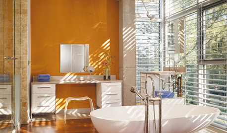
COLORBathed in Color: When to Use Bold Orange in the Bath
Orange you glad this warm and happy color can energize the place where you start your day?
Full Story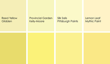
DECORATING GUIDESColor Feast: When to Use Yellow in the Dining Room
Make mealtimes a cheery affair with swaths of this sunshiny hue on your dining room walls, furniture or ceiling
Full Story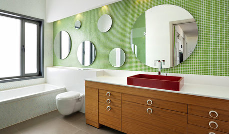
COLORBathed in Color: When to Use Green in the Bath
Splash some spring-conjuring green paint, tiles or accessories around your bathroom for natural appeal
Full Story
RL Relocation LLC