


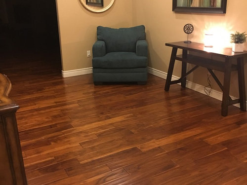
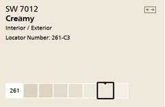
Help, revising my warm palette for neutral/cool tones
Sarah Downen
6 years ago


Featured Answer
Sort by:Oldest
Comments (9)
Related Discussions
Help needed for warm/cool colors
Comments (15)Twinkle, I wonder if Shaker Beige HC-45 from BenM might be a good chip for you to take a look at. It looks good with BenM's Decorator White and your description of the cabs kind of sounded like Decorator's White to me. I also like Powdered Pebbles from Ellen Kennon - plays well with a lot of other colors. Hard to tell if it's warm or cool or both - it's one of *those* kinds of colors. Two very different beiges/taupes to experiment with. Randita, when you were talking about lilac my first thought was Inspired AF-595 from BenM. I've often wondered why most lilac paint colors look nothing like a real lilac. ??? Inspired does remind me of one of the colors you'd see in a lilac. Gettin' all Mother Nature-y with color reference again. :) I totally agree that there is A LOT to personal color, authentic color. I have been on Jennifer Butler's website eleventy million times. Some day I would LOVE to do something like that for myself. I like the way she talks about color. The inner essence, alignment, authentic self stuff is all right up my ally. This blurb from her site is excellent: "Up to 55% of communication is visual. In order to be seen and heard 100% there must be a congruence between your inner self, your message, and your external presentation." So very fun....See MoreWarm vs cool tones. Amateur question.
Comments (14)1. Most of my house is Revere pewter and it's an open floor plan. Since it's a greige, do I stick to either grays or tans in all of the bedrooms to create flow? Colors commonly called grays or tans all belong to hue families. They're simply toned down versions of their hue parents like you see in the graphic below. You can find a gray from every hue family in the spectrum. Each row of child colors is about the same in terms of lightness and grayness. (These are all Dunn-Edwards paint colors, I left off the hue parent paint color info.) But that doesn't mean all of them go together. Color relationships matter and the way you understand color relationships, how you know what colors go together, is a color wheel. Color wheels illustrate how colors relate to each other and those color relationships have names like complementary, analogous, triadic, etc. Once you know what hue family a "gray" or "tan" belongs to, then it's easy to figure out what other colors go with it. For example, here's a tetrad of near neutrals. (I love a scheme of greens and purples) 2. Can I do a warm paint color in the living room but a cool color in the kitchen that is visible from the living room? Sure! The juxtaposition of warm and cool colors is one of the seven different kinds of color contrasts. (Johannes Itten detailed all seven.) If you are going to combine warm and cool colors, it's easier if they are about the same in terms of how gray they look. Like you see in the images above. 3. If I go more yellow beige in the kitchen do I have to stay with warm accents? Not at all. If you want your accents to have the most punch or pop, then using a cooler color would be the way to go to achieve maximum contrast and visual impact. If that maximum punch/pop is too much, then you go with warmer accents to lower the tension between all the colors so the visual impact isn't so intense. 4. I want to stay neutral for my wall color but from room to room, do I stay all warm or all cool? Same answer as #2. Keep all the colors within the same range of grayness and it will work. They can be lighter or darker, but it will be easier to pull off if you don't try to mix vivid, clear colors with your muted and chromatic gray colors like Revere Pewter. For example, I wouldn't put a vivid, clear color like Sugar Cookie 2160-60 with Revere Pewter. 5. I would love to paint my baby's room a light tan but my hallway is more of a cool gray. I would focus on choosing a light tan that works, harmonizes with the contents of your baby's room first. Then, I'd (casually) consider how it looks with the hallway color second. The interruption of a doorway between two room colors means you don't always have to work so hard at crafting perfectly harmonious wall color relationships; the doorway gives you more wiggle room for it to work and look good. Don't get too hung up on "warm" and "cool" color labels because color temperature is relative. In other words, a color isn't warm or cool on its own. We never see color in isolation and context is what determines an individual color's temperature which means all hue can be perceived as warm or cool - it depends. Technically speaking, warm and cool is not a continuous spectrum that splits the color wheel in half. Warm and cool is actually a spectrum within each hue family. There are warm blues and cool blues. Warm reds and cool reds. Warm oranges and cool oranges, etc. Like you see in this color wheel. The context for warm and cool in this case comes from the hue families in the color system that goes with this color wheel....See MoreCan you use warm white for trims and doors in a cool palette house?
Comments (17)The reason I suggested "Simply White" is because it is just that. It's snowy clean. We see color, white as well, by comparison. SW has replaced my old favorite custom "Jan mix", which was to combine 2/3 BM Decorator White, with 1/3 BM Linen White. My custom formula was so clean and non yellow, non gray....... a local cabinet company used it, and it became the number one selling cabinet white. Not icy, not warm, just CLEAN and fresh. I "get" what the op is asking. But Simply White does what the rest seem unable to do. And that is work and play very nice with virtually ANY wall color., warm or cool, Much like my now abandoned "custom" mix. Thank you Benjamin Moore....See MoreHelp tone down the "cool" tones & improve flow with warm kitchen
Comments (62)So, just a quick update. Still waiting on the rug & pillows to arrive. In the meantime a World Market *just* opened up near us and they had cinnamon pillows! I also found a funky wooden "tray" that I liked. Do the old pilllows go? Or do I need to find something else to tie it in? Also, thinking of hitting West Elm tomorrow. Browsing their website I found this cluster of vases I like - might put these on the console. Maybe the mantle? I need something warm on the TV console too.. I also found these blue ones, don't think I like them as much. They also had some cherry wood ones, but I think if I redo the large framed artwork I won't need them up there. Maybe use these for the TV console? Or keep looking? Also saw this chair at World Market that I like, but I'm going to wait until the carpet comes in. It's getting there!...See More
Sarah Downen
6 years agolast modified: 6 years agoSarah Downen
6 years agolast modified: 6 years agoSarah Downen
6 years ago


Related Stories
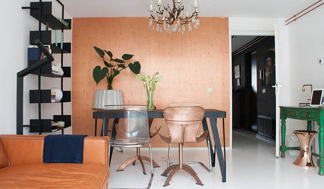
HOUZZ TOURSMy Houzz: Copper Tones Warm an Amsterdam Apartment
Paint, editing and a crush on copper help an Amsterdam resident conquer his compact space
Full Story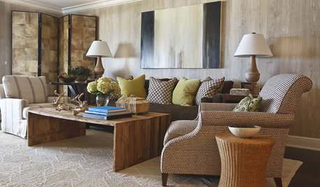
HOUZZ TOURSHouzz Tour: A Neutral Palette Pleases By the Sea
Designer Phoebe Howard creates earth-toned elegance for a family's Florida beach getaway
Full Story
NEUTRAL COLORS10 Ways to Make Your Neutral Palette Shine
Wake up your beige and gray with a rich combination of texture, shape and pattern
Full Story
COLORPick-a-Paint Help: How to Create a Whole-House Color Palette
Don't be daunted. With these strategies, building a cohesive palette for your entire home is less difficult than it seems
Full Story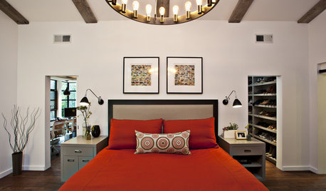
COLORColor Palette Extravaganza: Room-by-Room Help for Your Paint Picks
Take the guesswork out of choosing paint colors with these conveniently collected links to well-considered interior palettes
Full Story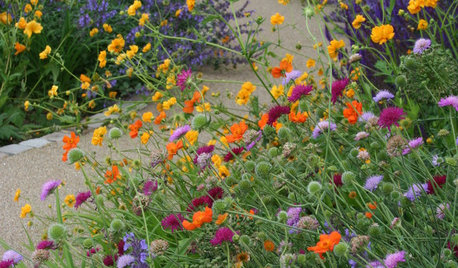
PLANTING IDEAS3 Color Palettes to Help Set Your Garden’s Mood
Select plants in these color combinations to create an outdoor space that’s cheerful, energizing or calming
Full Story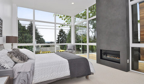
NEUTRAL COLORS8 Great Color Palettes: Surprising Bedroom Neutrals
Peaceful plum, relaxing black and many shades of gray show an unpredictably neutral nature in the bedroom
Full Story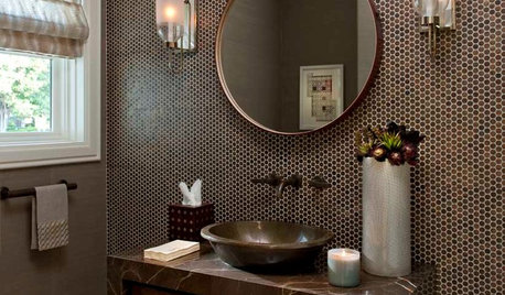
BATHROOM COLORPowder Room Palettes: 10 Browns That Go Beyond Neutral
See how paint, tile and wallpaper in shades of brown bring beauty to these powder rooms
Full Story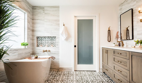
BATHROOM DESIGNBathroom of the Week: Neutrals Warm a Contemporary Master Bath
Abundant storage, elegant finishes and well-chosen tile patterns give this room standout style
Full Story
HOMES AROUND THE WORLDHouzz Tour: A Warm, Calm Palette Creates a Welcoming Home
Soft reds and soothing greens combine to make a London townhouse feel like a cozy cottage
Full Story


Rawketgrl