


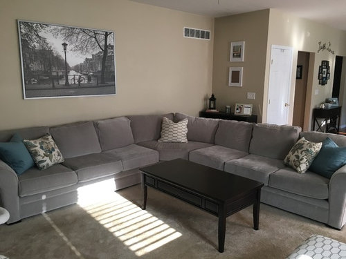
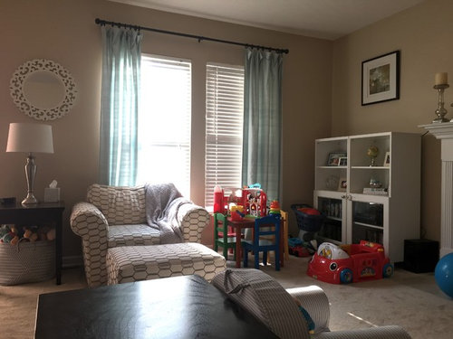
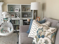
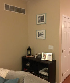
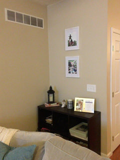
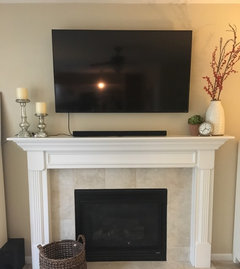
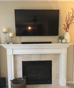
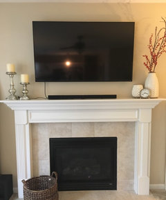
Living room wall color vs sofa color...
jlynn1187
6 years ago
Featured Answer
Sort by:Oldest
Comments (67)

amykath
6 years ago
aprilneverends
6 years agolast modified: 6 years agoRelated Discussions
Sectional vs Two Couches in Small Living Room
Comments (6)A sofa and two lounge chairs is always the most flexible, however a sectional small in scale might work. I might consider placing the TV in the RH corner instead of giving it a whole wall, but it's hard to tell without seeing that wall. You might want to consider adding think shelves to either side of the FP wall....See MoreHelp deciding between sectional vs 2 sofas in awkward living room
Comments (2)Personally, I'd get two sofas. This will allow for an end table and lamp to be placed in the corner. Also, people usually like arms to lean on when they sit. However, if you like the extra seating the sectional offers, I would decorate the curved void with a large floor vase or floor lamp....See Morelooking for a wall color for family room with Carmel color sofas
Comments (3)Hi.I'm Neha. Choosing the perfect wall color depends on the type of flooring you have. If you could share the exact color of the sofa and the type of flooring, I can create a 3D mockup to help you visualize better....See Morewhat color for sofa slip cover and living room rug?
Comments (9)I‘d start with the slipcover, as they are not easy to find regarding decent fabric quality, size and shape. Suggest blue, white or green and add cushions that complement drapes. I‘d skip a brown rug and wait until you decide on color scheme. Consider your taste/comfort with mixing patterns; see above. Use a textured rug to make it easier to coordinate around and if your preference is a solid....See More
lizbeth-gardener
6 years agojlynn1187
6 years agoUser
6 years agojlynn1187
6 years agojlynn1187
6 years agoUser
6 years agodeeinohio
6 years agojlynn1187
6 years agojlynn1187
6 years agolascatx
6 years agoUser
6 years agolast modified: 6 years agojlynn1187
6 years agoUser
6 years agolascatx
6 years agojlynn1187
6 years agojlynn1187
6 years agoUser
6 years agojlynn1187
6 years agolascatx
6 years agolast modified: 6 years agoamykath
6 years agojlynn1187
6 years agojlynn1187
6 years agolast modified: 6 years agojlynn1187
6 years agojlynn1187
6 years agoUser
6 years agolast modified: 6 years agojlynn1187
6 years ago
Kitch4me
6 years agojlynn1187
6 years agoKitch4me
6 years agojlynn1187
6 years agolast modified: 6 years agojlynn1187
6 years agojlynn1187
6 years agojlynn1187
6 years agoamykath
6 years agoKitch4me
6 years agojlynn1187
6 years agoKitch4me
6 years agojlynn1187
6 years agolast modified: 6 years agojlynn1187
6 years agoKitch4me
6 years agojlynn1187
6 years agolast modified: 6 years agojlynn1187
6 years agoKitch4me
6 years agoUser
6 years agojlynn1187
6 years agoamykath
6 years agojlynn1187
6 years ago


Related Stories
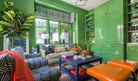
LIVING ROOMSRoom of the Day: Green Walls Raise the Energy in This Living Room
A vibrant paint color takes a pale yellow space to an upbeat place
Full Story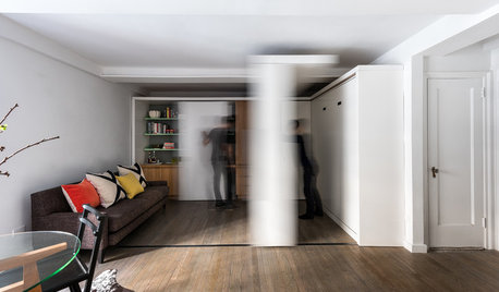
HOUZZ TOURSHouzz Tour: Watch a Sliding Wall Turn a Living Space Into 5 Rooms
A clever custom storage piece transforms this New York City microstudio into multiple living spaces
Full Story
MORE ROOMSCould Your Living Room Be Better Without a Sofa?
12 ways to turn couch space into seating that's much more inviting
Full Story
FURNITURE5 Daring Sofa Colors to Make Your Living Room Come to Life
Get expert tips on how to use bold furniture pieces to create a contemporary and refined living space
Full Story
DECORATING GUIDES13 Ways to Upsize a Small Living Room Without Moving a Wall
A design pro shows how to use light, colour, layers and focal points to make a compact room look and feel more expansive
Full Story
FIREPLACESNew This Week: 7 Living Rooms That Rethink the Fireplace Wall
Bold and adorned or streamlined and minimalist — which of these fireplaces would you want warming up your home?
Full Story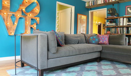
COLORFUL HOMESThe Best of My Houzz: 10 Living Rooms With Wall Colors to Love
Jet black, Meyer lemon yellow, mossy green — these spaces make a statement with bold color
Full Story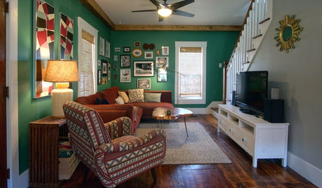
BEFORE AND AFTERSGreen Walls Wake Up a Tired Living Room
With a $6,000 budget, this couple rip out carpet and wallpaper to create a colorful, eclectic space to hang out in
Full Story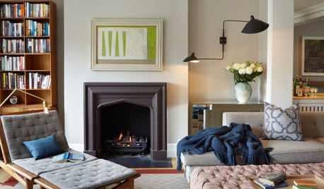
LIGHTINGSmart Ways to Work Wall Lights Into Your Living Room
Mood-setting sconces cast light where it’s wanted while keeping horizontal surfaces clear
Full Story
LIVING ROOMSBreaking the Rules: Living Rooms Without a Sofa
Spark conversation with one of these arrangements of chairs, chaises and floor seating
Full Story


Kitch4me