


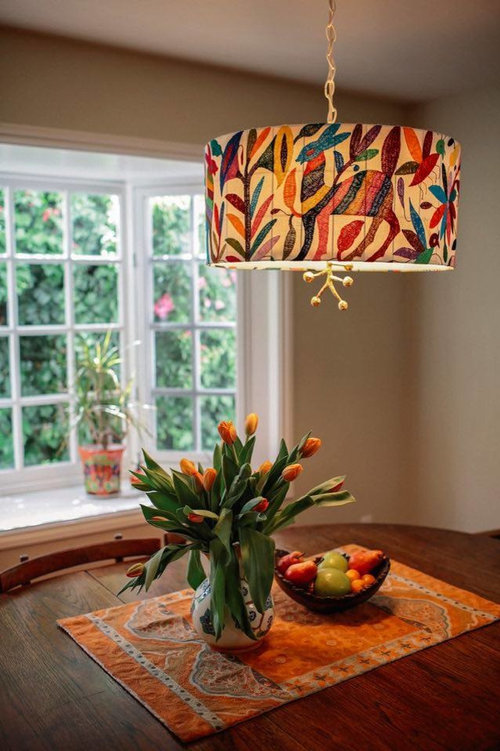
The weaving and the pendant
aprilneverends
6 years ago
last modified: 6 years ago

Featured Answer
Sort by:Oldest
Comments (8)
Related Discussions
Lightguy and others...would love your opinion about LED
Comments (24)I wanted to add my experience with the LR6. I have a 22' x 14' family room where I installed nine 3500-degree LR6s. The layout was a row of four lights down each side of the room, about 4' from the wall and about 4.5' apart, with one additional light in the center widthwise at the far end of the room (over a fireplace), essentially like this: :* *: : : :* *: : : :* *: : : :* * *: --------- The front four lights are controlled by one dimmer, and the back five by another. I used the Cree-recommended Cooper commercial dimmer switch and, while it doesn't dim as low as an incandescent, does go to 20% or so (in my estimation) without any flicker. We are thrilled with both the quality and the amount of light these give off. Before our "re-do" of this space, our family room had dark paneling and beams and was a challenge to keep adequately light, even during the day. We have remodeled the room in a contemporary style and the lighting really complements the new look....See MoreBest lighting for imperfect ceilings?
Comments (22)Drywall over plaster only works for the ceiling. You can't just add drywall to plaster walls unless you remove and reinstall the trim or your trim won't look right. Even if you do that, you will need to add jamb extensions to the door and window frames. Removing plaster is a lot of work and not recommended unless it is completely crumbling. It is heavy so the dump fees add up in a hurry. Then if you remove plaster and replace with drywall, your existing moldings are the wrong size as drywall is thinner than plaster. Plaster is more durable and helps minimize the sound transfer between rooms. Drywall also dents and scrapes much more easily than plaster. If you have large sections of plaster coming loose from the lath but still in a solid piece, it is better to reattach the plaster to the lath than to remove it. If you are new homeowners, make sure to tackle the structural issues first. If you have extensive cracks or settling, be sure to stabilize the foundation issues. Clean gutters and dirt sloped away from the house will avoid most water issues. Then take care of any roof, siding and window issues to keep moisture outside where it belongs. Sometimes homeowners start installing tile and cabinets level without insuring that the house isn't continuing to move. Old houses have their quirks and you have to accept them or you will drive yourself crazy. Don't try to make your old house into a new one by restructuring the entire floorplan. Sometimes removing a small wall or widening an opening helps the traffic flow but don't go crazy with the open floor plan concept. The wedding cake light fixture in the living room of my previous house was very effective at demonstrating issues with the ceiling. There was one small blip on the ceiling which was practically invisible until the light was turned on. Then, the pattern of lines on the ceiling was quite even everywhere except one spot. Just one line had a distinct squiggle about 8 to 10 inches out from the light base and it glared at me every time I turned that light on!...See MoreHelp for Lighting Over Dining Table
Comments (47)Btydrvn, to answer your OT question, my house is one of those places where people are always coming and going and everyone knows there’s food and a place at my table. So all the chairs are used. Not at every meal of every day, but very frequently. The table is not as close to the buffet as it might appear on the photo. My dining space is large enough that I can afford to let plenty of space between the table and buffet and all the places at the table are easily accessible. And to those of you who suggested I contact those who sell this light regarding open box or damaged lights, thank you. I’m currently waiting to hear back....See Moreshould I keep my fav pendant lamp?
Comments (20)https://www.birchlane.com/Birch-Lane%E2%84%A2--Farren-8-Light-Candle-Style-Wagon-Wheel-Chandelier-X114144561-L6085-K~B000142964.html?refid=GX432369512761-B000142964&device=c&ptid=1659330262496&network=g&ireid=209785450&targetid=pla-1659330262496&gclid=Cj0KCQjwteOaBhDuARIsADBqRehHEXr-Lg3d35TpDGx02DX4PEysuI-hyDIL4W9q4tAB6nfQ4kCE4kkaAs7wEALw_wcB lots to look at here....See More
aprilneverends
6 years agoaprilneverends
6 years agolast modified: 6 years agoaprilneverends
6 years ago
Related Stories

STUDIOS AND WORKSHOPSReaders Show Us Where They Create at Home in Winter
See how readers are engaging in crafts and hobbies, whether it’s weaving, winter gardening or fairy-home building
Full Story
LOFTSHouzz Tour: Tying Together a Boston Loft
Walnut and other elements weave throughout a family’s condo, filled with multipurpose spaces and newly maximized views
Full Story
LIGHTINGOn Trend: Globe Lights Give Rooms a Well-Rounded Look
Updated and transformed for fall 2012, globe light fixtures have a ball in rooms of any style
Full Story
DECORATING GUIDESThe Beauty of Contrast: Modern Lighting in Traditional Rooms
Give classic rooms an edge with a modern table lamp, pendant or chandelier
Full Story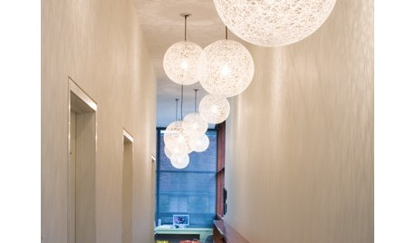
HOMES AROUND THE WORLDHouzz Tour: In Ireland, a Light and Airy Lakeside Cabin
Take a look inside this beautifully restored woodland cabin on the edge of an Irish lake
Full Story
HOUZZ TOURSHouzz Tour: Family-Friendly Coastal Style in Michigan
Three generations share a chic and comfortable home on a lake
Full Story
BARN HOMESHouzz Tour: Saddled-Up Chic for a Barn-Style Home
A mix of textures makes this family-friendly house comfy, welcoming and stylish
Full Story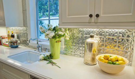
KITCHEN BACKSPLASHESTin's a Win for Kitchen Backsplashes
Durable tin has come down from the ceiling and out of Victorian times to decorate backsplashes today
Full Story
SMALL HOMESHouzz Tour: Small Coastal Bungalow for a Southern California Family
A designer creates a charming, modern space for her family with custom-made pieces
Full Story


elohbee