


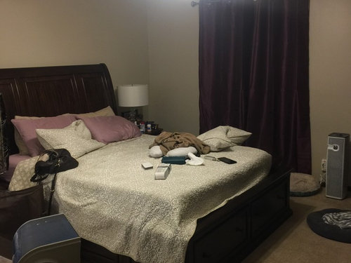
If this was your room, what color would you paint it?
hasmoody13
7 years ago

Featured Answer
Sort by:Oldest
Comments (37)
 PRO
PROLori A. Sawaya
7 years ago
kelleg69
7 years agoRelated Discussions
What color would you paint your laundry room if...
Comments (38)McMann...you need the mural I put in my sunroom...that way you can do laundry and while away at the beach! I even have a sound machine in there that sounds like the ocean and waves!! Dani...I haven't ordered it yet...but it most likely come from the place from the red trim...unless I find it somewhere cheaper...I need four rolls and it's 18.00 a roll!! They had some on Amazon for 12.00 a roll... Here's what my laundry room looks like now...It's fairly good size. the other side I do like the red...with the yellow option...however the green has the background the color of my floor in there...I could still do yellow though...I'm glad ya'll veto'd the sponge job cause I wasn't really all that choked up about it...it was just an idea that I quickly took your advice on! I'll let you know...I just hope the old wallpaper comes off easy!! I found this picture on the net several years ago...It's my dream laundry room...but it takes someone with talent in painting of which I don't have...Isn't it darling!! Thanks ya'll!! You've been a tremendous help as always!!...See MoreOh goodness! What color would you paint this room?
Comments (10)I can never pick colors out of the blue, (no pun intended) but need an inspiration piece to give me a direction...be it either a pic from a magazine, a piece of art, a vase, very often fabric I'll use in the space, or once, even the color of my cat's eyes. But once I have a color direction, all the other choices are so much easier. Not only that, but it will often take me in directions that I'd normally never ever go with surprisingly good results. Have you thought about getting a color inspiration first?...See MoreNot sure... Where would you start and end your paint colors?
Comments (4)Do you not want it all the same? Thats what I would do with that space. If you want difference you could define space with different coordinating accent pieces of whatever you choose. I think you will get much more cohesiveness and a better feeling with one color....See MoreWhat color would you paint a room with this in it
Comments (27)Okay, I'm so confused now. I'm a realtor and I just saw some houses with gorgeous paint jobs. You would think this would help me but it only confuses me more. Tone on tone striped walls or just tans with reds or all one color. The rest of my house is tan with red accents. Should I really keep the boys room the same? I have been thinking all day about the blues. My thoughts are...I cannot do the dark blue so maybe the light blue from the stripe on the bed? Then the dresser and maybe the headboards painted red? What do ya'll think of this idea? Oh, and on each wall that a bed is on paint a red box and hang the pictures in that area. Or Tan walls all over with red dresser, red curtains and then on one wall a bed is on paint one dark blue box with red matted pictures and the other wall paint a red box with with dark blue matted pictures. This one sounds confused but this is the one that is very clear in my mind. I wish I had photoshop to show everyone but I'm not one of the lucky ones....See Morehasmoody13
7 years agohasmoody13
7 years ago
ravencajun Zone 8b TX
7 years ago
House Vixen
7 years agohasmoody13
7 years agopkpk23
7 years agoHouse Vixen
7 years agohasmoody13
7 years agohasmoody13
7 years agoshari13
7 years agoUser
7 years ago- PRO
Lori A. Sawaya
7 years ago 
sprtphntc7a
7 years ago
lakeerieamber
7 years agohasmoody13
7 years ago- PRO
Lori A. Sawaya
7 years agolast modified: 7 years ago - PRO
Lori A. Sawaya
7 years agolast modified: 7 years ago 
Bunny
7 years ago- PRO
Lori A. Sawaya
7 years agolast modified: 7 years ago 
l pinkmountain
7 years agol pinkmountain
7 years agoUser
7 years agolast modified: 7 years ago- PRO
Lori A. Sawaya
7 years ago - PRO
Lori A. Sawaya
7 years agolast modified: 7 years ago l pinkmountain
7 years ago
OutsidePlaying
7 years ago
biondanonima (Zone 7a Hudson Valley)
7 years agolast modified: 7 years agoUser
7 years agohasmoody13
7 years agohasmoody13
7 years agohasmoody13
7 years ago- PRO
Lori A. Sawaya
7 years ago hasmoody13
7 years agonosoccermom
7 years ago


Related Stories
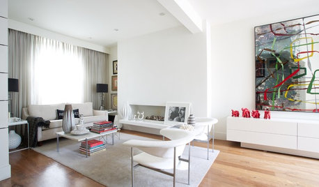
COLOR9 Decorating Ideas for White Living Rooms
These inspiring living rooms show how good an (almost) all-white room can look
Full Story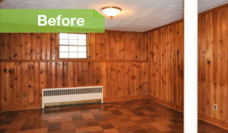
PAINTINGKnotty to Nice: Painted Wood Paneling Lightens a Room's Look
Children ran from the scary dark walls in this spare room, but white paint and new flooring put fears and style travesties to rest
Full Story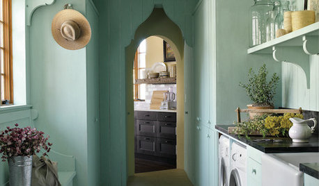
ROOM OF THE DAYRoom of the Day: A Laundry So Cheery, Wash Day Is Wonderful
Pretty paint and playful touches banish chore-day blahs in a laundry room designed for a magazine’s Idea House
Full Story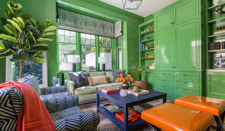
LIVING ROOMSRoom of the Day: Green Walls Raise the Energy in This Living Room
A vibrant paint color takes a pale yellow space to an upbeat place
Full Story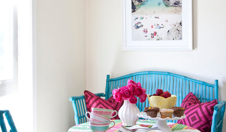
COLORSteep Your Rental in Color — Without Painting the Walls
Let your favorite hues loose without skirting your lease, with these room-by-room ideas for apartments and other rented homes
Full Story
WHITEWhat to Know Before You Paint Your Walls White
A coat of white paint can do wonders in one room and wreak havoc in another. Here are tips for using the popular hue
Full Story
HOUZZ TOURSMy Houzz: Creative Renters Triumph Over the ‘No Paint’ Rule
Not allowed to paint and limited with nails, a design-minded couple uses furnishings and textiles to make their rooms stand out
Full Story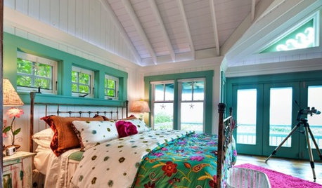
COLORAccent a Room With Colorful Trim
Watch rooms come to life when you add color to trim, mantels and more
Full Story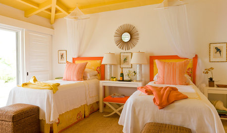
DECORATING GUIDESPaint Color Ideas: 7 Bright Ways With Yellow and Orange
Go with the glow. These sample palettes and room examples show you how to work with two of the happiest hues around
Full Story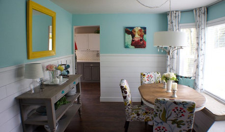
ROOM OF THE DAYRoom of the Day: A DIY Dining Room Full of Cheer
Seeking an uplifting spot during gray days in Washington state, this couple brightened their space with turquoise paint and DIY spirit
Full Story


hasmoody13Original Author