


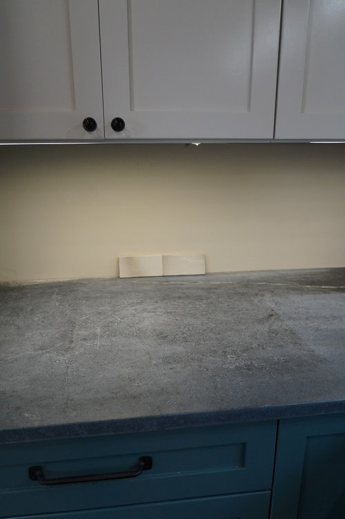
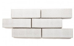
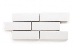
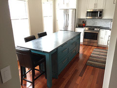
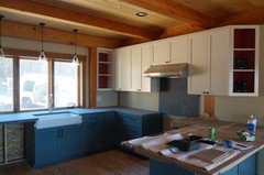
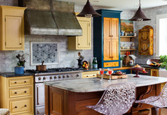
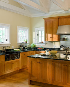
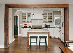
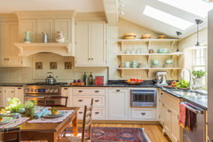
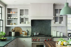
Anyone want to help me choose a backsplash?
Am E
7 years ago


Featured Answer
Sort by:Oldest
Comments (56)

daisychain Zn3b
7 years ago
eam44
7 years agolast modified: 7 years agoRelated Discussions
Backsplash...please help me choose!
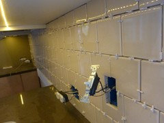
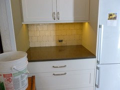
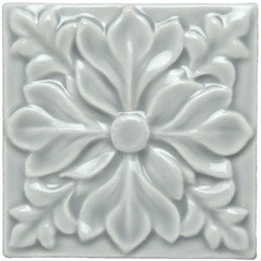
Comments (12)Thank you so much, everyone, for weighing in with your opinions. I am definitely not good at this sort of thing, and have a horrible time picturing how it will all look in the end. It's nice to have other expert advice! Initially, I was very excited about the travertine. The sample I have is nice, but I am definitely concerned that it might blend in too much with the cabinets and not give that 'wow factor' that I'm hoping for. I've always been drawn to slate, but as rhome said, I really want the kitchen to have a warm and friendly feeling. I tried to balance the warmth of all of the woods with the coolness of the dark grey Basalt Slate countertops. I guess it would be nice if the backsplash could bring everything together. Slate usually reads very cool to me. However, I really like the visual interest of the Falling Water pattern, and it seems to have some warm colors. I'm waiting on a sample of the 'Earth' color pictured above, and this one, called 'Prairie'. Remodelfa, how do you always find the coolest tiles? :) I really like those Java Sticks and the irregular edges. It also has the warmth I'm looking for. Another possibility added to the mix! So now, how in the world do I choose?...See MoreHelp me choose Pendant lighting! Backsplash ideas also needed!
Comments (16)Thanks for the suggestions! I will be getting my Vetro B/S sample today (there was a mix up with the supplier.) I really hope I like it because I am really getting kitchen reno fatigue and don't want to keep searching for the right B/S. It's been chaos juggling work, kids and dragging my kids to endless trips to Home Depot, granite, lighting, etc. stores!! Fortunately, we have a much needed vacation next week! The discus pendant is nice, but at 10" in diameter, I think a bit big for my kitchen. Any other ideas? I have no clue what I even like in pendants?? I am considering a brushed nickel b/c of the hardware/SS appliances but also think maybe something glass or crystal would be nice. any other suggestions??? Thanks!!...See MorePlease help me choose a kitchen backsplash!
Comments (11)Both will work - you have great taste. At first I thought I would prefer the one you do, the silver birch, because it's warm tones echo those of the floor. But when I put the elements next to each other, I prefer the contrast shine, and stronger colors of the chalkboard. It has warmth, whites, greys, metallic sheen, and iridescence. Your granites call for a statement bs, something a little bolder than the birch. Either way, you have grey granites, white cabs and a grey backsplash - what other paint are you going to use? The birch limits you to earth tones. The chalkboard opens you up to earth tones, shades of white, taupe, copper, greens and even purple. I understand that you want to keep things neutral to offer you the option for change in the future, but the one thing your kitchen could use right now is a color other than grey. BS tile gives you the opportunity to add some now, not just some day. Here are two glass mosaic options that harmonize with your greys but also add a lot of needed color, and will animate your space. Choosing either could narrow you paint options in the future, or open them up - depends on how you look at it, really. http://www.glasstileoasis.com/item.asp?item=13181 http://www.glasstileoasis.com/item.asp?item=18123...See MoreMinty green backsplash - help me choose!
Comments (45)HI mnmamax3 (and MN anniebird!), no, I just pulled celadon and mint because those were colors you mentioned. I almost put in Winchester's Sudbury, which is a variable green and sometimes regret not doing so. Rubble reps Winchester and many other cool lines, but again, I like your trapazoid tiles a lot. I bought my tile from Mercury Mosaics - mixed 3 whitish shades in a block herringbone pattern. My daughter is a potter and I wanted to support a local group of young potters, plus, they bring their dogs to work and they need kibble, lol....See More
User
7 years agolast modified: 7 years agoAm E
7 years agoAm E
7 years agoDIY2Much2Do
7 years agolast modified: 7 years agoUser
7 years agoJillius
7 years agoAm E
7 years agoUser
7 years agolast modified: 7 years agodaisychain Zn3b
7 years agoAm E
7 years agoUser
7 years agolast modified: 7 years agoJillius
7 years agoeam44
7 years agolast modified: 7 years agoeam44
7 years agonosoccermom
7 years agoAm E
7 years ago
cpartist
7 years agoAm E
7 years agoAm E
7 years agoAm E
7 years agoUser
7 years agocpartist
7 years agocpartist
7 years agoAm E
7 years agoUser
7 years agoeam44
7 years agolast modified: 7 years agoAm E
7 years agoeam44
7 years agolast modified: 7 years ago
The Smiths
7 years agoeam44
7 years agoUser
7 years agoAm E
7 years agoAm E
7 years agoUser
7 years agoeam44
7 years agolast modified: 7 years agocpartist
7 years agoAm E
7 years agolast modified: 7 years ago
barncatz
7 years agolast modified: 7 years agobarncatz
7 years agoUser
7 years ago
Pipdog
7 years agocpartist
7 years ago
sheloveslayouts
7 years agoAm E
7 years agocpartist
7 years ago


Related Stories
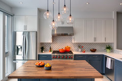
LAUNDRY ROOMSThe Cure for Houzz Envy: Laundry Room Touches Anyone Can Do
Make fluffing and folding more enjoyable by borrowing these ideas from beautifully designed laundry rooms
Full Story
KITCHEN DESIGNThe Cure for Houzz Envy: Kitchen Touches Anyone Can Do
Take your kitchen up a notch even if it will never reach top-of-the-line, with these cheap and easy decorating ideas
Full Story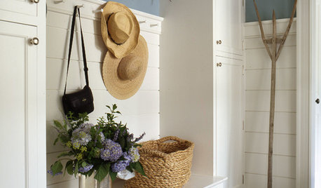
MUDROOMSThe Cure for Houzz Envy: Mudroom Touches Anyone Can Do
Make a utilitarian mudroom snazzier and better organized with these cheap and easy ideas
Full Story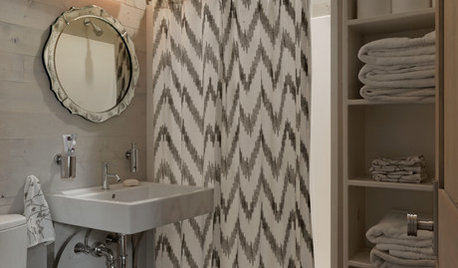
BATHROOM DESIGNThe Cure for Houzz Envy: Bathroom Touches Anyone Can Do
Take your bath from blah to ‘ahhhh’ with just a few easy and inexpensive moves
Full Story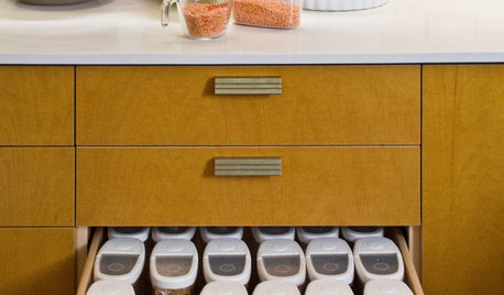
KITCHEN DESIGN6 Clever Kitchen Storage Ideas Anyone Can Use
No pantry, small kitchen, cabinet shortage ... whatever your storage or organizing dilemma, one of these ideas can help
Full Story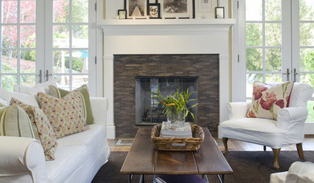
DECORATING GUIDESThe Cure for Houzz Envy: Family Room Touches Anyone Can Do
Easy and cheap fixes that will help your space look more polished and be more comfortable
Full Story
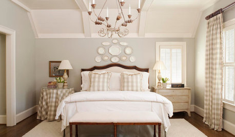
BEDROOMSThe Cure for Houzz Envy: Master Bedroom Touches Anyone Can Do
Make your bedroom a serene dream with easy moves that won’t give your bank account nightmares
Full Story
DECORATING GUIDES7 Bedroom Styling Tricks Anyone Can Do
Short on time or money? You can spruce up your bedroom quickly and easily with these tips
Full Story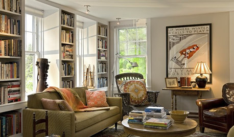
BUDGET DECORATINGThe Cure for Houzz Envy: Living Room Touches Anyone Can Do
Spiff up your living room with very little effort or expense, using ideas borrowed from covetable ones
Full Story

eam44