


Please Critique Our Plans
rockb9
7 years ago
last modified: 7 years ago
Featured Answer
Sort by:Oldest
Comments (52)
Related Discussions
Please critique our floor plans!
Comments (3)This is a really great plan. The only comments I have are those that would be along the lines of personal preference. For example, in the master bathroom, I would have a door to the toilet area so that you can have some privacy in there while the other person is also in the bathroom. Similarly in your other full bath, I'd put a pocket door between the sink area and the toilet/shower area. That way, somebody can brush their teeth/get ready while another is using the toilet. When the kids are young, they don't seem to care if everybody can see them using the toilet or taking a bath, but as they get older, I have found that my kids like to shut the door. Also, not sure if there is a way to open up the entry space, but it seems like you go down a tunnel to get to the great room. Really though, this plan seems to have good flow. Good luck!...See MorePlease critique our floor plans
Comments (13)I understand the why's of what you've designed, but there's a lot to be desired in this plan in terms of how the house will look and live. For example, having the foyer come into a long wall along one side is not comfortable. The dining room is too far from the kitchen. The shape of the rooms seems long and narrow. (I can't see the dimension on the drawing.) I think it would benefit by putting some furniture in the space like sofas and tables so you get a better sense of how the space will live. For example, in the living room, where would you put the sofa so you could enjoy the fireplace and how would the conversation cluster work around it? I like the orientation and the walk out. I'd consider putting 9' finished ceilings in the basement...we did and it's critical to making the lower level feel like livable space. However, if you cover up the windowed part of the basement with a deck above, you will lose all your light and sense of openness. Consider putting the deck behind the garage and leave as much light available to the lower level as possible....See MoreFloor plan. Please critique
Comments (10)Mostly I like it. If you switch the tub and shower in the master, the light from the window above the tub will make the hallway between the closets much more bright and inviting. And, the toilet door should swing out, not in. No closet by the front door? The garage door and cubby area is a little funky. Imagine coming in the door, shutting it, and then stepping back toward the door to the cubbies. Or several people all putting on shoes and coats at the cubbies and trying to get out the door. It's not horrible, but it seems like it could be a congested space depending on the number of people in your family. The kitchen is... well, its bad. Really bad, at least from a function standpoint. Imagine the number of steps you would have to take to cook even a simple meal, around and around the island, from fridge to sink to stove to sink, on and on. I would post it on the kitchens forum. I like the one nice dining space, instead of two smaller dining spaces that are common in a lot of plans. I think the study will be a great space that can fill many functions over the years, nursery, office, away room, etc. It might be a little dark in there though, with just one small window....See MorePlease Critique Our Plan!
Comments (27)Maybe there is a way to build an elevated house facing south, like what they do on the coasts where flooding is more of an issue? Like this: http://sandcastlecoastalhomes.com/wp-content/themes/sandcastle/images/slideshow/8.jpg I live in a west-facing condo, and it is hot as blazes every afternoon. I have to run the air conditioning for about 45 minutes every day at sunset. Other than some extra insulation and a stucco exterior, we don't have thick windows or a large roof overhang or any other measures to mitigate the sun. But it is bad enough now that it is hard to imagine any measures could work well enough to make me not have to run the air conditioner every day. In your situation, I'd have to be able to go at sunset and stand inside a west-facing house built with the sun/heat mitigating measures that were going to be used on my house and experience for myself that they fixed the issue. Otherwise, I just wouldn't believe it....See More
rockb9
7 years agolast modified: 7 years ago PRO
PROVirgil Carter Fine Art
7 years agodoc5md
7 years ago
bpath
7 years ago
keywest230
7 years agolast modified: 7 years agorockb9
7 years agolast modified: 7 years agorockb9
7 years agolast modified: 7 years agorockb9
7 years agolast modified: 7 years agorockb9
7 years agolast modified: 7 years agorockb9
7 years agolast modified: 7 years ago
cpartist
7 years agocpartist
7 years agoBuehl
7 years agorockb9
7 years agorockb9
7 years agocpartist
7 years ago
Naf_Naf
7 years agolast modified: 7 years ago- PRO
Virgil Carter Fine Art
7 years ago rockb9
7 years agomrspete
7 years agorockb9
7 years agorockb9
7 years agoFred M
7 years agorockb9
7 years ago PRO
PROMark Bischak, Architect
7 years ago
Architectrunnerguy
7 years ago
Related Stories
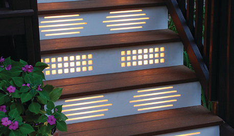
GARDENING AND LANDSCAPINGNo Fall Guys, Please: Ideas for Lighting Your Outdoor Steps
Safety and beauty go hand in hand when you light landscape stairways and steps with just the right mix
Full Story
BATHROOM DESIGNUpload of the Day: A Mini Fridge in the Master Bathroom? Yes, Please!
Talk about convenience. Better yet, get it yourself after being inspired by this Texas bath
Full Story

HOME OFFICESQuiet, Please! How to Cut Noise Pollution at Home
Leaf blowers, trucks or noisy neighbors driving you berserk? These sound-reduction strategies can help you hush things up
Full Story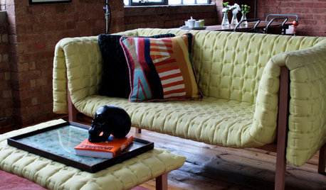
DECORATING GUIDESPlease Touch: Texture Makes Rooms Spring to Life
Great design stimulates all the senses, including touch. Check out these great uses of texture, then let your fingers do the walking
Full Story
HOUSEPLANTSMother-in-Law's Tongue: Surprisingly Easy to Please
This low-maintenance, high-impact houseplant fits in with any design and can clear the air, too
Full Story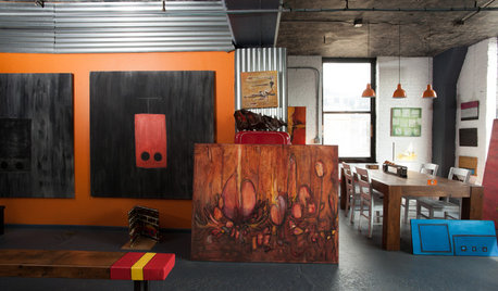
HOUZZ TOURSMy Houzz: Hold the (Freight) Elevator, Please!
Industrial style for this artist's live-work loft in Pittsburgh starts before you even walk through the door
Full Story
ARCHITECTUREOpen Plan Not Your Thing? Try ‘Broken Plan’
This modern spin on open-plan living offers greater privacy while retaining a sense of flow
Full Story
UNIVERSAL DESIGNHow to Light a Kitchen for Older Eyes and Better Beauty
Include the right kinds of light in your kitchen's universal design plan to make it more workable and visually pleasing for all
Full Story
Architectrunnerguy