


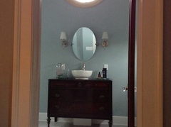
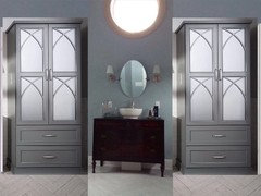
Color scheme advice for Master bath; warm/cool combo
User
7 years ago
Featured Answer
Sort by:Oldest
Comments (7)

roarah
7 years agolast modified: 7 years agoRelated Discussions
Cool or warm color for bedroom?
Comments (44)Yeah! Success! I ended up going with BM Smoke at 75%. BM Silver Gray just looked a bit too cold for me, so I chose Smoke because it had just a little bit of green to warm up the color. Now the pinky tones that sometimes came out of the headboard are just about gone. I will post pics when I get all the pictures hung and everything put back in place. The LRV of Smoke is 56.3. I wonder what the LRV is now that I only used it at 75%? Comparing to the fan deck, the 75% Smoke it a little bit lighter than the 100%, but not even close to as light as the next color up on the strip, Iceberg, which has an LRV of 73.4. I think Smoke is one of the neutral blue/gray/greens. Just about every other color works with it. It seems like more and more designers are using these "neutral blues" as a backdrop that will go with about anything but is so much more interesting that your standard beige. Does anyone have recommendations for sites with great bedding? I really like some of the stuff Dwell does, but nothing they currently have on their site right now would work for me. I really think I would like to use something that has some navy in it, and I would like to add some little pillows with some red or yellow, or even kelly green to spice things up....See MoreConflicting information re warm or cool whites
Comments (17)One person at the SW call in color experts stated it was fine with the correct lighting and the other said no as extra white is a cool white and divine white is a warm white. I know there is no umber in the extra white but I thought it was one of those colors that went with anything. "White" paint colors aren't white. They're all colors and each belongs to a hue family. All of them. And just like more chromatic (or colorful) colors, the basics of color relationships to create harmonious color schemes still apply. It gets super challenging when a paint color is so close to a "true" white that it's hard to detect any hue at all in order to distinguish what hue family it belongs to. The same can be said for gray and black. When paint colors are so near a true neutral gray or black, it's really hard to identify hue family. Color relationships and schemes hinge on hue family, right? So if you don't know the hue family, it's impossible to purposefully coordinate colors. Colors of white, however, have an extra, added challenge. When the chromaticity (amount of colorfulness) is super low, the tiniest differences (in hue, value and chroma) matter a lot. I'm going to use three colors as an example: Sherwin Williams' Pure White, Extra White and Ceiling White. They all belong to the Green-Yellow hue family. Seriously, they do. Not kidding. Take a look at the numbers: 7005 PURE WHITE Hue 0.87GY - Value 9.3676443 - Chroma 0.327977538 7006 EXTRA WHITE Hue 5.11GY - Value 9.448748589 - Chroma 0.224431425 7007 CEILING WHITE Hue 9.12GY - Value 9.297595978 - Chroma 0.222947001 Don't panic. The image attached below plots these differences on a color wheel: -Pure White has the most chroma and its position within the hue family, 0.87GY, is closest to the neighboring hue family, Yellow. -Extra White is in the middle in terms of both the amount of chroma as well as its position, 5.11GY, in the Green-Yellow hue family. -Ceiling White has the least amount of chroma. Therefore, it looks the most "grayed" and "cool". Plus, its position of 9.12GY means it is very close to the neighboring Green hue family. When you compare Pure White to Ceiling White, Pure White will look "warmer" than Ceiling White. Again, Pure White is close to the Yellow hue family and Ceiling White is close to the Green hue family - which explains why Pure White will look warmer. Looking at the image below, it makes perfect sense, doesn't it? As you might imagine, comparison and context is crucial when it comes to colors of white paint. Next, let's take a look at Divine White: 6105 DIVINE WHITE Hue 1.36Y - Value 8.870009422 - Chroma 1.16972518 It belongs to the Yellow hue family. It's position of 1.36Y means that it is very near the Yellow-Red (or orange) hue family. So it is indeed a "warm" white and will likely show as "warm" in most contexts. Divine White's chroma is more than 1 and that indicates that seeing some chroma or colorfulness should be pretty easy. If you can pull a chip to look at it, you'll see this is true. So, what about Divine White and Extra White together? 6105 DIVINE WHITE Hue 1.36Y - Value 8.870009422 - Chroma 1.16972518 7006 EXTRA WHITE Hue 5.11GY - Value 9.448748589 - Chroma 0.224431425 They work just fine together and here's why. Extra White's position of 5.11GY means that it is * just close enough * to Divine White's hue family of Yellow to work. Much farther past that point of 5.11 and the color combination of Divine White and Extra White would be iffy at best. Technically, Pure White would be a better choice to go with Divine White because it is closer in proximity to Divine White - but, again, Extra White is close enough and should be perfectly fine. Testing the colors together in the space should easy any worries. If you're still with me, you've probably already put it together that in comparison, ceiling white being so close to the Green hue family, is too far away from Divine White in the Yellow hue family to work well. In summary: - You can find a "white" from every hue family - maybe not from just one paint brand, but they are out there. - Sometimes what matters more than hue family relationships is the white paint color's amount of chroma or colorfulness. The color could be knocked back so close to a "true" white that the factor of hue becomes diluted in context of adjacent colors. It depends. You have to be careful. Your eyeballs might not pick up any trace of hue from the paint chip, but the space's inherent light will "see" it in a test swatch. This is why testing colors in situ is crucial. - Don't ever look at the paint formula to try to determine anything about a paint color because the formula means absolutely nothing. - When it comes to warm and cool, it truly all depends. If someone tells you the "rule" is to not mix warm and cool colors, they are full of crap. Mother Nature mixes warm and cool and so far it seems to be working. A picture is worth 1,000 words....See MoreNeed help! Warm beige sofa with cool interiors
Comments (1)Do you like/use accessories like pillows and throws? You don't need many, I can see it's a sofa that doesn't require any pillows as a principle. Yet if you do find them cozy and useful-find a one or two that combine in their pattern both warm cream and slighty cooler grayish tones. What's your preffered style, what patterns you like, if any? Maybe we can be helpful with specific sugestions. But it's a quite popular combo. You can also do it with a rug. (which again, you don't really need because of the carpet-but you can still have one if you want it) You can also go this direction with a lampshade for example. With a ceramic flowerpot. With a ..I don't know. mother of pearl tray if to your liking, put on a coffeee table.. With the warm color in frames in your art . With lots of things. You can add metal finishes that read warm-that'll help to bring things together too. You disperse the "odd" color some more around, it will look intentional, and it will look pleasant. It can look sophisticated too. Congrats on your new place! It'll be fun to decorate....See MoreMaster bath help - trying to avoid allover beige/tan scheme
Comments (10)the colors are gave you all should lean on the yellow side. It's easy enough to check the color values of any color. you want something in the yellow/brown side, not blue or green. here's gray owl. it's more yellow/green here's gray mist. this one may work better for you Balboa Mist is in the same realm Since you have all of the warm browns/tans/ beiges, you want to stay on the warmer side of the yellow, with any of the undertones. grab some samples of some of the others and try them in your space w/your lighting....See MoreUser
7 years agoelpaso1
7 years ago


Related Stories
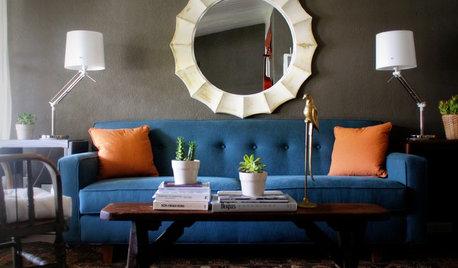
DECORATING GUIDESHot Color Combo: Cool Blues and Warm Brass
It's trending all over, but navy or royal blue with brass or gold just also might become a new classic pairing
Full Story
DECORATING GUIDESDecorating Advice to Steal From Your Suit
Create a look of confidence that’s tailor made to fit your style by following these 7 key tips
Full Story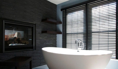
BATHROOM DESIGNDreaming of a Spa Tub at Home? Read This Pro Advice First
Before you float away on visions of jets and bubbles and the steamiest water around, consider these very real spa tub issues
Full Story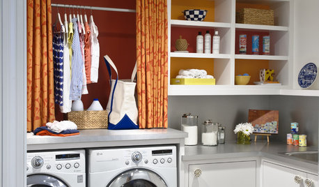
REMODELING GUIDESContractor Tips: Advice for Laundry Room Design
Thinking ahead when installing or moving a washer and dryer can prevent frustration and damage down the road
Full Story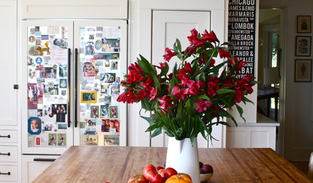
DECORATING GUIDES10 Design Tips Learned From the Worst Advice Ever
If these Houzzers’ tales don’t bolster the courage of your design convictions, nothing will
Full Story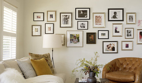
LIFEEdit Your Photo Collection and Display It Best — a Designer's Advice
Learn why formal shots may make better album fodder, unexpected display spaces are sometimes spot-on and much more
Full Story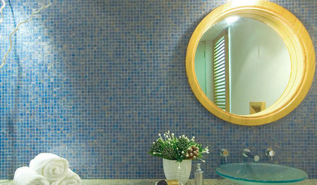
BATHROOM COLOR6 Bathroom Color Schemes That Will Never Look Dated
If you’d love to splash some color around your bathroom but fear it won’t stand the test of time, stick with these fail-safe combos
Full Story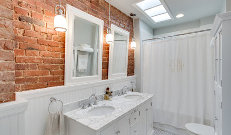
BRICKUse the Ruggedness of Brick to Warm Up Your Bath
Check out these stylish ways to add a bit of earthy character to the bathroom
Full Story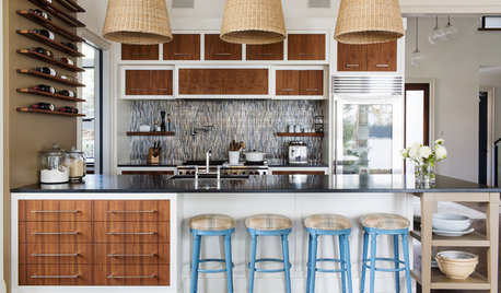
CONTEMPORARY HOMESHouzz Tour: Contemporary Canadian Lake House Warms and Welcomes
A northern Ontario home accommodates parties of 100 but is cozy enough for two
Full Story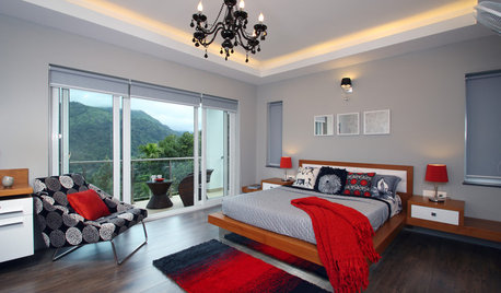
DECORATING GUIDESGreat Color Palettes: 8 Hot Bedroom Color Schemes
Go spicy, mild or a mix of both with warm and cozy hues in your bedroom
Full Story
elpaso1