


Cool or warm color for bedroom?
jockewing
12 years ago

Related Stories
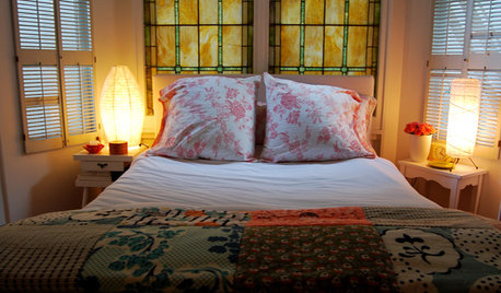
BEDROOMSWarm Up Your Bedding for Winter
Plain white, patchwork or plaid, an extra quilt or blanket brings the cozy, keeps the chic
Full Story
DECORATING GUIDES12 Warm-Weather Makeover Ideas for the Bedroom
Are your linens and bedroom decor still playing the heavy? Shed some visual weight for spring and summer with these decorating ideas
Full Story
COLORWarm Up to White All Around the House
Explore the many ways to design a white kitchen, bathroom, dining room or bedroom that's far from stark and sterile
Full Story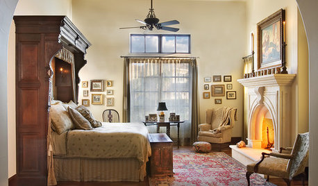
MORE ROOMSRoom of the Week: A Master Suite in a Warm, Mexican Style
Private foyer, hand-carved fireplace and confessional-booth headboard create a unique sanctuary
Full Story0
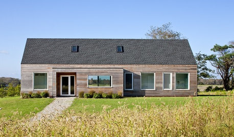
HOUZZ TOURSHouzz Tour: Bright, Sun-Warmed New England Getaway
Country views, flexible living space and a just-right size make for a soothing, comfortable family retreat
Full Story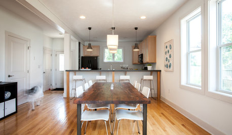
HOUZZ TOURSMy Houzz: Warm Minimalism in Pittsburgh
Clean lines and carefully edited furnishings are balanced by warm materials and creative DIY touches in a couple's new build
Full Story
HOUZZ TOURSHouzz Tour: Warm Minimalism in the California Wine Country
Mixing yellow pine and lots of sunshine with a simple design, this vineyard getaway is just right for its site
Full Story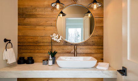
MOST POPULAR8 Reasons to Warm Up With a Wood Plank Wall
The accent finds a place in every room — adding focus, coziness, definition and more
Full Story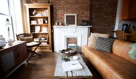
HOUZZ TOURSMy Houzz: Warm Industrial Style in a Brooklyn Apartment
Natural tones and travel-inspired mementos decorate this cozy Park Slope rental
Full Story
HOUZZ TOURSMy Houzz: Sentimental Favorites Warm Up a Vancouver Home
Keepsake furniture mixes with contemporary decor in a transitional-style home for a Canadian family with a baby
Full Story

les917
Bumblebeez SC Zone 7
Related Discussions
What Color for A North Facing Bedroom? Warm Colors?
Q
How to warm up this bedroom?
Q
Advice on how to warm up my master bedroom
Q
Wall art to warm up my bedroom?
Q
akrogirl
enduring
gmnolen
sashasmommy
sis2two
katrina_ellen
Mom2BoysWisconsin
susanlynn2012
jockewingOriginal Author
jockewingOriginal Author
busybee3
Valerie Noronha
zaara10
les917
jockewingOriginal Author
yayagal
Saypoint zone 6 CT
jockewingOriginal Author
loribee
jerseygirl_1
jerseygirl_1
beekeeperswife
busybee3
graywings123
abundantblessings
Saypoint zone 6 CT
abundantblessings
jockewingOriginal Author
ummm
abundantblessings
jockewingOriginal Author
sis2two
sewwhatsnew
jockewingOriginal Author
Lyban zone 4
jockewingOriginal Author
jockewingOriginal Author
Lyban zone 4
randita
nosoccermom
jockewingOriginal Author
mykingcomforter