


6 Bathroom Color Schemes That Will Never Look Dated
If you’d love to splash some color around your bathroom but fear it won’t stand the test of time, stick with these fail-safe combos
Jacquelene Symond
March 27, 2016
Houzz Australia Contributor. Architectural Colour Consultant, Trainer, Writer and PostGrad Psychology student
Houzz Australia Contributor. Architectural Colour Consultant, Trainer, Writer and... More
Bathrooms can be one of the most challenging rooms to overhaul. Renovating them can not only put a strain on your time and budget, but it puts the room out of commission while the work’s being done. No one wants to renovate their bathroom more often than necessary, and for this reason many people are afraid to use color — what happens if the colors you choose fall out of favor and affect the value of your house? But white isn’t the only way to downplay the risk. Here are six color combinations that will always be winners.
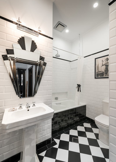
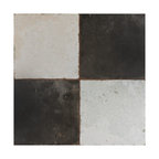
1. Black and white. This is a classic combo that became ultra-popular during the Art Deco period of the 1920s and ’30s. Bold black and white geometric shapes on floors and walls have stood the test of time. Use checkerboard tiles, chrome fixtures and silver-framed mirrors and you’ll have a look that’s as stylish now as it was then.
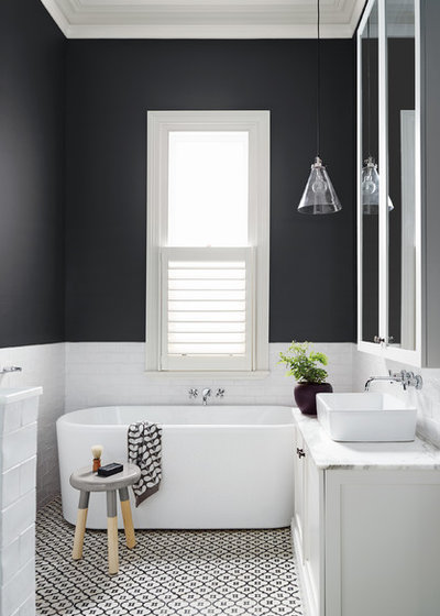
A contemporary bathroom design works just as well with a monochrome color scheme as one that’s more Art Deco. Charcoal walls add some dramatic flair in this Melbourne, Australia, bathroom.
Do: Jazz it up with some bold red or yellow towels and accessories.
Don’t: Make it too busy or fussy.
Do: Jazz it up with some bold red or yellow towels and accessories.
Don’t: Make it too busy or fussy.
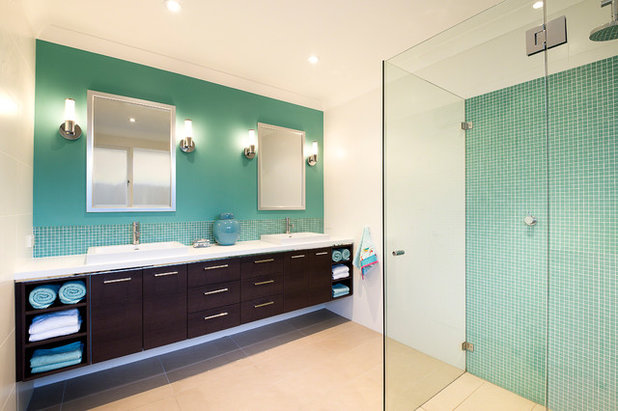
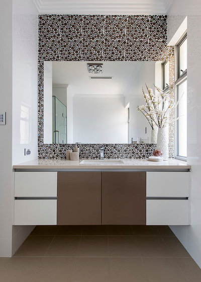
2. Aqua, chocolate and white. This combination is a nice balance between traditional and contemporary. Use aqua and white to make the room feel cool and airy, then add a deep chocolate vanity and beige flooring for warmth. If you’re going for a spa-like feel, this combo is a classic. Add aqua and white towels for extra luxury.
Do: Check the positioning of the lighting to ensure it doesn’t throw unflattering blue-green light on your skin.
Don’t: Use too much chocolate. Overindulgence is never a good thing.
Do: Check the positioning of the lighting to ensure it doesn’t throw unflattering blue-green light on your skin.
Don’t: Use too much chocolate. Overindulgence is never a good thing.
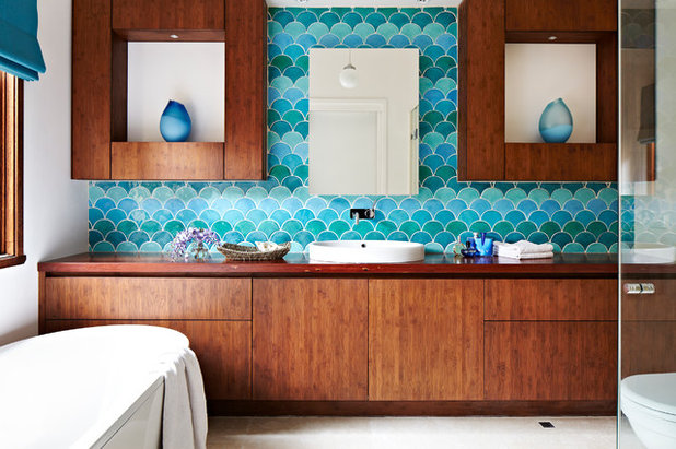
Natural wood can work as nicely as chocolate with this fail-safe color combo. This bathroom by Camilla Molders may be bold, but it won’t ever be outdated.
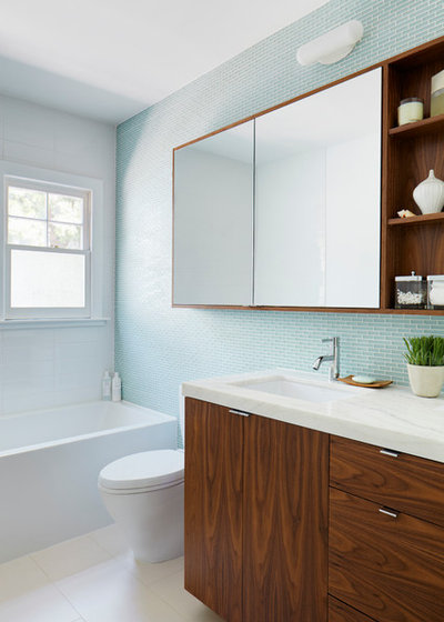
If aqua is a little too out there for your sensibilities, why not stick with the same color scheme but tone it down a notch or two?
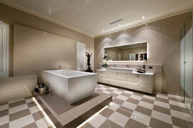
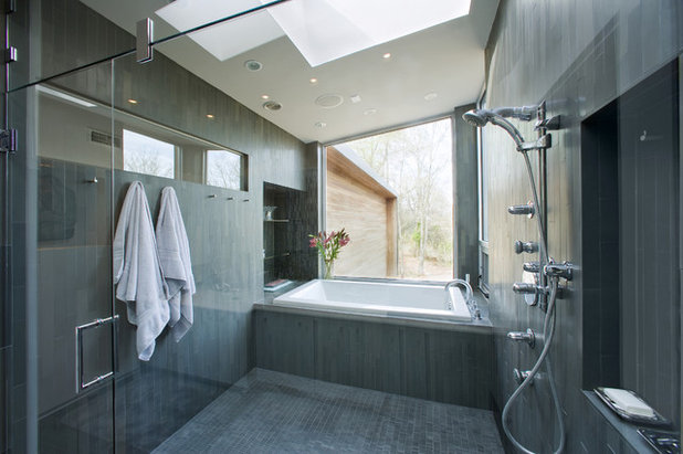
3. Mocha and creamy white. Mocha tones make this bathroom warm and inviting. Start your color palette with one shade of mocha and a creamy white, then layer with various espresso-inspired shades to create some movement and depth. Just remember that darker shades advance and lighter shades recede. Use blocks of color to highlight areas such as the bathtub to provide interest and direction within the room.
Do: Use a standout dark tone such as the one under this bathtub to ground and unite the color scheme.
Don’t: Add any bold or bright colors. They won’t work with this more subdued aesthetic.
Do: Use a standout dark tone such as the one under this bathtub to ground and unite the color scheme.
Don’t: Add any bold or bright colors. They won’t work with this more subdued aesthetic.
If you’re looking to cool the bathroom down a little and creamy white isn’t your thing, use a crisp white instead. Contrast it with a rich, warm mocha on the floor and bring it through to highlight the vanity and wall.
4. Monochromatic grays. To create a clean and simple look, add various shades of gray to keep your bathroom flowing and to provide depth and orientation. Add some fresh flowers or a lush and leafy potted plant and you’ll create a beautiful, classic environment.
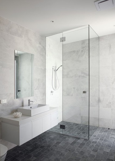
Carrara marble was first used in ancient Rome and has featured on many notable monuments and buildings ever since. The gray and white veining of the marble gives any bathroom a luxe look.
Do: Go for a quartz product offering a similar look if Carrara marble is out of your price range.
Don’t: Use gray if you find it depressing rather than soothing or uplifting.
Do: Go for a quartz product offering a similar look if Carrara marble is out of your price range.
Don’t: Use gray if you find it depressing rather than soothing or uplifting.
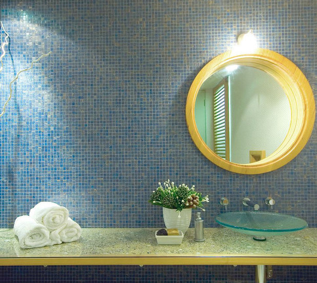
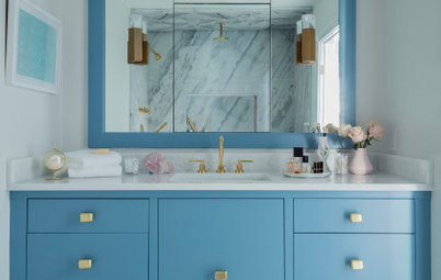
5. Blue and yellow. If you’re ever in doubt about color combinations that work, look to nature. Blue and yellow are a classic mix, akin to the sun rising in a clear blue sky.
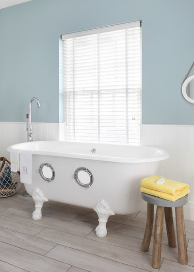
For a cooler feel, use sky or ocean blue as your dominant color and accent with bright yellow.
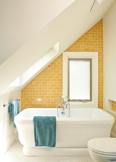
To warm your bathroom up a little, choose yellow as the dominant color through tiles or paint and accent with blue. Given its sunny disposition, this combo is great if you live by the water.
Do: Think about using traditional blue mosaic tiles, which don’t ever seem to grow stale.
Don’t: Overdo it with the yellow because it can become overbearing, particularly in a small room.
Do: Think about using traditional blue mosaic tiles, which don’t ever seem to grow stale.
Don’t: Overdo it with the yellow because it can become overbearing, particularly in a small room.
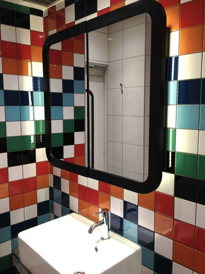
6. Double complementary colors. In color theory, this scheme just works. A pair of complementary colors (those that sit opposite each other on the color wheel, such as blue and orange) works well alongside another set of complementary colors (in this case, red and green). The result is called a double complementary color scheme.
Add black and white to bring the colors into balance and you’ll create a bathroom with wow factor. This combo is not for the faint-hearted but, if executed correctly, it will definitely go the distance.
Do: Be strategic with the placement of color to ensure the scheme is cohesive.
Don’t: Use this color combo if you don’t love it wholeheartedly — it won’t become outdated, but you might get sick of it.
Tell us: What color scheme have you used in your bathroom? Share your photos and favorite color combos in the Comments.
More: 20 Bathroom Wallpapers That Bring the Wow


Whatever your next project may entail, Whisler Home Improvement is here to help. We are committed to treating our... Read More
What are you working on?
Related Products
Custom Home Works is a full-service Ohio contracting company specializing in high quality custom design, building... Read More
Related Stories
Powder Rooms
Powder Room Palettes: 10 Great Color Options
See how paint, tile and wallpaper in 10 colorful shades add style, drama and fun to these powder rooms
Full Story
Color
8 Ways to Use White in the Bathroom
By Jennifer Ott
See how to incorporate this popular color in your bathroom while avoiding a clinical look
Full Story
Trending Now
8 Beautiful Blue Powder Rooms From Spring 2020’s Top Photos
See how this classic color can add style, surprise and serenity in various ways to a small space
Full Story
Color Palettes
7 Beautiful Blue Paint Colors for Bathrooms
By Jennifer Ott
Whether it’s soothing or sophisticated, you really can’t go wrong with a blue hue in the bath
Full Story
Bathroom Design
10 Bathrooms With Big, Bold Color
By Jennifer Ott
For a not-so-subtle approach to bath design, try a revved-up red, feisty yellow or leafy green
Full Story
Bathroom Design
Blue Makes a Refreshing Splash in These 10 Bathrooms
By Janet Paik
Get ideas for adding this calming hue through striking tile designs, wallpaper and vanities
Full Story
Powder Rooms
Powder Room Palettes: 10 Browns That Go Beyond Neutral
See how paint, tile and wallpaper in shades of brown bring beauty to these powder rooms
Full Story
Powder Rooms
Powder Room Palettes: 10 Beauties in Black
See how paint, tile and wallpaper in sexy shades of black spruce up these powder rooms
Full Story

Powder Rooms
Powder Room Palettes: 10 Handsome Dark Blues
See how paint, tile and wallpaper in shades of dark blue bolster these powder rooms
Full Story
Powder Rooms
Powder Room Palettes: 10 Pinks That Pop
See how paint, tile and wallpaper in shades of pink prettify these rooms
Full Story
@Raquel,
I was advised not to use anything on the treated side and definitely not to clean glass with the product you used but that could just be a sales pitch. I was told the easiest and best glass cleaner, although not a natural alternative, is metho and have started using it for far better results on my mirrors and windows and especially love no smears like you can get with other glass cleaning products
Don't those white bricks in the first make you shiver at the thought of taking your clothes off? And doesn't the blue and yellow scheme near the end make you feel warm enough to get undressed?
"Don’t Use grey if you find it depressing rather than soothing or uplifting." Well said!!! Living in a country that normally has grey weather, why do we need so much grey indoors as well? Am I unusual in feeling happiest on sunny days, or in the presence of bright colours?
That first mocha room! Why do we see so many millionaires' homes? Even my master bedroom's not that size and the bathroom of course is even smaller - but I shudder at the thought of heating bills for a bathroom big enough to be a ballroom (nearly)!
Love the aqua room, with those scales! :-) Blue and yellow is great as well. As for complimentary colours, as an artist I use them whenever I can. :-) That sets me thinking. The most attractive pair of complimentary colours of all are, in my opinion purple and yellow, but I've yet to combine purple with yellow in furnishing...
Wow! I love it but I don’t like the window....l patterns on window are not my thing