


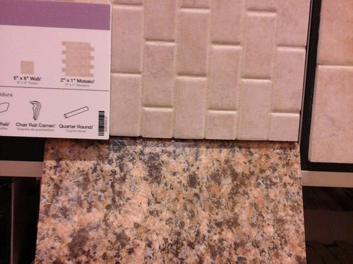
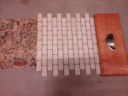
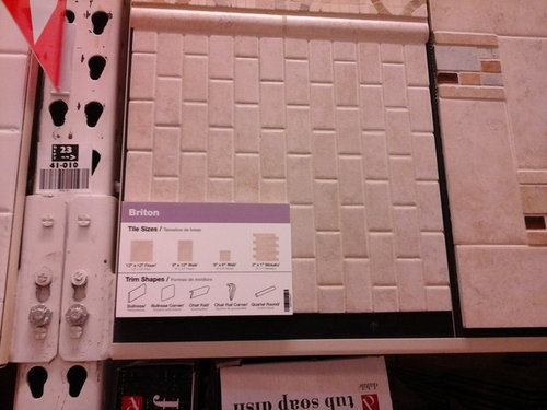
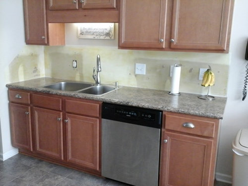
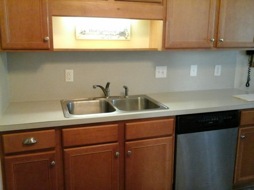
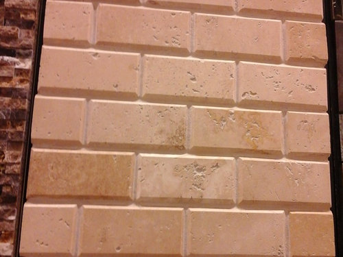
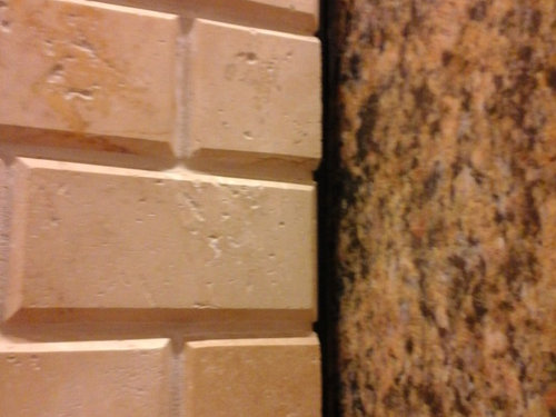
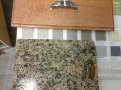
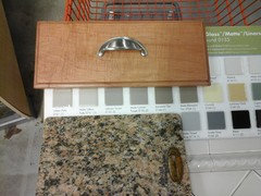
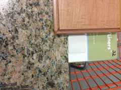
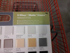
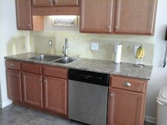
Still need help choosing backsplash tile
CJ Mac
8 years ago
last modified: 8 years ago
Featured Answer
Sort by:Oldest
Comments (16)

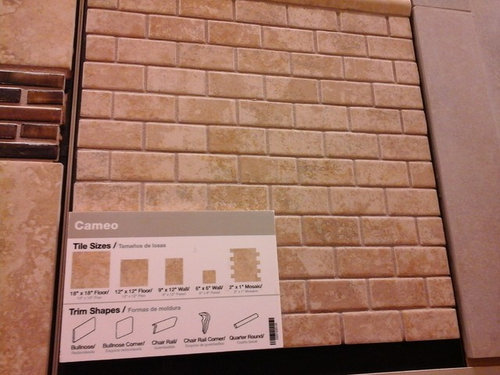
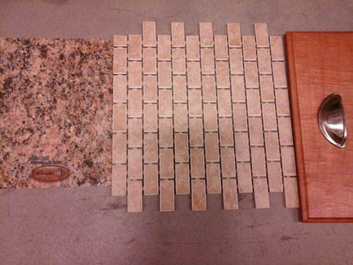
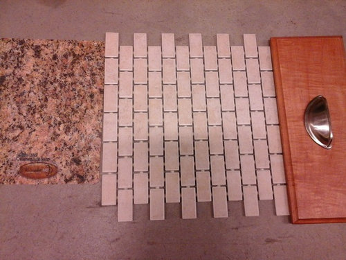
CJ Mac
8 years ago
localeater
8 years agoRelated Discussions
Need help choosing backsplash - pics included!
Comments (101)It's still a side splash, which I typically wouldn't tile, even though there's a cab over it. But you have a sink nearby. The granite looks tight to the wall, so I think caulk and a washable paint is enough protection from occasional splashing. If you leave standing water from draining dishes, I'd tile, but I doubt you do that with white granite. You could tile it the height of the raised bar, which I think is what you intend with your finger placement. But that leaves a small area of wall between the tile and cabinet, which would look like you ran out of tile if it were done on a row of cabinets. So you could do just two rows of tile. I would bring it to the end of the counter in that case, but normally I'd say stop at the upper cabinet. Tape some up and let's see what looks best....See MoreNeed help choosing backsplash tile color
Comments (2)The oiled pic didn't come through : ( Your kitchen is really great! A lot of things would go with it. It's so pretty and timeless. Do you like modern or more traditional type of tiles? What is the style of the rest of your home?...See MoreNeed Help to Choose Backsplash for My Kitchen, Please Provide Feedback
Comments (6)Do you have any inspiration images? I know you think you've found great options, but I think it might be helpful to you to read some of the collected wisdom here on bs selection and start your search with fresh eyes. This is proposed as a backsplash addition to the New to Kitchens FAQ. To the age old question, "Do I need a backsplash?" the short answer is yes. You need some sort of backsplash in wet zones to protect your walls, cabinets floors and subfloors from deterioration due to water infiltration, and in your cooking zone to protect your drywall from cooking oils, spills, odors, and cleaning chemicals. That said, plenty of houzzers have chosen not to have a backsplash, or to delay the choice for budgetary or other reasons. Search for threads with ABB (all but backsplash) in the titles to check those out. How does one choose a backsplash? First, like every other process here, we encourage you to do some research on your own, then post your particulars and ask for feedback. One fundamental question you must consider before all others is whether your counter material or your backsplash will be the focus of your space. Consider images of kitchens with busy counters, and those with commanding backsplashes, and decide which you prefer. Bold counters and tile rarely work well together. To Wait or Not To Wait Buying your bs material when you buy your other finishes might prevent delays down the road and could help with electrical outlet placement. Drawbacks include that you are making decisions on colors and finishes based on samples, sample cabinet fishes, sample counter swatches, etc... and that samples don't always represent the final product accurately. Waiting to buy your bs materials until you have had your counters installed allows you to see sample tiles in your space in your light throughout the day with your actual installed materials. If your cabinets are warmer than you expected, or your counter cooler, you are free to search for a bs material that can pull things together. The only drawback to waiting is that you may have to wait for tiles to be fabricated or to arrive, causing possible delays in the completion of your space. The majority wisdom on this site favors waiting if that is possible. Regardless of which approach you choose, you should consider your bs as one part of a whole picture of your beautiful new space. Inspiration Images These really help you to focus on what your kitchen as a whole will look like. They also give the folks responding to your queries an idea of what looks you like, so they won't recommend white subway tiles if all your inspiration images feature handpainted Mexican tile. Google images of kitchens with your other materials (white cabinets, walnut floors, etc...) and select which ones you like the look of. What type of bs do they use? The idea is not to copy the look, but to get a feel for looks you like, and communicate those looks to others. Budget Finally, we'll need an idea of a materials budget. Installation can account for half of the budget for a backsplash, so take that into consideration in your planning, and deduct accordingly, and let us know how much you want to spend in $/sf for your materials? It's not very helpful falling in love with a handmade tile in a custom glaze if it costs $100/square foot and your budget for tile is $10/sf, but houzz members are fantastic at finding similar (and occasionally the same) tiles for less money. Without budget numbers it is very difficult for us to truly be of help to you. How we can help. The way it works is that we can recommend a surface (usually tile, sheet glass, metal, slab stone or laminate), advise against a choice (color, or busy-ness are the usual reasons), provide you with layout and pattern feedback, and images you might have missed of materials that have worked for us or caught our eye. "How can I find a bs tile to go with my green floors, counters, and purple cabinets" The answer might be that you have to paint your cabinets or change your floors to make it right, or maybe some houzzer somewhere will show you an image of a kitchen with a painted tin backsplash that pulls it all together. It has happened before. Some houzz members are great at photoshopping images together to give you an idea of what a small sample of tile might look like in your space. It is time and effort on their part that can be truly helpful. Remember to say thanks. I hope we can be helpful!...See MoreAdvice Needed on Kitchen Tile Back-Splash and LVT/LVP Flooring Color
Comments (5)Hi Chispa, House is a townhouse built in 1996, trying to modernize the look. As far as decorating style, I like modern/contemporary, nothing too funky. Something that would be cohesive with the rest of the kitchen, and bring the kitchen to life a little. It's very white right now....See MoreCJ Mac
8 years agoCJ Mac
8 years agolast modified: 8 years ago
Texas_Gem
8 years ago
mark_rachel
8 years ago
romy718
8 years agoCJ Mac
8 years agoktj459
8 years agoKaren Eagle
8 years agoromy718
8 years agoCJ Mac
8 years agomark_rachel
8 years agoCJ Mac
8 years agoCJ Mac
8 years ago
Related Stories
REMODELING GUIDESHouse Planning: How to Choose Tile
Glass, Ceramic, Porcelain...? Three Basic Questions Will Help You Make the Right Pick
Full Story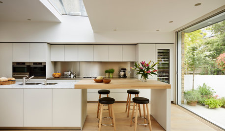
MATERIALSKitchen Ideas: How to Choose the Perfect Backsplash
Backsplashes not only protect your walls, they also add color, pattern and texture. Find out which material is right for you
Full Story
KITCHEN BACKSPLASHESHow to Choose a Backsplash for Your Granite Counters
If you’ve fallen for a gorgeous slab, pair it with a backsplash material that will show it at its best
Full Story
TILEHow to Choose the Right Tile Layout
Brick, stacked, mosaic and more — get to know the most popular tile layouts and see which one is best for your room
Full Story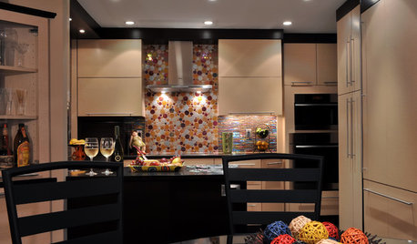
KITCHEN DESIGNChoosing a Backsplash: What's Your Personality Type?
10 Tile Styles That Say a Little Something About You
Full Story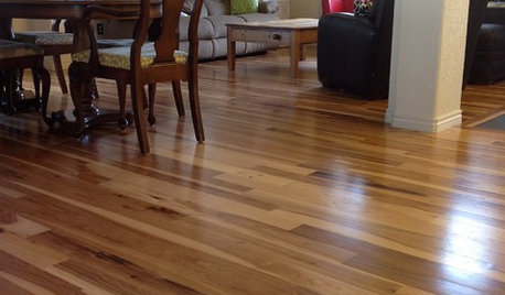
MATERIALSWhat to Ask Before Choosing a Hardwood Floor
We give you the details on cost, installation, wood varieties and more to help you pick the right hardwood flooring
Full Story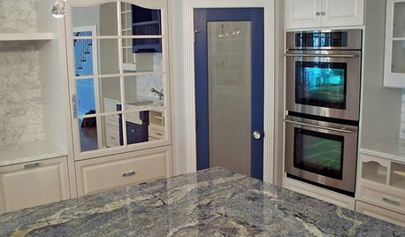
KITCHEN COUNTERTOPSKitchen Counters: Granite, Still a Go-to Surface Choice
Every slab of this natural stone is one of a kind — but there are things to watch for while you're admiring its unique beauty
Full Story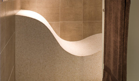
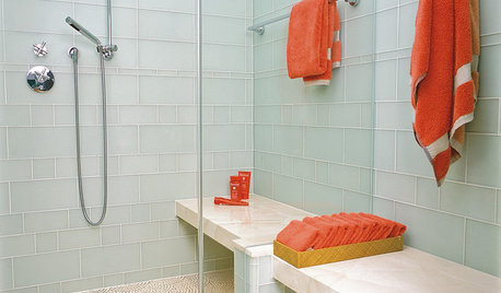
REMODELING GUIDESTop 10 Tips for Choosing Shower Tile
Slip resistance, curves and even the mineral content of your water all affect which tile is best for your shower
Full Story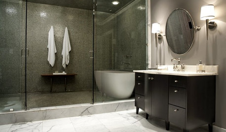
BATHROOM DESIGNHow to Choose Tile for a Steam Shower
In steamy quarters, tile needs to stand up to all that water and vapor in style. Here's how to get it right the first time
Full Story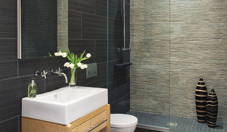
REMODELING GUIDESChoosing Tile: Durable, Versatile Porcelain
Get the Look of Stone, Metal, Terracotta and More With Today's Porcelain Tile
Full Story


Texas_Gem