


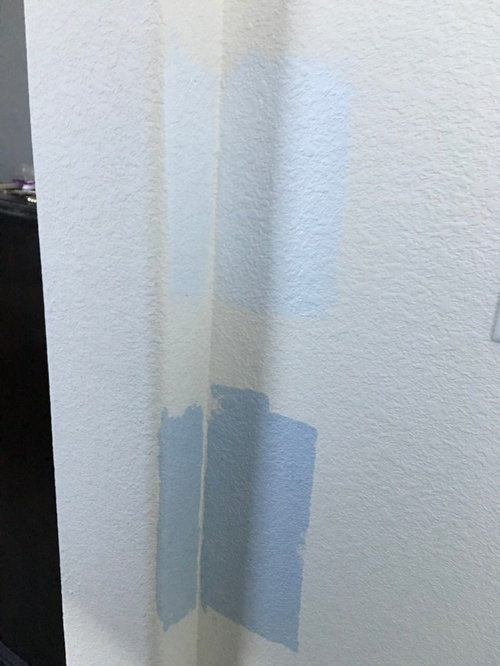
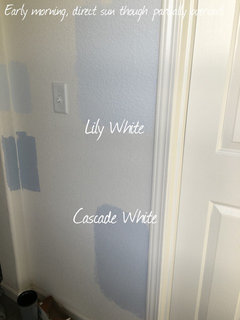
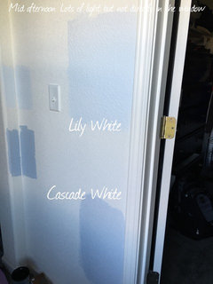
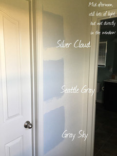
SO bummed...color problems
User
8 years ago
Featured Answer
Sort by:Oldest
Comments (55)

heatheron40
8 years ago
graywings123
8 years agoRelated Discussions
The problem with Coral Trees in So Cal
Comments (8)The Coral tree shouldn't get all the blame here... It looks like it was getting lawn irrigation which encourages fast weak growth, the multiple trunks are a known case of creating a weaker crotch subject to wind damage, and aan overly large growing weak woods tree species was planted in a location not really appropriate for the size and nature of the tree. I'd second the plug for E. x bidwillii, but in my experience here in the SF Bay Area it is more a shrub than a tree. I also find species such as E. coraloides slower growing and less dangerous specimens which I've used locally. I also find the idea of European white birch trees inappropriate for most California conditions; almost always subject to constant aphid and borer infestations and looking rather pathetic unless very well watered. I had a few things come crashing down here in my garden with our northern California version of Santa Ana winds here, but it was just smaller light weight limbs from tree dahlias and Iochromas. Not heavy enough to do any damage in the garden, but still a surprise to have to clean up afterwards. I'm glad our local Diablo winds aren't particularly fearsome, as we'd have a lot more downed trees here if they were....See Moreso funny, so true: first world problems
Comments (20)So funny. DH and I were both so annoyed the other night because the TV remote seemed to be dying. I was able to step back and laugh at the situation pretty quickly. DH, a little less so! The sad thing is that it took us a while to figure out how to turn off the TV without a remote! A couple of years ago when we were having our beach cottage renovated, we were regularly p.o.'ed at the delays but we were both able to laugh and say, "yeah, poor us, it's going to take an extra few weeks to custom rebuild our beach house!" The sad thing is, there are so many people out there who can't step back and put it in perspective....See MoreComputer problems so won't be
Comments (2)Check the connection on the monitor. Unplug it and plug it back in a few times. Could just be a bad connection. Also do the same with the power cord. Is it going into power saving mode by chance? Or is your screen saver just set to a blank screen?...See MoreSo I've been thinking about my no vent problem...
Comments (32)My DD informed me this morning that a long stretch of counter at the back of the kitchen would look "weird" and just get covered with stuff, THE NERVE! It's like she knows me or something. It's weirder to have a long, useful counter cut in two by a vertical element. Show her the NKBA guidelines--a budding kitchen designer is never too young to learn. ;) Guideline #3 (In part): A major appliance and its surrounding landing/work area form a work center. The distances between the three primary work centers (cooking surface, clean-up/prep primary sink, and refrigeration storage) form a work triangle. Guideline #4: A full-height, full-depth, tall obstacle should not separate two primary work centers. (Examples of a full-height obstacle are a tall oven cabinet, tall pantry cabinet, or refrigerator) If the oven cabinet is directly adjacent to the fridge, it becomes part of that work center--you move items from the fridge to the counter beside the ovens, then have a clear field to the cooktop. That long counter would be useful for staging baking trays for making cookies, lining up and landing multiple dishes going to/from the ovens for large holiday meals, and assembling school and work lunches....See Morejpmom
8 years ago
tibbrix
8 years agolast modified: 8 years agoUser
8 years agoUser
8 years agoUser
8 years agoUser
8 years ago
Errant_gw
8 years ago
Linda Doherty
8 years agolast modified: 8 years agoUser
8 years ago
Michael
8 years agotibbrix
8 years agoUser
8 years agoUser
8 years ago
mark_rachel
8 years agotibbrix
8 years ago
raee_gw zone 5b-6a Ohio
8 years agoUser
8 years agoMichael
8 years agosjhockeyfan325
8 years ago
lisa_mocha
8 years agolast modified: 8 years agoMichael
8 years agolast modified: 8 years agolascatx
8 years agolast modified: 8 years agoblumster4734
8 years ago- PRO
shay_fox
8 years ago User
8 years agolast modified: 8 years ago
amykath
8 years agolascatx
8 years ago
eastautumn
8 years ago
cawaps
8 years ago- PRO
shay_fox
8 years ago User
8 years agoUser
8 years agoUser
8 years agobusybee3
8 years agolast modified: 8 years agomark_rachel
8 years ago- PRO
shay_fox
8 years ago Elizabeth Z
8 years ago
lizzierobin
8 years agoUser
8 years agoUser
8 years ago
Kristin Elias
2 years ago
Yvonne Barcewski
2 years agoHU-150484164
2 years agoYvonne Barcewski
2 years agoYvonne Barcewski
2 years agoHU-150484164
2 years agoYvonne Barcewski
2 years ago


Related Stories

BATHROOM DESIGNBath Remodeling: So, Where to Put the Toilet?
There's a lot to consider: paneling, baseboards, shower door. Before you install the toilet, get situated with these tips
Full Story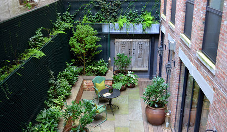
LANDSCAPE DESIGNProblem Solving With the Pros: How to Build a Garden in an Urban Canyon
Skyscrapers, noise and deep shade create an unlikely sweet spot for a timeless green retreat in New York City
Full Story
DECORATING GUIDESSolve Privacy Problems With Window Film
Let the light in and keep prying eyes out with an inexpensive and decorative window film you can apply yourself
Full Story
FURNITURESlipcovers: Problem Solvers With Style
9 Great Ways to Change Up Your Look With the Ever-Practical Slipcover
Full Story
REMODELING GUIDESThe Hidden Problems in Old Houses
Before snatching up an old home, get to know what you’re in for by understanding the potential horrors that lurk below the surface
Full Story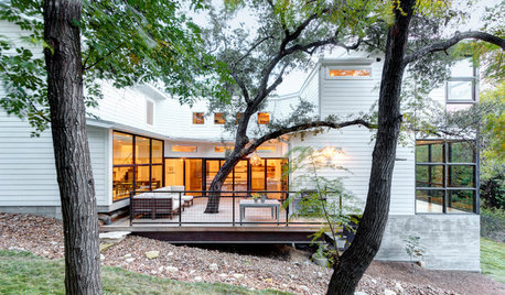
ECLECTIC HOMESHouzz Tour: Problem Solving on a Sloped Lot in Austin
A tricky lot and a big oak tree make building a family’s new home a Texas-size adventure
Full Story
HOUSEKEEPING10 Problems Your House May Be Trying to Show You
Ignore some of these signs and you may end up with major issues. We tell you which are normal and which are cause for concern
Full Story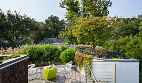
LANDSCAPE DESIGNProblem Solving With the Pros: Sustainable Landscape Captures Runoff
An underground cistern, permeable paving and a rain garden are part of this Washington, D.C. yard's thoughtful design
Full Story
LANDSCAPE DESIGNProblem Solving With the Pros: Rustic Simplicity in a Country Garden
Editing thoughtfully and adding some magic result in a timeless weekend retreat
Full Story
FEEL-GOOD HOMEBack Problems? Try Putting Your Feet Up
Consider these alternatives to that one-size-doesn’t-fit-all sofa to avoid slumping and spinal stress
Full Story


UserOriginal Author