


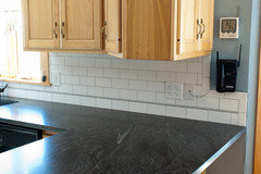
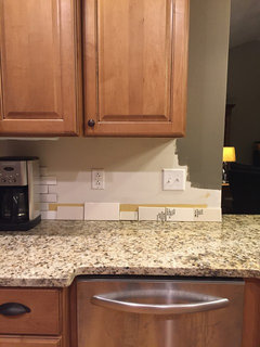
Looking for help choosing color of tile for backsplash...
pschr
8 years ago

Featured Answer
Sort by:Oldest
Comments (42)
Related Discussions
Need help with choosing backsplash tile please!
Comments (11)Bill, you clearly need some crab or gingko dear! LOL (As your new OCD friend I can say these things *winks*!) Traci can't get those first tiles because they have been discontinued. Do you know of a different tile company that makes something similar? She would love those first tiles, actually she DID love those first tiles until she found out that the sample the company sent had been discontinued. Traci, I hope I didn't put words in your mouth, but that's what you are asking right? If anyone knows of a different source for the first tiles? I do like those first ones with the mother of pearl type tiles mixed in, but I also think the second one you found would also be pretty! When I get back from running errands I'll try to see if I can help you find those other ones. There was no identifying info anywhere on the sample? Not a number of any sort or color name? Kat :)...See MoreNeed help choosing backsplash tile color
Comments (2)The oiled pic didn't come through : ( Your kitchen is really great! A lot of things would go with it. It's so pretty and timeless. Do you like modern or more traditional type of tiles? What is the style of the rest of your home?...See MoreStill need help choosing backsplash tile
Comments (16)ktj, I finally got a sample of the cameo today. I didn't really like it in the store and I liked it even less at home. For some reason they put more of the color "gunk" on it than they do with the Britton. If it had a lot less of the added color, it might not be so bad. The thing I really can't figure out is why in the store display--hanging vertically--the Britton bone has a much warmer tone to it and looks like it would go perfectly. But when you pick up a sample and look at it horizontally--or at my home in natural light--it has a very stark white/gray look. It's better than the Cameo but I need something with a bit of warmth....See MoreLooking for help choosing an entryway floor tile
Comments (1)Hi there - I can't seem to find a tile that gets me excited for this stairway landing. We just replaced the back door, and this landing is at the top of our basement stairs. The stairs and the floor leading to the landing are both white oak. I like 12x24 solid-color porcelain tiles, but I can't find a color that looks great. The square brown tile is too big, I think (the landing is only 3' x 3') and too close to the color of the wall without matching. The lighter colors just seem... wrong to me. We have a dark brown constrast wall that you can see here- the other walls nearby are a caramel color; trim is white. Does anyone have great ideas? Thanks in advance!...See More
pschr
8 years agopschr
8 years agopschr
8 years agopschr
8 years agopschr
8 years agopschr
8 years agopschr
8 years agoeld6161
8 years agopschr
8 years agopschr
8 years ago
a2gemini
8 years ago
Carrie B
8 years agoUser
8 years agopschr
8 years agoisabel98
8 years agopschr
8 years agopschr
8 years agopschr
8 years agolast modified: 8 years agopschr
7 years ago


Related Stories
REMODELING GUIDESHouse Planning: How to Choose Tile
Glass, Ceramic, Porcelain...? Three Basic Questions Will Help You Make the Right Pick
Full Story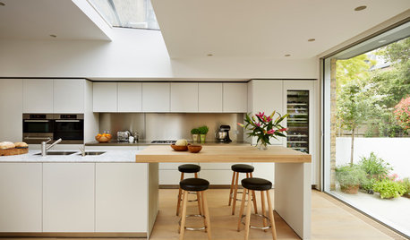
MATERIALSKitchen Ideas: How to Choose the Perfect Backsplash
Backsplashes not only protect your walls, they also add color, pattern and texture. Find out which material is right for you
Full Story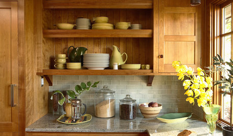
KITCHEN BACKSPLASHESHow to Choose a Backsplash for Your Granite Counters
If you’ve fallen for a gorgeous slab, pair it with a backsplash material that will show it at its best
Full Story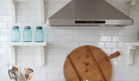
TILEHow to Choose the Right Tile Layout
Brick, stacked, mosaic and more — get to know the most popular tile layouts and see which one is best for your room
Full Story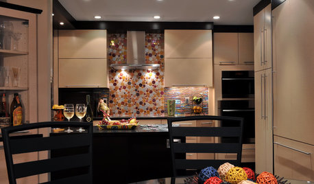
KITCHEN DESIGNChoosing a Backsplash: What's Your Personality Type?
10 Tile Styles That Say a Little Something About You
Full Story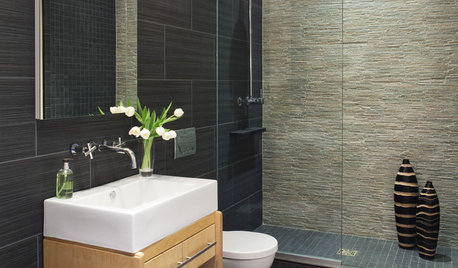
REMODELING GUIDESChoosing Tile: Durable, Versatile Porcelain
Get the Look of Stone, Metal, Terracotta and More With Today's Porcelain Tile
Full Story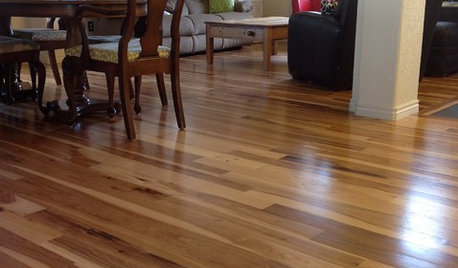
MATERIALSWhat to Ask Before Choosing a Hardwood Floor
We give you the details on cost, installation, wood varieties and more to help you pick the right hardwood flooring
Full Story
GRAYChoosing Color: Give Me More Gray Days
Layer On the Grays for a Sophisticated Look in Any Room
Full Story
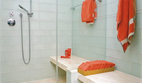
REMODELING GUIDESTop 10 Tips for Choosing Shower Tile
Slip resistance, curves and even the mineral content of your water all affect which tile is best for your shower
Full Story


pschrOriginal Author