


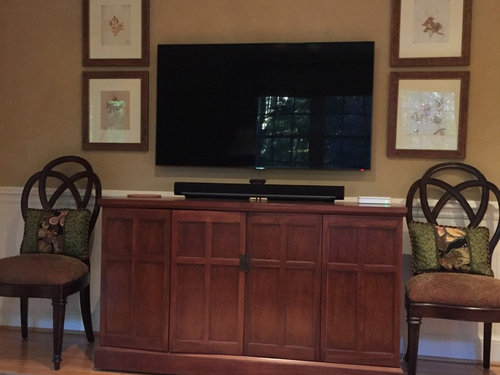
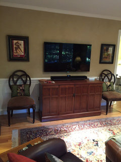
How can I make this TV wall look better?
jjam
8 years ago
Featured Answer
Sort by:Oldest
Comments (69)

User
8 years agolast modified: 8 years agojjam
8 years agoRelated Discussions
How can I make this look better?
Comments (8)I like the idea of removing all the plants laying gravel or pavers, I was thinking that would probably be the best way to control the weeds. The fountain needs a new pump but will work just fine once it has one, I was thinking I might wait on that until I get the dirt covered. I'll have to move the fountain out of the way to do that and was wondering if it might be better placed somewhere else? There is an entrance hatch to the underfloor of the house right next to the fountain, it's kind of an eyesore but needs to remain accessible. I was thinking of getting a wrought iron table that would straddle it to make it less obvious. I was also thinking of getting a nice looking rain barrel to put at the end with the gutter. I want to strike a balance between busyness and barrenness, I'd like the fountain to be the focus without it sitting alone on a gray stretch of rock. I'm also wondering about the heights of things, should I look for some of those iron plant stands so that the fountain is not so much taller than everything else? Hostas aren't very well suited to my climate, we have to conserve water so I try to limit my 'heavy drinkers' to things that I can't live without - like veggies and roses. I'm thinking that Spider Plants will do well there, they don't mind the shade and are fine with minimal watering. I have some in a similar spot and they are happy and sending out lots of little babies, so maybe I'll just take some cuttings and see how they do. Thanks for the suggestions, please give more : )...See MoreHow can I make my house look better?
Comments (17)It looks like the "front" (view) side has vertical siding. Is that the same as the "back" side? So that the horizontal and little bits of diagonal siding are only on the gabled ends? If so, I'd consider swapping out the siding on the garage end (and the far end, possibly, if it matters) to be vertical siding that matches the long sides. The funny bits of white trim can go, and I would also lose the contrasting corner trim (paint it to match the body of the house). If you don't need the light from the two windows above the garage, consider losing those as well. Maybe replace with a simple vent. If you're wanting to reside completely, I think a vertical board-and-batten looks great on a California ranch. Here's a thread from another board that shows a ranch with original B&B siding. If you scroll down you'll see a photoshop where someone has made the garage door B&B as well, so it all blends together. And way toward the bottom you'll see it painted in a dark gray. I think this type of siding works well with darker colors. Here is a link that might be useful: Board and Batten ranch....See MoreHow can i make my room look better?
Comments (8)Your idea books show your love of traditional library decor and rich colors. I think. That your current wall color, however, clashes with the lovely color of your new sofa bed. And you do seem to have too much furniture in the room at this point. I think that I would, first, strip all of your wall paper and prime your walls. Then I would fin a traditional oriental style rug for your room and center it. From the rug, I would choose a complimentary color for your walls. Then....I would begin to build your room. The perfect location for your “library area” would be in the nook where your sofa currently resides. The entire wall could be book shelves. What kind of storage does your room require? (There is no closet.). Do you need the little glass cases in the corner? If you need a dresser for guests, the large dresser will work. You could place the tv on it or hang it on the wall above it. Your sofa needs end tables with reading lamps on it. I think the sofa would look best on the top wall in the room. Centered. The TV on the left wall as you enter it. And the room could use a chair in which to sit and read, too. Located close to the window with the radiator on the right, and in front of your library wall. This is a one step at a time project. But I would start with finding a lovely rug for your room that works with the sofa. Good luck!...See MoreWall TV in kitchen looks worse than I expected. Can you help pls?
Comments (71)You could build a niche in the wall to recess the TV. When we renovated our master bath we recessed a large medicine cabinet with an integrated electrical outlet. Seems you could do that here too. It isn't complicated. Painting the wall a dark colour will make the TV "disappear" and will accentuate the sconces. This will work whether or not you use a shelf and/or recessed niche. http://blog.sanus.com/why-your-tv-wall-is-practically-made-for-the-dark-wall-trend...See More
Ziemia
8 years agolast modified: 8 years ago
just_terrilynn
8 years agoamberm145
8 years agokatrina_ellen
8 years agoUser
8 years agolast modified: 8 years agok9arlene
8 years ago
Annie Deighnaugh
8 years agopatty_cakes42
8 years agoZiemia
8 years ago
l pinkmountain
8 years agojjam
8 years ago
ghostlyvision
8 years agoannztoo
8 years agocliff_and_joann
8 years agooaktonmom
8 years agojjam
8 years agojjam
8 years agoghostlyvision
8 years ago
shopping101
8 years agocliff_and_joann
8 years agoZiemia
8 years agoUser
8 years agoUser
8 years agolast modified: 8 years agoUser
8 years agolast modified: 8 years agojust_terrilynn
8 years agojjam
8 years agojust_terrilynn
8 years agojjam
8 years agojust_terrilynn
8 years agolast modified: 8 years agojjam
8 years agojust_terrilynn
8 years agolast modified: 8 years agoUser
8 years agojjam
8 years agojjam
8 years agoZiemia
8 years agojjam
8 years agojjam
8 years agoUser
8 years agolast modified: 8 years ago
lisa_mocha
8 years agolast modified: 8 years ago
amykath
8 years agojjam
8 years agoUser
8 years agojjam
8 years agoUser
8 years agojjam
8 years agoUser
8 years agolast modified: 8 years agoZiemia
8 years agojjam
8 years ago


Related Stories
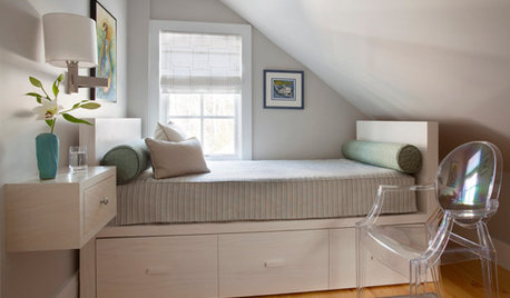
BEDROOMS7 Ways to Make a Small Bedroom Look Bigger and Work Better
Max out on comfort and function in a mini space with built-ins, wall mounts and decorating tricks that fool the eye
Full Story
MOVINGRelocating? Here’s How to Make the Big Move Better
Moving guide, Part 1: How to organize your stuff and your life for an easier household move
Full Story
MOST POPULAR12 Key Decorating Tips to Make Any Room Better
Get a great result even without an experienced touch by following these basic design guidelines
Full Story
DECORATING GUIDES8 Ways to Make What You Have Better
You don’t necessarily need a full reset. Try building on the things you already own to create fresh new decor
Full Story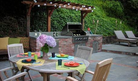
MOST POPULAR8 Ways to Improve Your Grill Setup
Rethinking the old grilling station? Here’s how to pack more function and style into your backyard cooking zone
Full Story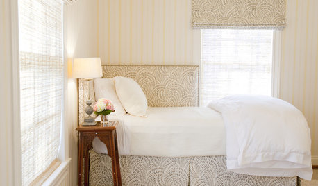
BEDROOMS14 Ways to Make Better Use of Bedroom Corners
These spots were made for nestling, storing, displaying and enjoying. Are you making the most of them?
Full Story
FEEL-GOOD HOMEThe Question That Can Make You Love Your Home More
Change your relationship with your house for the better by focusing on the answer to something designers often ask
Full Story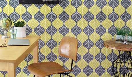
WALL TREATMENTSCan't Find the Right Wallpaper? Make Your Own
For one-of-a-kind walls, just use your imagination. Custom wallpaper is easier and less expensive than you might expect
Full Story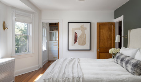
FEEL-GOOD HOME10 Ideas to Make Every Day at Home a Little Better
Consider some simple changes and fun tips for brightening your world
Full Story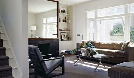
LIVING ROOMSIdeabook 911: How Can I Make My Living Room Seem Bigger?
10 Ways to Make a Small Space Live Large
Full Story


User