


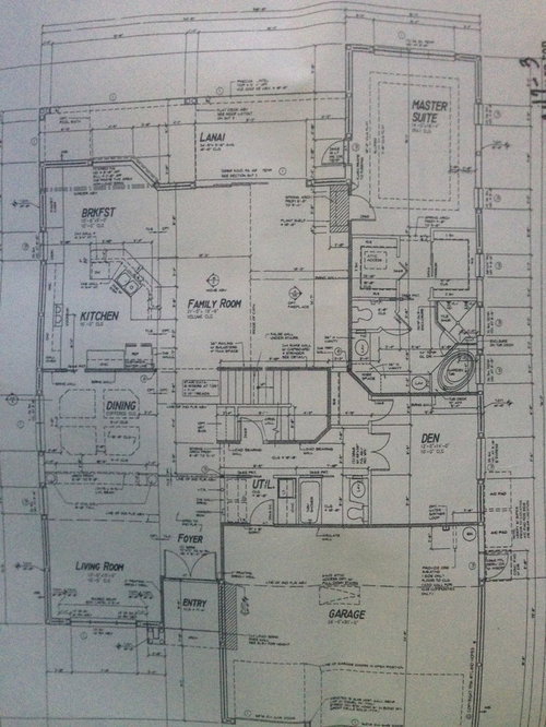
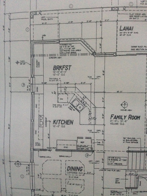
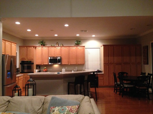
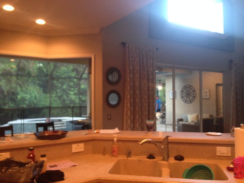
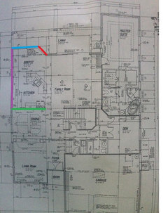
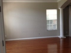
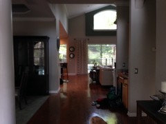
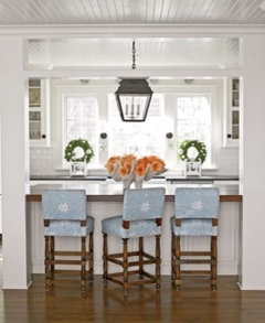
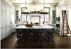
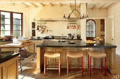
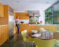
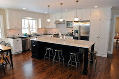
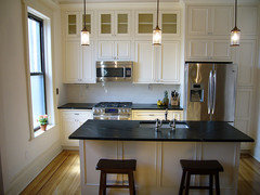
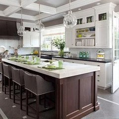
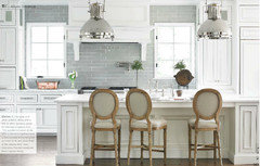
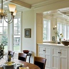
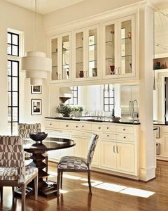
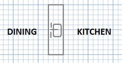
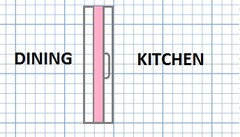
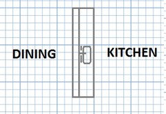
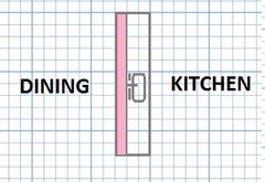
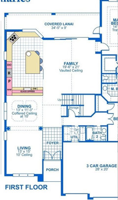
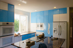
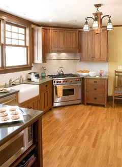
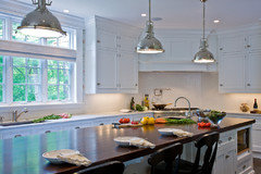
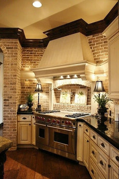
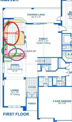
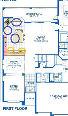
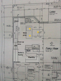
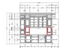
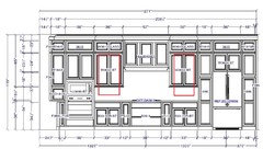
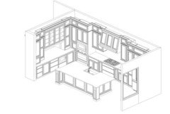
Do I start over with my design and scrap months of work and money?
Erica L
8 years ago
Featured Answer
Sort by:Oldest
Comments (47)

Jillius
8 years ago
rebunky
8 years agoRelated Discussions
Do I need to start all over? HELP!!
Comments (13)I bought my grass seed from a very reputable nursery - it is the exact same mix they sell to sod farms, and know this weed is just in my dirt, because it pops up in my garden when I water as well. So the seed isn't the problem. I've mowed it a few times now, and it is encouraging to see good grass mixed in with the weeds. Some weed killer, fertilizer, and more time will win the fight I think. Thanks to everyone who replied....See MoreHelp PLEASE! I started lasagna, do I need to start over?
Comments (6)Not to worry Mari. As others have said tilling is not necessarily needed. My tiller was never effective in this rocky, hard clay and usually just bounced all over creation so I stopped trying. I've been doing exactly what you did for the last two years with great results. I'm slowly reclaiming what I thought were impossible areas just by putting down a couple of layers of cardboard right overtop of thriving weeds and making sure it overlaps properly to prevent sunlight from penetrating. Then I cover that with a thick layer of mulch/dirt, etc... (heck, sometimes I don't even mulch if it's an area that isn't easily visible and won't be an eyesore. If there are already established plants in the area I just cardboard around them and pull whatever weeds may reach out around their bases. Otherwise I just wait until the weeds are dead before planting new things. Even if a few stray weeds or runners find a way through it's much easier to eliminate those few once all the rest are dead. I had an area that was completely taken over by wild blackberry vines taller than me. They spread 15 feet closer to the house in just one season! So I whacked everything to the ground and then blanketed with the cardboard in the summer and everything underneath is dead now(yay!) I have yet to find a chemical brush or weed killer that actually does what it's supposed to and kill the root of the annoying weed grasses, thorny vines, etc... This takes a little longer but will not waste your money or time like spraying. I also just borrowed a large rubber liner from a relative and I'm going to use that to try and retake my gravel driveway and parking area one section at a time. I have heard this "solarization" is not always recommended for areas where you intend to plant though because the heat will also kill the beneficial microbes & organisms that are in that soil. Weeds in gravel are an awful pain. I look forward to a day when we can afford to blacktop it. Sincerely, Danielle...See MoreHow do I get started in a career in kitchen design?
Comments (16)Not that I'm a fan of the home center's kitchen departments, but it would be a great place to test the waters. They use 20/20. Plus you would get lots of computer and manufacturer training there. Make a plan to work there for at least 6 months. If you still like it, then send out your resumes to the local dealers. I honestly don't think that you could start out as an independant designer without more kitchen design and installation experience. And don't even consider buying 20/20 on your own. That would be cost prohibitive. Kitchen design is a wonderful career. I've been doing it for 23 years. But Livewire makes some VERY valid points. You can be a great designer, yet not make it in the KD world. Here's a list of traits/skills I personally think one needs to be a KD. Livewire, please add to the list if you think of any more: 1. creative 2. problem solver..."think outside the box" 3. be able to visualize 3D space 4. multi-tasking!!!! 5. good memory (product knowledge and technical (construction) knowledge) 6. Tough skin (you can't take things personally. You will lose jobs....even ones that you worked your tail off on!! Ones where the customers TOLD you that they were ordering from you...only to go with another company. You WILL get used...and you will have to learn from that. You have to be able to 'let it go'.) You'll also need tough skin if a customer yells at you for something. Stay calm. A few clients will lose their temper during your career, but I imagine in my thought that: they had a tough day....or maybe their mom is in the hospital....etc. 7. Detail oriented. There are so many things to measure and to consider, to ask....and to research! What's the wall height? The window trim width? Are the walls square? Is the customer using frameless or inset? How will changing that alter the design? Which cabinet line are they going with? If I Have to change over the design from brand A to brand B, how will that change the design? How much room for crown? How should I design the crown? The list can go on and on..... 8. Must be patient. It's like having kids...you never know what you're gonna get....with your customers. Most people are great to work with but you will get: nervous-nellies, nit-pickers, fighting couples, arrogant engineers, indecisive people....etc. You can't take things personally. 9. Listening skills: Don't think that you know it all (be humble). Even if your design is the absolute best for their room....it's still their room. And if they want this or that....even after explaining the brilliance of your design...so be it. People will get very angry if you don't give them what they want and they WILL go elsewhere. 10. Field experience: Installation knowledge and experience is very important. If you're in this business long enough, you will learn a lot from your installers. I recommend any new KD to be on the job during an entire install. 11. Problem solve: When problems arise during installation...you'll need to talk with the subs and the customers to devise a plan to action. I hope this helps! Kompy...See MoreWhole house needs work!!! Where do I start.
Comments (54)Time for an update - we had all the popcorn removed and all the walls repainted except for the bathrooms. We've moved in and are waiting, waiting, waiting for the tile people to come and do the bathroom floors. Our condo hasn't sold, although we have yet another offer. This is the 4th one - they keep falling through, mostly related to Covid issues, and it's incredibly stressful. Because of budgetary constraints - we paid cash for the condo 2 years ago and need some of that money to really do what needs to be done at the new house - I resorted to Facebook Marketplace and Nextdoor Market for furnishings, since this house is twice the size of our little condo. The house has ivory carpet on the main level, so since we're renting it out this summer to Texas Hill Country tourists, we've bought runners for all over the place. The house looks pretty good, and as soon as those bathroom floors get the tile they deserve, we're outa here and back to California for the summer. I can hardly wait. The pictures I posted in the original listing were from the real estate listing - none of that furniture was mine - it's gone. I'm going to get some graph paper, map out the current kitchen, take pictures, and figure out what to do with it once we sell our condo. I can cook in it (I can cook over an open fire if needed), but it's pretty ugly. The kitchen is straight out of the 1980s, and it's in desperate need of everything. The cabinets are truly awful, and it's got mauve formica counters. The appliances are old, like original to the 1980s, although they work just fine, but a 31" refrigerator is way too small for someone who loves to cook. My husband and I struggle over what to get for flooring. Once the kitchen goes, the carpet in the main living area is going to go, too. The kitchen floor is ceramic tile - it's chipped in a few spots and it'll go. There's an attached, carpeted dining area that's adjacent to the living room with continuous carpet. Not only do i not understand bathroom carpet, I do not understand carpet in a dining area, especially ivory carpet. If it was up to me, I'd get ceramic/porcelain tile on the whole thing - kitchen, dining, living, entryway. He doesn't like tile - says it's too cold on his little tootsies. He talks about wood, but we have hardwood in our other home and I know it scratches. We have white oak floors there - the kind you lay down the piece, sand, stain, and finish. It there any kind of pre-finished wood flooring that's more durable, and doesn't have sort of rounded edges? I don't like those little grooves between the boards. We're not getting vinyl plank - I thought about it for the bathrooms, and on seeing real samples just couldn't do it....See More
Erica L
8 years agorebunky
8 years agoErica L
8 years agolast modified: 8 years ago
sheloveslayouts
8 years agolast modified: 8 years agoJillius
8 years agolast modified: 8 years agoJillius
8 years agolast modified: 8 years agoJillius
8 years agolast modified: 8 years agoJillius
8 years agoErica L
8 years agolast modified: 8 years agoJillius
8 years agolast modified: 8 years agoJillius
8 years agolast modified: 8 years agoErica L
8 years agoJillius
8 years agolast modified: 8 years agoErica L
8 years agolast modified: 8 years ago
cpartist
8 years agocpartist
8 years agoErica L
8 years agoErica L
8 years agolast modified: 8 years agocpartist
8 years agoErica L
8 years agoOaktown
8 years agoJillius
8 years agoErica L
8 years agolast modified: 8 years agoErica L
8 years agoErica L
8 years agolast modified: 8 years agoErica L
8 years agoErica L
8 years agoErica L
8 years agolast modified: 8 years agoJillius
8 years agolast modified: 8 years agoOaktown
8 years ago
Lavender Lass
8 years agoErica L
8 years agolast modified: 8 years agonancyjwb
8 years agoatmoscat
8 years agolast modified: 8 years agoErica L
8 years agolast modified: 8 years agoJillius
8 years agolast modified: 8 years ago
edenaurora
8 years agoJillius
8 years agoErica L
8 years agolast modified: 8 years agoErica L
8 years ago
funkycamper
8 years agocpartist
8 years ago


Related Stories
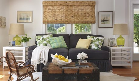
DECORATING GUIDESHow to Decorate When You're Starting Out or Starting Over
No need to feel overwhelmed. Our step-by-step decorating guide can help you put together a home look you'll love
Full Story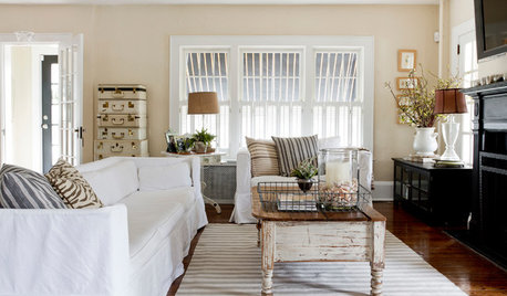
FEEL-GOOD HOMESimple Pleasures: 10 Ideas for a Buy-Less Month
Save money without feeling pinched by taking advantage of free resources and your own ingenuity
Full Story
LIFEA Month-by-Month Guide to ‘Downton Abbey’ Withdrawal
Missing Lady Grantham’s zingers? Edith’s furrowed brow? Romance simmering downstairs? Here’s help to get you through until season 6
Full Story
DESIGN PRACTICEDesign Practice: Start-up Costs for Architects and Designers
How much cash does it take to open a design company? When you use free tools and services, it’s less than you might think
Full Story
DECORATING GUIDES28 Decorating Moves to Try This Month
Treat your interiors to a pick-me-up with these quick and cheerful decorating tricks
Full Story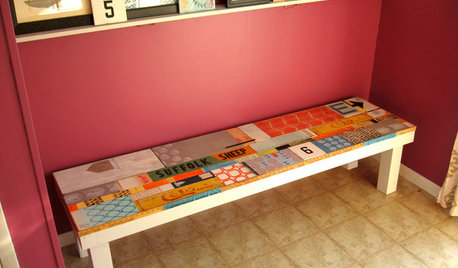
WOODWORKINGDIY Project: Artful Scrap-Wood Bench
Salvage signs, block-printed wood and a secret compartment turn a handmade bench into an interactive work of art
Full Story
HOUZZ TOURSHouzz Tour: Totally New Beauty for a Townhouse in Just 5 Months
Hardworking contractors and loved ones help a Canadian Realtor put a run-down house on the fast track to charm
Full Story
ARCHITECTUREDesign Practice: How to Start Your Architecture Business
Pro to pro: Get your architecture or design practice out of your daydreams and into reality with these initial moves
Full Story
INSIDE HOUZZInside Houzz: Starting From Scratch in a Manhattan Apartment
Even no silverware was no sweat for a Houzz pro designer, who helped a globe-trotting consultant get a fresh design start
Full Story
GARDENING GUIDES10 Tips to Start a Garden — Can-Do Ideas for Beginners
Green up your landscape even if you're short on time, money and knowledge, with these manageable steps for first-time gardeners
Full Story
Oaktown