


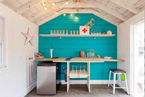
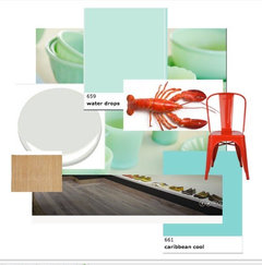
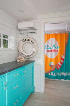
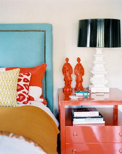
Executing a color scheme; what where?
MtnRdRedux
8 years ago
last modified: 8 years ago

Featured Answer
Sort by:Oldest
Comments (80)

just_terrilynn
8 years ago
palimpsest
8 years agoRelated Discussions
Just scheming. What do you think of this scheme? (pics)
Comments (20)Avesmor, sorry I have not gotten back to you on your questions. The rounds things on my wall are old stove pipe vents. They were found in walls and on floors for stove pipe to go through to prevent things from getting too hot from the stove pipe. The bedskirt came with the set. I have not been disappointed with this bed set. I love the colors. Can't wait to see what you do with yours. Kim...See MoreWhere does Anderson Woodwrights fall in the scheme of what is bes
Comments (5)I have walnut stained trim throughout my house, so a stainable finish would be preferred. We do however, have an off-white interior on our front door which is surrounded by the walnut trim. I don't know if it would be acceptable to go with an off-white interior on the windows as well. I know white just doesn't fly in our home; it would mean a complete re-do of the entire house and that just isn't going to happen. We went with warm colors on the exterior as well, so we have off-white on the exterior windows as well....See Morewhere to find someone to help me with paint color scheme?
Comments (8)Be very careful. I hired a designer at 150 an hour. I put a cap on ten hours. I wanted her to help me with the (dreaded) backsplash, kitchen window treatment and kitchen chair cushions. Long story short, she gave a lovely presentation with the professional board display, but I didn't use any of it! Not even the fabric for curtains! If I would do it over, I would have asked around and possibly seen work of the designer. So say, if I liked what they did in your house, not that I would copy it, but maybe the vision would be similar. Have you seen the Color me Happy blog? Some people here have used her. She is in Vancouver but evidently can help you with photos and talking to you on the phone....See MoreExterior color scheme question; where does color belong?
Comments (11)KSWL, I am using FnB lime white on the interior trim (except for the ceiling). I will try that just for comparison, I hope it wont look like a near miss. Here is the Hampshire Grey test: We need to get new garage doors anyway, which will be a whole nother post someday. Kitchy, I don't think it read as a whole. But I would not do ALL exterior doors in HG. We have a oddly pourous house. We have a double front door and then a front to back hallway with a back door (that is the one I might paint HG, but it has very little wood so I'm not sure, to wit:) But if we did all exterior doors... there are double french doors all the way around the pool building, and another set to the greenhouse. There are double french doors from the DR to the back patio. Then there is a single french door to the side, one to the garage, one from the LR to an interior courtyard, from the LR to back patio, from the side to the mudroom, from a powder room that connects to the pool, and I think I still forgot some. Oh yes graage doors on our little "barn" and on our garage. The only ones in the running are the back door to the center entry hall, and barn and garage doors. You can't see the stonehouse from the main house, except maybe from the pool when the leaves are bare. Even then not really. And the only place you see it when you are walking the far side of the pond (below, the stonehouse is all the way to the left, where the ladder is).....See More
MtnRdRedux
8 years agolast modified: 8 years ago
tibbrix
8 years agopalimpsest
8 years agojust_terrilynn
8 years agolast modified: 8 years agoMtnRdRedux
8 years agotibbrix
8 years agoMtnRdRedux
8 years agojoaniepoanie
8 years agopalimpsest
8 years agopalimpsest
8 years agolast modified: 8 years agojust_terrilynn
8 years agoMtnRdRedux
8 years agolast modified: 8 years agojoaniepoanie
8 years agoMtnRdRedux
8 years agopalimpsest
8 years agolast modified: 8 years ago
Sueb20
8 years agolast modified: 8 years agoMtnRdRedux
8 years ago
Annie Deighnaugh
8 years agoMtnRdRedux
8 years agolast modified: 8 years agoMtnRdRedux
8 years ago
MagdalenaLee
8 years agolast modified: 8 years agojust_terrilynn
8 years ago
robo (z6a)
8 years agolast modified: 8 years agojust_terrilynn
8 years agolast modified: 8 years agoMtnRdRedux
8 years agojust_terrilynn
8 years agolast modified: 8 years agogrammaj_gw
8 years ago
Lavender Lass
8 years agolast modified: 8 years ago
voila
8 years agolast modified: 8 years agoSueb20
8 years ago
rebunky
8 years agoMtnRdRedux
8 years agolast modified: 8 years agoUser
8 years agolast modified: 8 years ago
Holly- Kay
8 years ago
jlc712
8 years agoMtnRdRedux
8 years ago
gramarows
8 years agolast modified: 8 years agoUser
8 years agojlc712
8 years agoUser
8 years agolast modified: 8 years agoMtnRdRedux
8 years agoUser
8 years agolast modified: 8 years agoMtnRdRedux
8 years agoUser
8 years agoMtnRdRedux
8 years agoAnnie Deighnaugh
8 years agolast modified: 8 years ago


Related Stories
TASTEMAKERSWorld of Design: Where Color Trends Begin
Colors go in and out of vogue. Here’s how they make their way into our home decor
Full Story
THE ART OF ARCHITECTUREHow to Make Your House Feel at Home Where It Is
Take cues from nature for placement, materials, shapes and patterns, for a house that sits well in its surroundings
Full Story
REMODELING GUIDESWhere to Splurge, Where to Save in Your Remodel
Learn how to balance your budget and set priorities to get the home features you want with the least compromise
Full Story
ART10 Homes Where Art Takes Center Stage
Homeowners’ passion for their collections drives the design of these art-filled homes
Full Story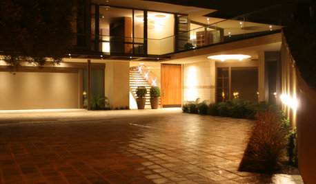
GARDENING AND LANDSCAPING9 Outdoor Lighting Schemes That Get Universal Design Right
Boost safety and a feeling of welcome with exterior lighting that offers visual cues and clearly defines paths
Full Story
KITCHEN DESIGNWhere Should You Put the Kitchen Sink?
Facing a window or your guests? In a corner or near the dishwasher? Here’s how to find the right location for your sink
Full Story
LIFEHouzz Call: Where (and What) Are You Reading This Summer?
Whether you favor contemporary, classic or beach reads, do the long and lazy days of summer bring out the lit lover in you?
Full Story
EVENTSSee Where America's Most Celebrated Furniture Maker Lived and Worked
Walk with us through the Southern California home and studio of Sam Maloof as events honoring his centennial kick off
Full Story
WINDOWSTransom Windows: Why Use Them — and Where?
See How a Little Extra Glass Lets in Light, Air and Style
Full Story
EVENTSSneak a Peek at Where the Pros Go to Get Inspired
At the 2015 Summer Las Vegas Market, thousands of retailers, designers and home pros will gather to discover the latest home decor trends
Full Story


Lavender Lass