


Changing Background Colours using Chrome
Jasdip
9 years ago
Featured Answer
Sort by:Oldest
Comments (18)

ravencajun Zone 8b TX
9 years agolast modified: 9 years agoravencajun Zone 8b TX
9 years agoRelated Discussions
What causes my violets to change colour?
Comments (16)Zu - you use Klasmann Peat. My guess you are using not their raw material - but a peat based mix - or you do something to adjust Ph? Straight peat has Ph of 4-4.5 - and AVs need 6.3-6.8 range - that's why we repot them every 6-12 months - to avoid the damaging from progressively more acid aging peat soil mix. Your violets look way too healthy and green - so I suspect you mitigate the acidity someway. But if it is on a low side - it can explain more than normal sporting. You think 200 AV is a lot? I had a friend visiting - and she told me she has 3000 pots if you count all potted leaves and starters. She is a young retiree - so it seems she created another job taking care of them AVs. (I suggested to donate a good portion of them to the nursing home before she starts sleeping in her truck because of the massive AV hoard). I,...See MoreWhat should I change - lots of input requested
Comments (30)Jillies, the green will be cooler. The yellow is really warm! Do you wear more blues or more earth tones in clothing? Those are probably the colours you are drawn to. I'm a blue green lady personally. Maria Killam can be catty but she really makes you think about the underlying tones in colours. Beware though...once you can see the undertones clashing it will bother you forever! She thinks often if you're dissatisfied with a room and can't figure out why, it's probably undertones like a pinky beige clashing with a greenish beige. The general rule is of the rainbow we learned back in school Red orange yellow green blue purple Red, orange and yellow are warm, with orange being the warmest Green blue purple are cool with blue being the coolest. Green blue is cool but warmer than straight up blue. Yellow green is quite warm but cooler than yellow orange. Bluish (like cherry) red is cooler than orangey (like tomato) red. @davidahn....lets just say I'm more like you in that equation!! But let's weight the votes by good taste, too! Here is a link that might be useful: Maria Killam on undertones This post was edited by robotropolis on Wed, Feb 6, 13 at 17:22...See MoreBold black type, Please?
Comments (25)Making the text a darker bolder black color with in the actual body of the post and replies would not even be seen on the main pages so that surely can't be the logic, if so it is flawed. You would actually have to click on a topic to view the post and then see the darker font. But they are already using the perfect color on the houzz heading, the dark houzz top left beside the icon. And they changed it on the main pages for the posters name, so why the problem with doing it here in the replies where it's desperately needed. If anyone knows of any way to alter the fonts and colors for an Android browser please post your suggestions. I am currently using Boat browser which does have themes and I am using one but no browser I have tried has font color choices....See MoreChrome or gold finish?
Comments (3)I say go for it! I wouldn't overdo the gold finish in the adjoining room, but adding a bit of a new element in special pieces can add a lot of interest & visual dimension to a room. Also, maybe bringing in an accessory in the kitchen that has a mix of metals or materials will give you courage to confidently add it to your other room....See Moreravencajun Zone 8b TX
9 years ago
Jasdip
9 years agoravencajun Zone 8b TX
9 years agoJasdip
9 years agoravencajun Zone 8b TX
9 years ago
dbarron
9 years agorhizo_1 (North AL) zone 7
9 years ago
PKponder TX Z7B
9 years ago
angela_nor_calif
9 years agoshea
9 years agoravencajun Zone 8b TX
9 years ago
arkansas girl
9 years agoJasdip
9 years agoUser
9 years agoJasdip
9 years ago
Related Stories
COLORBest Ways to Use Radiant Orchid, Pantone's Color of 2014
Learn how to work in this bold fuchsia-pink-purple successfully around the home, and give it a yay or nay in the Houzz poll
Full Story
COLORBathed in Color: When to Use Pink in the Bath
Even a sophisticated master bath deserves a rosy outlook. Here's how to do pink with a grown-up edge
Full Story
COLORBest Ways to Use the Soft Yellow Color of 2014
You may fall for PPG Pittsburgh Paints’ Turning Oakleaf if you like your hues warm, mellow and cheery
Full Story
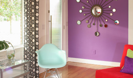
COLORBest Ways to Use Exclusive Plum, Sherwin-Williams’ Color of 2014
Pretty, moody, maybe even a neutral, this toned-down grayish purple can work in any room. Here's how
Full Story
COLORBest Uses for the Saturated Blue Color of 2015
Kelly-Moore’s selection is a classic shade of blue worthy of chunky accents around the home
Full Story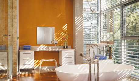
COLORBathed in Color: When to Use Bold Orange in the Bath
Orange you glad this warm and happy color can energize the place where you start your day?
Full Story
COLORCooking With Color: When to Use Gray in the Kitchen
Try out Trout or shake up some Martini Shaker gray for a neutral-based kitchen that whispers of sophistication
Full Story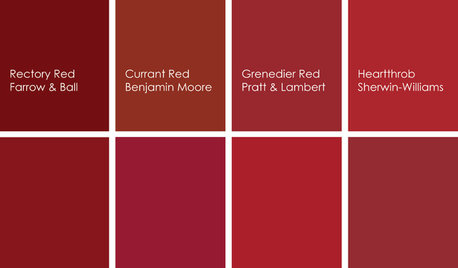
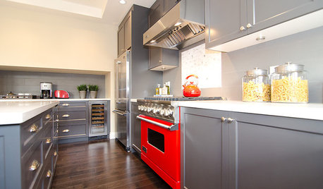
KITCHEN DESIGNCooking With Color: When to Use Red in the Kitchen
Candy Apple Red, Red Licorice and more for your kitchen walls, cabinets or island? The color choices are as delicious as they sound
Full Story
COLORHow to Use Marsala, Pantone’s 2015 Color of the Year
Pantone digs deep and goes earthy with its selection. Here are ways to make it work in your home
Full Story
ravencajun Zone 8b TX