


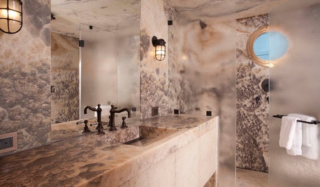
Are these stone counters too wild?
kaysd
12 years ago

Sort by:Oldest
Comments (33)
Related Stories
STONEGive In to Your Wild Side With Exotic Granite and Onyx
Go beyond the standard slab with these radiant and rare stones
Full Story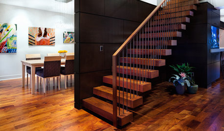
HOUZZ TOURSHouzz Tour: Wild for Wood in Central Texas
Mesquite, cherry and white oak harmonize beautifully in an Austin family's warm and modern home
Full Story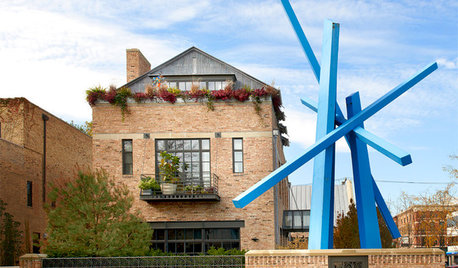
ECLECTIC HOMESHouzz Tour: Wild Ideas in the Windy City
When bold art meets great architecture and interior design, something wonderful happens
Full Story
FUN HOUZZ31 True Tales of Remodeling Gone Wild
Drugs, sex, excess — the home design industry is rife with stories that will blow your mind, or at least leave you scratching your head
Full Story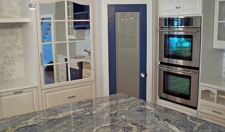
KITCHEN COUNTERTOPSKitchen Counters: Granite, Still a Go-to Surface Choice
Every slab of this natural stone is one of a kind — but there are things to watch for while you're admiring its unique beauty
Full Story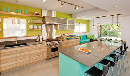
KITCHEN DESIGN10 Wildly Colorful Kitchens That Thrill and Delight
See how some of the most vivid kitchens on Houzz let loose with fearless color and personality
Full Story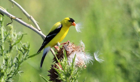
GARDENING FOR BIRDSWild Birds Transform a Woman’s Garden and Life
How Sharon Sorenson created a wildlife haven and became the Bird Lady of Southern Indiana
Full Story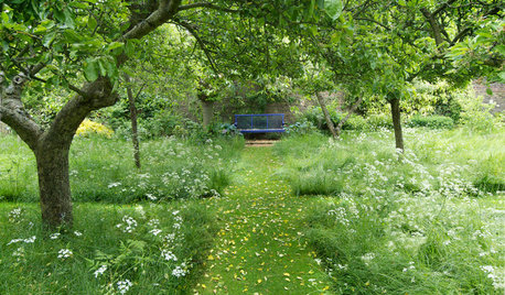
GROUND COVERSGive Your Lawn a Taste of the Wild
Consider the joys of an irregularly trimmed meadow lawn: It’s ecofriendly, visually interesting and still good for romping
Full Story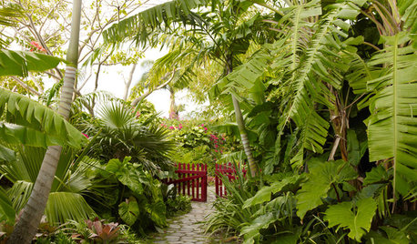
LANDSCAPE DESIGNWild Gardens Bring Excitement and Beauty to Landscapes
Forget what’s expected and ‘fashionable.’ Bold gardens teeming with site-appropriate plants make for a richer experience
Full Story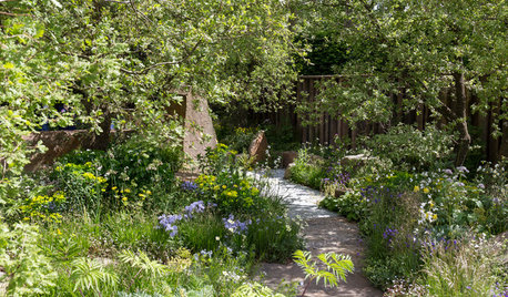
TASTEMAKERSWild Countryside Evoked in a Garden of Memories
For the Chelsea Flower Show, a designer taps into his experience of Exmoor, England, to create a garden that is powerfully personal
Full StorySponsored
Columbus Area's Luxury Design Build Firm | 17x Best of Houzz Winner!

christine40
remodelfla
Related Discussions
wild sea granite/ dune counter top pictures
Q
granite counter-top seams ... are we being too picky?
Q
wild sea/wild west green granite
Q
Help! Counter too high?
Q
kaysdOriginal Author
mtnrdredux_gw
kaysdOriginal Author
beaglesdoitbetter1
danikiser2
annachosaknj6b
northcarolina
northcarolina
marcolo
jsceva
carybk
User
sochi
breezygirl
lazy_gardens
athensmomof3
Mercymygft
kaysdOriginal Author
Fori
gr8daygw
boxerpups
CEFreeman
holiday2525
dianalo
kitchendetective
Circus Peanut
davidro1
davidro1
User
cawaps
fks3