


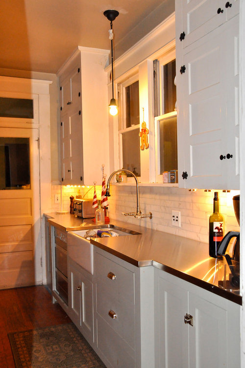
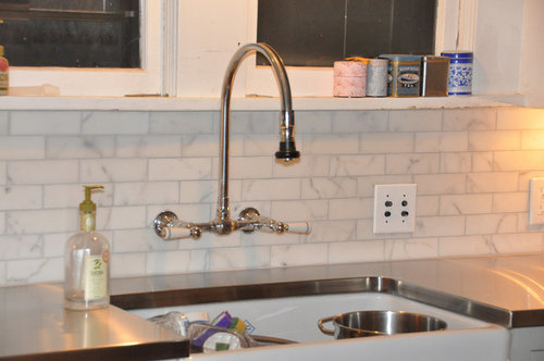
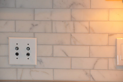
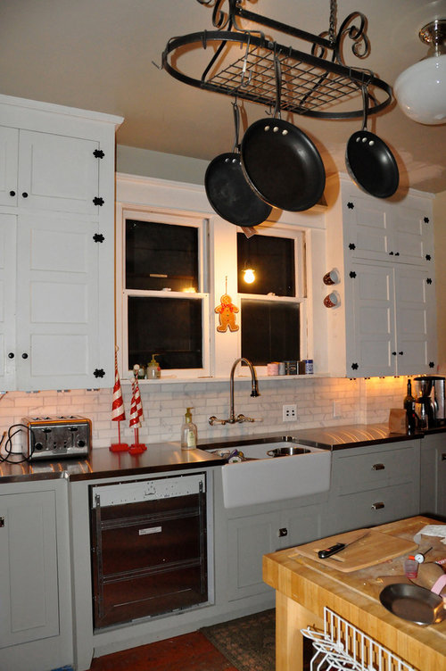
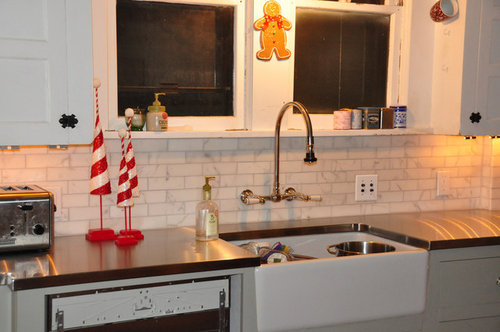
Pics of marble subway done (grout dried)
13 years ago
Sort by:Oldest
Comments (53)
Related Stories
KITCHEN DESIGNSubway Tile Picks Up Gray Grout
Heading into darker territory, subway tile offers a graphic new look for kitchens, bathrooms and more
Full Story
TILEEpoxy vs. Cement Grout — What's the Difference?
Grout is grout, right? Nope. Cement and epoxy versions have different appearances, durability and rules of installation
Full Story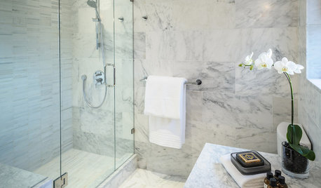
BATHROOM DESIGNConvert Your Tub Space Into a Shower — the Tiling and Grouting Phase
Step 3 in swapping your tub for a sleek new shower: Pick the right tile and test it out, then choose your grout color and type
Full Story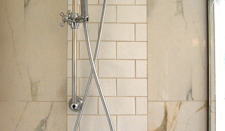
REMODELING GUIDES9 Ways Grout–Yes, Grout–Can Add to Your Design
Choose From a Palette of Grout Colors for a Warm, Unified Look
Full Story
HOUSEKEEPINGHow to Clean Grout — Stains and All
If your grout is grossing you out, this deep-cleaning method will help it look new again
Full Story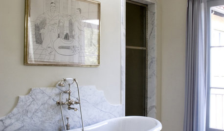
MATERIALS10 Modern Marble Looks
Marble has broken free of the standard kitchen countertop slab and is showing up on bathtub backsplashes, modern dining tables and more
Full Story
TILE3 Key Steps for Grouting That Looks Its Best
Get your grout right to keep your tile beautiful and for an installation that will last
Full Story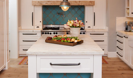
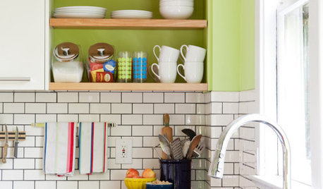
KITCHEN DESIGN10 Gorgeous Backsplash Alternatives to Subway Tile
Artistic installations, back-painted glass and pivoting windows prove there are backsplash possibilities beyond the platform
Full Story
EXTERIORS8 Homes With Exterior Paint Colors Done Right
Get ideas for an exterior palette from these homes that run the gamut from Mediterranean to modern
Full Story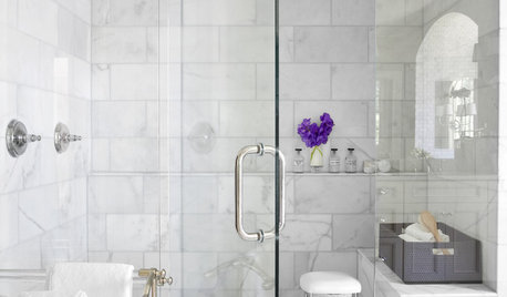
REMODELING GUIDESWhy Marble Might Be Wrong for Your Bathroom
You love its beauty and instant high-quality appeal, but bathroom marble has its drawbacks. Here's what to know before you buy
Full Story

islanddevil
theresseOriginal Author
Related Discussions
DIY budget elegant bathroom, almost done: pics...
Q
Daily life with marble countertops - dried espresso
Q
diy venatino marble backsplash done - pics
Q
Please Help! Polished Marble Mosaic Tile Dull After Grout? Pics Inside
Q
theresseOriginal Author
francoise47
eandhl
irishcreamgirl
swhite10
gsciencechick
bmorepanic
punamytsike
tontam
beaglesdoitbetter1
Christine Clemens
adel97
morgne
honorbiltkit
onedogedie
blondelle
Gena Hooper
User
oldhousegal
blondelle
pharaoh
islanddevil
User
blondelle
warmfridge
dee850
dianalo
katsmah
flwrs_n_co
prill
katyde
kathec
formerlyflorantha
theresseOriginal Author
theresseOriginal Author
theresseOriginal Author
theresseOriginal Author
worldmom
theresseOriginal Author
theresseOriginal Author
John Liu
theresseOriginal Author
theresseOriginal Author
young-gardener
10KDiamond
worldmom
John Liu
Renee_talentshowcase_tv