


Honest backsplash feedback
snowyshasta
15 years ago


Sort by:Oldest
Comments (75)
Related Stories
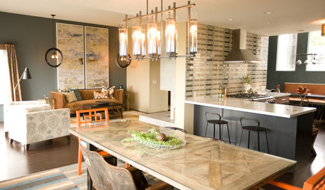
KITCHEN DESIGNKitchen of the Week: Navy and Orange Offer Eclectic Chic in California
Daring color choices mixed with a newly opened layout and an artful backsplash make for personalized luxury in a San Francisco kitchen
Full Story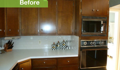
KITCHEN DESIGN3 Dark Kitchens, 6 Affordable Updates
Color advice: Three Houzzers get budget-friendly ideas to spruce up their kitchens with new paint, backsplashes and countertops
Full Story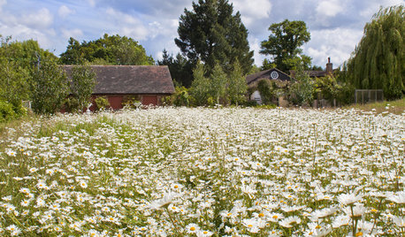
GARDENING GUIDESHouzz Call: What’s Your Favorite Backyard Beauty?
The simple, honest daisy is this writer’s go-to garden flower. We want to hear which plant, flowering or otherwise, gives you special joy
Full Story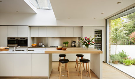
MATERIALSKitchen Ideas: How to Choose the Perfect Backsplash
Backsplashes not only protect your walls, they also add color, pattern and texture. Find out which material is right for you
Full Story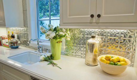
KITCHEN BACKSPLASHESTin's a Win for Kitchen Backsplashes
Durable tin has come down from the ceiling and out of Victorian times to decorate backsplashes today
Full Story
KITCHEN DESIGN15 Creative Backsplashes Full of Character
You’ll find personality aplenty in these distinctive backsplashes — and lots of inspiration too
Full Story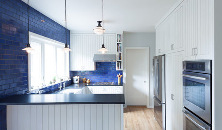
COLORKitchen Color: 15 Beautiful Blue Backsplashes
Blue is the new cool kid on the backsplash block, showing up in shades from pale ice to cobalt
Full Story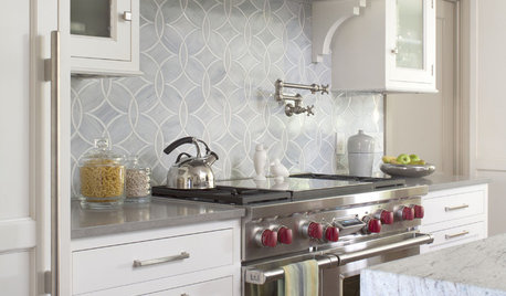
KITCHEN DESIGN8 Top Tile Types for Your Kitchen Backsplash
Backsplash designs don't have to be set in stone; glass, mirror and mosaic tiles can create kitchen beauty in a range of styles
Full Story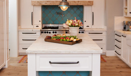
KITCHEN DESIGN10 Gorgeous Backsplash Alternatives to Subway Tile
Artistic installations, back-painted glass and pivoting windows prove there are backsplash possibilities beyond the platform
Full Story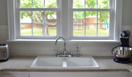
KITCHEN BACKSPLASHESHow to Install a Tile Backsplash
If you've got a steady hand, a few easy-to-find supplies and patience, you can install a tile backsplash in a kitchen or bathroom
Full Story
astridh
snowyshastaOriginal Author
Related Discussions
mock up backsplash feedback needed
Q
Need your honest backsplash opinion
Q
Backsplash Help....Feedback Needed!
Q
I think I've found my backsplash- feedback please.
Q
remodelqueen
rhome410
remodelfla
msrose
cheri127
morton5
ccoombs1
astridh
segbrown
moonkat99
snowyshastaOriginal Author
marlene_2007
igloochic
dixiedo
snowyshastaOriginal Author
pbrisjar
rhome410
mindstorm
chinchette
remodelfla
pbrisjar
jules1906
teddas
moonkat99
snowyshastaOriginal Author
snowyshastaOriginal Author
Window Accents by Vanessa Downs
eagle100
segbrown
snowyshastaOriginal Author
remodelfla
snowyshastaOriginal Author
anew
mustbnuts zone 9 sunset 9
abbycat9990
snowyshastaOriginal Author
positano
remodelfla
gwent
Window Accents by Vanessa Downs
mustbnuts zone 9 sunset 9
anew
snowyshastaOriginal Author
bananafana
mindstorm
snowyshastaOriginal Author
debsan
moonkat99