


Recognizing trendy and what will be dated (long, with pics)
plllog
12 years ago
Featured Answer
Sort by:Oldest
Comments (150)

palimpsest
12 years agolast modified: 9 years agoUser
12 years agolast modified: 9 years agoRelated Discussions
Long shot- does anyone recognize this bloom?
Comments (2)Since it is not open all the way, can't tell for sure but looks a little like SILOAM FRENCH MARBLE. However, there are a couple of hybridizers who market small blooms. Here is a pic of SILOAM FRENCH MARBLE Julia...See MoreCanary Island date palm in va beach and some more pics
Comments (22)I didn't realize reed grass was anything special or tender, since it's everywhere here . I pulled mine out because it grew too tall in my garden. Replaced it and some other too tall grasses and shrubs to make room for hardy palms....See MoreDoes anyone recognize this table? pics
Comments (8)Cooperbailey (that sweetie!) mentioned mine, which I got from eBay a few years ago. I checked yesterday and I saw the same one on eBay in an auction that ends in about 13 hours. After I bought mine, I looked around, and saw it on 1st Dibs for $3900! Here is the link to it there, but you have to be a member and log in to see the price. It's small at height: 16.5", depth: 17.5", width/length: 29", but that was perfect for my long. narrow living room. http://www.1stdibs.com/furniture_item_detail.php?id=348919 Here is a link that might be useful: Italian brass coffee table on eBay...See MoreWhat did you do that wasn't trendy?
Comments (71)Some of this is hard to evaluate, particularly the white cabinets. As has been discussed a lot here, white cabinets seem to be "new and trendy" in some areas, but "longtime classic that happens to be popular right now" in others. We live in an area where the latter is the case, so I'm not viewing the fact that I'm painting cabinets white to be trendy, per se. But anyway: dark distressed wood floors - No, our wood floors are the rather standard "medium" finish oak, and I am perfectly fine with them. I think the really dark floors are one of those things that are going to wind up looking really dated really fast. white counter tops - No, we're going with honed jet mist granite (which, in fairness, could also be viewed as trendy I suppose). white cabinets - Yes, but as I said above, I view them as more classic than trendy white walls - Sort of. Wall color (and our kitchen is totally open to dining/sitting, so I had to pick a color that would work overall) is more of a very light beige/cream. So not white white, but not a bold color big gas range - Absolutely, and I can't wait. farmhouse sink - No. I wanted one, but since we're not doing a full gut and are using existing cabinets, it would have been kind of a pain to install stainless steel - yes. I have rather mixed feelings on this one. I'm fine with stainless steel, but don't love it in a House Hunters sense of "I NEED MY STAINLESS STEEL APPLIANCES". The range we ordered is a Blue Star, and I kind of wanted to go with one of the fun color options. But on the other hand, I wouldn't say that this is our "forever" house, and I do want to keep resale in mind. I may order a set of colored knobs eventually, though - I want obnoxious lime green ones to pay homage to the 70s era formica in my childhood home. Other things: Backsplash - I am doing subway tiles, but not white. That's where I'm bringing in some color, and am currently trying to decide between Fireclay's "nautical" and "crater lake" blues. The current cabinetry is raised panel. I'm about 75% sure that we're just painting (there is a chance we may replace just the doors with shaker style, which would be my preference, but budget plays a role). Even though the shaker is my preference, I won't be crushed if it doesn't happen and we stick with the raised panel. I don't really view raised panel as dated, I think of it as classic. I also think of shaker as classic, though, because it is. We are turning an existing peninsula into an island, but it's to improve flow/create a more circular floor plan, not because it's trendy. No built in microwave drawer. Keeping existing fridge which isn't counter depth. So yeah, it isn't as perfectly flush and sleek as it could be, but it holds groceries for a family, plus a collector-level amount of craft beer, so it's staying....See Moresayde
12 years agolast modified: 9 years agosteff_1
12 years agolast modified: 9 years ago
Fori
12 years agolast modified: 9 years agocolin3
12 years agolast modified: 9 years ago
plllog
12 years agolast modified: 9 years ago
beckysharp Reinstate SW Unconditionally
12 years agolast modified: 9 years agoblfenton
12 years agolast modified: 9 years ago
cawaps
12 years agolast modified: 9 years agoplllog
12 years agolast modified: 9 years agoplllog
12 years agolast modified: 9 years agomarcolo
12 years agolast modified: 9 years ago
Circus Peanut
12 years agolast modified: 9 years agoUser
12 years agolast modified: 9 years agoUser
12 years agolast modified: 9 years ago
mtnrdredux_gw
12 years agolast modified: 9 years agoUser
12 years agolast modified: 9 years agomtnrdredux_gw
12 years agolast modified: 9 years agoharrimann
12 years agolast modified: 9 years agosteff_1
12 years agolast modified: 9 years agopalimpsest
12 years agolast modified: 9 years agokitchendetective
12 years agolast modified: 9 years agomtnrdredux_gw
12 years agolast modified: 9 years agopalimpsest
12 years agolast modified: 9 years agoUser
12 years agolast modified: 9 years agoharrimann
12 years agolast modified: 9 years agoFori
12 years agolast modified: 9 years agobeckysharp Reinstate SW Unconditionally
12 years agolast modified: 9 years agomarthavila
12 years agolast modified: 9 years agomarcolo
12 years agolast modified: 9 years agoplllog
12 years agolast modified: 9 years agoplllog
12 years agolast modified: 9 years agokitchendetective
12 years agolast modified: 9 years agodianalo
12 years agolast modified: 9 years agomarcolo
12 years agolast modified: 9 years agomarthavila
12 years agolast modified: 9 years agochiefy
12 years agolast modified: 9 years agoFori
12 years agolast modified: 9 years agoplllog
12 years agolast modified: 9 years agopalimpsest
12 years agolast modified: 9 years agomarthavila
12 years agolast modified: 9 years agoGina_W
12 years agolast modified: 9 years agobeckysharp Reinstate SW Unconditionally
12 years agolast modified: 9 years agosteff_1
12 years agolast modified: 9 years agoharrimann
12 years agolast modified: 9 years agoplllog
12 years agolast modified: 9 years agoplllog
12 years agolast modified: 9 years agoCircus Peanut
12 years agolast modified: 9 years agoCircus Peanut
12 years agolast modified: 9 years ago


Related Stories
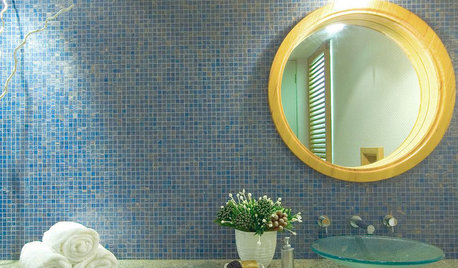
BATHROOM COLOR6 Bathroom Color Schemes That Will Never Look Dated
If you’d love to splash some color around your bathroom but fear it won’t stand the test of time, stick with these fail-safe combos
Full Story
MOVINGRelocating Help: 8 Tips for a Happier Long-Distance Move
Trash bags, houseplants and a good cry all have their role when it comes to this major life change
Full Story
DECORATING GUIDESBlues Blaze Into Fashion for Fall 2012
Sashaying down designer runways and sported by trendy home interiors, this cool hue is looking to be way hot this fall
Full Story
BATHROOM MAKEOVERSInside Houzz: A Chopped-Up Bathroom Goes Streamlined and Swank
Dysfunctionally divided and dated too, this bath needed major help. The homeowner found it on Houzz
Full Story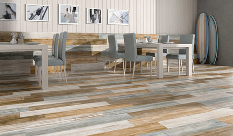
TILETop Tile Trends From the Coverings 2013 Show — the Wood Look
Get the beauty of wood while waving off potential splinters, rotting and long searches, thanks to eye-fooling ceramic and porcelain tiles
Full Story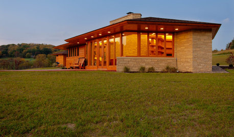
HOUZZ TOURSHouzz Tour: Usonian-Inspired Home With All the Wright Moves
A Chicago couple's weekend retreat fulfills a long-held dream of honoring architect Frank Lloyd Wright
Full Story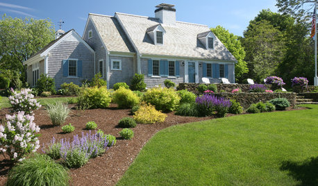
ARCHITECTURERoots of Style: Cape Cod Evolves Into an American Favorite
With its simple gabled roof forms and straightforward design elements, the Boston-area style maintains a centuries-long following
Full Story
BUDGET DECORATING13 Versatile Furniture Pieces That Grow With You
Build a collection of high-quality pieces that will work from that first solo rental to a long-term home
Full Story
MY HOUZZMy Houzz: Visit a Potter’s Creative Retreat and Studio
Bold hues and personalized style outfit a couple’s home and workshop along a river in Maine
Full StoryKITCHEN DESIGN12 Great Kitchen Styles — Which One’s for You?
Sometimes you can be surprised by the kitchen style that really calls to you. The proof is in the pictures
Full Story

marcolo