


Help with new color for DR
Kathleen McGuire
15 years ago


Featured Answer
Sort by:Oldest
Comments (77)

Kathleen McGuire
15 years ago
squirrelheaven
15 years agoRelated Discussions
Need Help with DR Color - Gray or Camel
Comments (3)Heck, I vote for the orange/cinnamon/nutmeg color that is in the rug. I think BM's Pottery Barn line has a perfect color for that rug in the winter 2008 series. Can't remember what it's called......See MoreDR/Kitchen color help desperately needed
Comments (1)I'm trying to pick out a whole house now too! what pressure! We have an open floor plan as well (FR, kitchen, butler, DR, LR & hall - eek! I planning on using the natural 'breaks' to change colors, but likely the same tones/same strip? My color wheel is in the car...will post later....See MoreNeed help with DR color selection, please
Comments (3)Dining rooms are among the jewel boxes in your home. No matter what color paint you choose, your room is not going to have more light. I once heard Lynette Jennings say rather than pretending a light color will make your room appear lighter and brighter, don't tease yourself. Go with the drama of rich color to make it seem more elegant and royal for it's a jewel box or can be. I have had taupe in dark rooms and beige and it can look a little bit "dirty or dusty" in low light, another reason I suggested perhaps a wheat, something richer to give it that rich look....See MoreHelp with paint color for DR/ LR.
Comments (16)I don't think so. The chairs are basically the color of your furniture, and green would give a fresh feeling to this room, as would blue. Are you planning on having a rug in the dining room? I'm wondering if there would be other colors to take into consideration....See Moresquirrelheaven
15 years agoKathleen McGuire
15 years agojohnatemp
15 years agosquirrelheaven
15 years agoKathleen McGuire
15 years agosquirrelheaven
15 years agojohnatemp
15 years agojohnatemp
15 years agobronwynsmom
15 years agoKathleen McGuire
15 years agoparma42
15 years agomomfromthenorth
15 years agosquirrelheaven
15 years agosquirrelheaven
15 years agodekr8
15 years ago
ingrid_vc so. CA zone 9
15 years agohoyamom
15 years agosquirrelheaven
15 years agoingrid_vc so. CA zone 9
15 years agoles917
15 years agosquirrelheaven
15 years ago
CaroleOH
15 years agoparma42
15 years agoKathleen McGuire
15 years agoKathleen McGuire
15 years agohoyamom
15 years agosquirrelheaven
15 years agocasajakada
15 years agoKathleen McGuire
15 years agosquirrelheaven
15 years agoKathleen McGuire
15 years agosquirrelheaven
15 years agoKathleen McGuire
15 years agosquirrelheaven
15 years agoKathleen McGuire
15 years agosquirrelheaven
15 years agosaltnpeppa
15 years agosquirrelheaven
15 years agosquirrelheaven
15 years agosquirrelheaven
15 years agoummm
15 years agoKathleen McGuire
15 years agosaltnpeppa
15 years agosquirrelheaven
15 years agosquirrelheaven
15 years agoparma42
15 years agoKathleen McGuire
15 years ago


Related Stories
MOVINGRelocating Help: 8 Tips for a Happier Long-Distance Move
Trash bags, houseplants and a good cry all have their role when it comes to this major life change
Full Story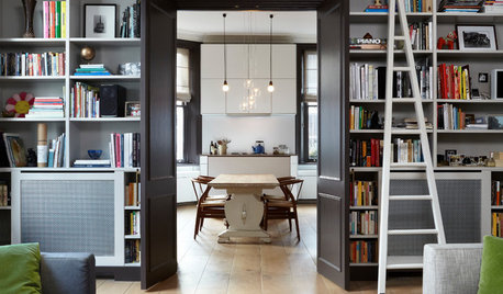
ORGANIZINGGet the Organizing Help You Need (Finally!)
Imagine having your closet whipped into shape by someone else. That’s the power of working with a pro
Full Story

WORKING WITH PROS5 Steps to Help You Hire the Right Contractor
Don't take chances on this all-important team member. Find the best general contractor for your remodel or new build by heeding this advice
Full Story
MOST POPULAR7 Ways to Design Your Kitchen to Help You Lose Weight
In his new book, Slim by Design, eating-behavior expert Brian Wansink shows us how to get our kitchens working better
Full Story
SELLING YOUR HOUSE5 Savvy Fixes to Help Your Home Sell
Get the maximum return on your spruce-up dollars by putting your money in the areas buyers care most about
Full Story
GARDENING GUIDES8 Unthirsty Plants Help You Save Water in Style
Spend less effort and money on your landscape with drought-tolerant and native plants that liven up your yard
Full Story
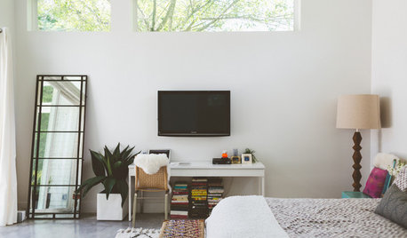
DECORATING GUIDES13 Strategies for Making a Large Room Feel Comfortable
Bigger spaces come with their own layout and decorating challenges. These ideas can help
Full Story
REMODELING GUIDESHouse Planning: When You Want to Open Up a Space
With a pro's help, you may be able remove a load-bearing wall to turn two small rooms into one bigger one
Full Story
SMALL HOMESMy Houzz: Artistry and Personality Color a London Flat
A photographer’s Holland Park home does much better than just get by with a little help from friends
Full Story


Kathleen McGuireOriginal Author