


Starting Soon!! New Kitchen Plan Review PLEASE!
2LittleFishies
11 years ago


Sort by:Oldest
Comments (40)
Related Stories

GARDENING GUIDESGet a Head Start on Planning Your Garden Even if It’s Snowing
Reviewing what you grew last year now will pay off when it’s time to head outside
Full Story
DECORATING GUIDESHow to Decorate When You're Starting Out or Starting Over
No need to feel overwhelmed. Our step-by-step decorating guide can help you put together a home look you'll love
Full Story
REMODELING GUIDESPlanning a Kitchen Remodel? Start With These 5 Questions
Before you consider aesthetics, make sure your new kitchen will work for your cooking and entertaining style
Full Story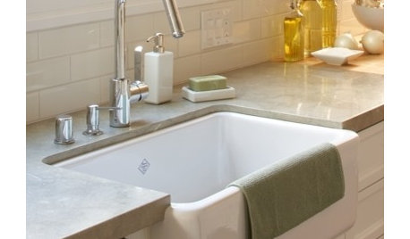
CONTRACTOR TIPSContractor Tips: Countertop Installation from Start to Finish
From counter templates to ongoing care, a professional contractor shares what you need to know
Full Story
DECORATING GUIDESDecorating 101: How to Start a Decorating Project
Before you grab that first paint chip, figure out your needs, your decorating style and what to get rid of
Full Story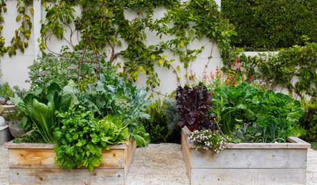
MOST POPULARHow to Start a Cool-Season Vegetable Garden
Late summer and late winter are good times to plan and plant cool-season crops like salad greens, spinach, beets, carrots and peas
Full Story
MOST POPULAR10 Things to Ask Your Contractor Before You Start Your Project
Ask these questions before signing with a contractor for better communication and fewer surprises along the way
Full Story
ARCHITECTUREDesign Practice: How to Start Your Architecture Business
Pro to pro: Get your architecture or design practice out of your daydreams and into reality with these initial moves
Full Story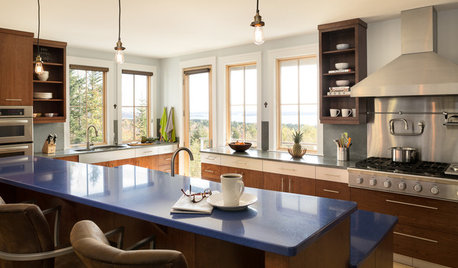
DECLUTTERING5 Ways to Jump-Start a Whole-House Decluttering Effort
If the piles of paperwork and jampacked closets have you feeling like a deer in the headlights, take a deep breath and a baby step
Full Story
HOUZZ TOURSMy Houzz: Hold the (Freight) Elevator, Please!
Industrial style for this artist's live-work loft in Pittsburgh starts before you even walk through the door
Full Story


lavender_lass
2LittleFishiesOriginal Author
Related Discussions
New and learning - please review my compost bin plans
Q
please review my sfg plan, new to sfg
Q
starting over (ugh) please critique new plan
Q
Kitchen gurus, please review new construction kitchen layout
Q
herbflavor
2LittleFishiesOriginal Author
rosie
marcolo
2LittleFishiesOriginal Author
2LittleFishiesOriginal Author
2LittleFishiesOriginal Author
User
User
pawa
2LittleFishiesOriginal Author
lavender_lass
pawa
pawa
Heather31383
blfenton
ghostlyvision
babushka_cat
rosie
2LittleFishiesOriginal Author
marcolo
2LittleFishiesOriginal Author
natebear zone 10B
lavender_lass
marcolo
2LittleFishiesOriginal Author
2LittleFishiesOriginal Author
lavender_lass
2LittleFishiesOriginal Author
2LittleFishiesOriginal Author
2LittleFishiesOriginal Author
lavender_lass
2LittleFishiesOriginal Author
marcolo
2LittleFishiesOriginal Author
2LittleFishiesOriginal Author
marcolo
2LittleFishiesOriginal Author