


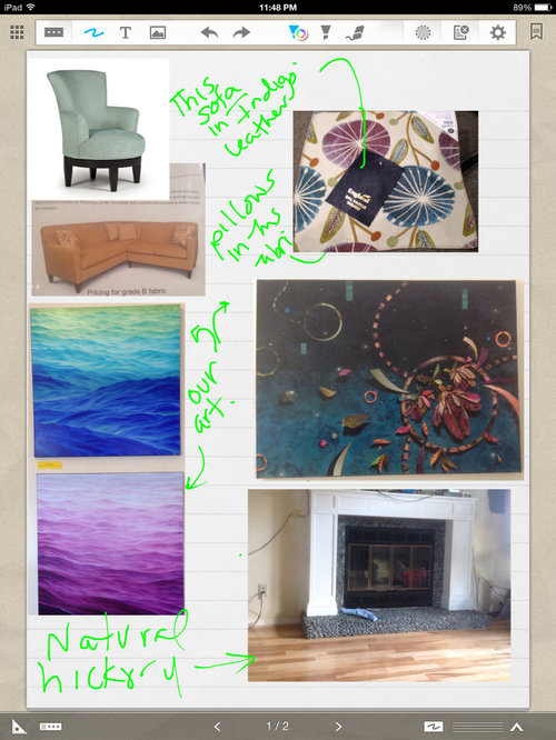
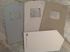
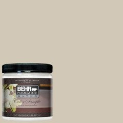
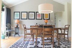
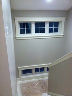
Ok, ok...you want a reveal, I need to pick paint first!
williamsem
9 years ago
Featured Answer
Sort by:Oldest
Comments (21)

ktj459
9 years agoRelated Discussions
Anyone pick paint color FIRST when decorating?
Comments (17)Letting a beautiful rug form the basis for a room's color scheme works fine, as long as you A) already happen to own a beautiful rug or B) you have somewhere else to live while you wait to find a beautiful rug that you C) fall in love with and D) can afford, and then, gradually, build the rest of your room around it. For a long time, that's been the 'ideal' decorating scenario. But for those people who can't wait for the planets to align--which group includes myself-- picking your wall color first works out OK. Of course, as Dilettante discovered, you may find that the perfectly lovely color you choose for your walls doesn't come in anything but paint. And, if you're into the perfectly co-ordinated look, that can be a problem, but it it doesn't have to be. You don't hear people critiquing the blue of the sky because it doesn't match the blue of the pool, or the lake, or the iris, or your kid's eyes. That's all irrelevant. The blue is a background, so it doesn't need to match, and I generally take that low-stapproach when I'm working on a room for a client. Life's hard enough already without worrying about stuff like that. And at home, I never use my wall color anywhere else in a room, certainly not that exact color. It's lots more interesting if there's some contrast, or even a little dissonance between foreground & background. It makes the room look less stagy & contrived, and, basically, less decoratorish--and I say that as a decorator. So if I were determined to have a yellow room, I would get one, and I wouldn't worry about not finding yellow fabrics to go with it, but would just slap the color on the wall. Then, if it takes me a year or two to put the rest of the place together, I at least have a nice color in the meantime. That ought to count for something. By the last inning, when I've got most of my furnishings, I can always change to a different yellow if I think it might better complement the rest of the stuff, but then, maybe it's that dissonance thet gives the room its life. All I can say is that my furniture is a hodgepdge of different woods, fabrics, patterns & textures and that it's all worked equally well in rooms of a bunch of different colors: cornemal yellow, duck egg blue, spruce green,, paper bag brown, oyster gray, olive green & the newest one, Farrow & Ball's Churlish Green, the first time I've ever used an off-the-shelf paint color. So don't get all hung up on the rules about sequence. You can either follow the rules or the you can make up your own rules. That's what I do. One of my favorite New Yorker cartoons shows an older chef talking to his assitant who's adding some herbs to a pot: "Look, who CARES how much oregano you use!" It's like that. Don't make yourself crazy. It's only decorating. Regards, Magnaverde....See MoreWant to gel stain kitchen cabs. Look ok?
Comments (89)Technicolor - After reading your original post again, I never thought about porch and floor paint but that would make sense. What brand (Ace?) were you talking about? Oh, and wouldn't you still need to sand - at least scuff sand and use a (bonding) primer like Zinsser first? *NOTE - Just a general heads up, I don't recommend anyone using SW Porch and Floor paint. Total crap. I supposedly got a 'bad batch' (it never got past tacky and I went above and beyond to do that job right.) and had to redo my stair project which was MISERABLE. They gave me a new gallon of paint and threw in some tape and sandpaper but that still didn't fix my stairs. I was told they were discontinuing the product but I believe it's still available. Your kitchen sounds really pretty. And I like red - have a bathroom painted BM Moroccan Red. You think bb around my DR side too? "My senses tell me it is the dining room that is making this so difficult for you. I know you don't want to change it, but the styles are clashing regardless of color." I almost hate to ask, but can you be more specific? I look at it everyday and I'm sure can't 'see' it like someone else. I'm assuming it's too formal/stuffy for the kitchen side? I've been trying to get away from that a bit, tho the rug didn't bother me enough to make it a replacing priority right now. I figured I'd have a better chance of stumbling across art I liked first. Even if I had more money, I don't know what I'd pick or replace first. Ha, it's a little tough to change anything if you don't have a clear game plan. It's interesting, in the past when I had a project, I'd throw ideas out and go back and forth, back and forth with what I wanted to do and I always have to WAIT, sometimes months, until I figure out what's going to work for me. I wish I knew how to speed the process up. I'll post a photo with the new hardware on when it comes....See MoreOK, need some advice from all the paint/glazing guru's out here!
Comments (9)Sorry to say this, but there is a difference in looking timeworn, rustic and beat up, and well, a slap dash quality paint job. You needed to prime the cabinet before doing a top coat. Then sand that. Maybe even a second coat of primer. Then a top coat with Floetrol in it to help it settle out better. Then a second top coat. All using a better quality brush. Don't go back over an area after you've painted it once if it's starting to dry a bit. That's when you get those brush marks that drag up a little orange peel with them. Sand this coat of paint smooth and assess how well it's sticking to the wood base. Without primer, it may not have very good adhesion. If it's coming off fairly easily in "chunks" when you sand, then you'll need to strip the whole thing and start over. If it lets you sand it to a fairly smooth level without having any peel off, then you can do a second coat of paint. If you prefer the whole thing to be a different shade of blue, then it'll be easier to just get a different paint that is more the shade you want it to be. The Floetrol will help it to go on smoothly. Wait for that layer to cure, and then you can glaze, if that's a look you like with a grey/blue glaze. At this point, if you want the aged and distressed look, you can then carefully sand through some of the layers on wear points and/or knock it about a bit with a small chain. Then you can clear coat the whole thing with polycrylic to protect it....See MoreHelp! New house, need to pick paint colors
Comments (24)Distance would be a beautiful color for the DR, but I may be biased. Mine is a similar color. Silver, gold, brass and crystal and wood tones, espcially darker tones, all look great against it. Hale Navy is a great color too, but I'm not seeing it in the kitchen with dark wood cabinets (paint the cabinets white and I'd love it, but the counter might need to change too). The FR could take that dark color on the walls, with the vaulted ceiling, light carpet and lots of windows. Am I understanding correctly that these are photos from the listing (looks like and MLS watermark)? And you are moving from another area so you can't go back and check colors? Can your realtor or anyone you know go back and take some photos with the color chips? Would you be willing to have the realtor and a color consultant look at that for you and work with you via photos/videos? My SW store has one or maybe two consultants and I know some folks here have used color consultants via phone and nternet. Maybe they can weigh in on how that could work for you. My biggest concern is the kitchen, and I'm not sure if by painting the trim lighter you mean the baseboards (don't), the trim around the entry door (do), the mantel or something else (like painting the cabinets white?). The issue in the kitchen is the dark wood with a lot of red in it. There also appears to be some warm tones (pinkish beige) in the countertops. If you are going to paint the cabinets white and change the counter, I think you can use those cooler greys in there, but I think you might need a warmer grey in there if all you plan to change is the wall color. If you go with a cooler grey or a blue next to the stained wood, they will accentuate each other -- you will see more of the warm tones in the wood and counters and more blue in your grey. There appears to be some of that going on with the current wall color and the green/grey. You could have similar issues with the brick and mantel in the FR. Collonade is one of the colors I tried in my home and it definitely has more green in it. It has more grey than what is on the walls now, but may not give the look you seem to be after. Can you try Agreeable Gray or Accesible Beige -- possibly Alpaca (all SW) in the kitchen? Requisite Gray looks like another possibility but darker. Mega Greige is warmer (slightly more toward beige) and darker still. I would probably chose one of the lighter shades for the entry and then go a shade darker in the LR, but not too dark so it contrasts with Distance in the DR. The FR could go lighter or darker, but it isn't clear where you can transition between the kitchen/breakfast area (looks like that needs to be the same color) and the FR....See Morekirkhall
9 years ago
romy718
9 years ago
speaktodeek
9 years agomgmum
9 years ago
williamsem
9 years agobrowniepie
9 years ago
my_four_sons
9 years ago
berner43
9 years agoOOTM_Mom
9 years ago
amyktexas
9 years agodcward89
9 years agomaggieq
9 years ago
Swentastic Swenson
9 years agowilliamsem
9 years ago
autumn.4
9 years agofeisty68
9 years agogreenhaven
9 years agodcward89
9 years agogreenhaven
9 years ago


Related Stories
FURNITUREWhy It's OK to Hate Your New Custom Sofa
It takes time to get used to bold new furniture, but dry your tears — the shock can be good for you. Here's what to expect
Full Story
HOUZZ TVHouzz TV: This Maker‘s Home Makes Everything OK
Maker Aleksandra Zee finds inspiration in a common building material and the serenity of home. Watch our latest episode of Houzz TV
Full Story
MY HOUZZMy Houzz: Surprise Revealed in a 1900s Duplex in Columbus
First-time homeowners tackle a major DIY hands-on remodel and uncover a key feature that changes their design plan
Full Story
DECORATING GUIDESTop 10 Interior Stylist Secrets Revealed
Give your home's interiors magazine-ready polish with these tips to finesse the finishing design touches
Full Story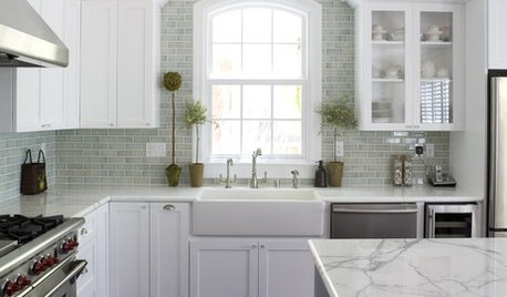
INSIDE HOUZZA New Houzz Survey Reveals What You Really Want in Your Kitchen
Discover what Houzzers are planning for their new kitchens and which features are falling off the design radar
Full Story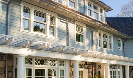
TRADITIONAL HOMESHouzz Tour: New Shingle-Style Home Doesn’t Reveal Its Age
Meticulous attention to period details makes this grand shorefront home look like it’s been perched here for a century
Full Story
FURNITUREOrigins Revealed: The Orkney Chair Goes From Humble to Haute
Straw and driftwood made up the original versions, but Orkney chairs have come a long way from their modest island beginnings
Full Story
MOST POPULARFirst Things First: How to Prioritize Home Projects
What to do when you’re contemplating home improvements after a move and you don't know where to begin
Full Story
BATHROOM DESIGNPrivate Access: 12 Bathroom Windows That Reveal Only the Views
Be hidden but not hemmed-in with a strategically placed bathroom window that brings an outdoor view but not prying eyes
Full StoryREMODELING GUIDESBathroom Remodel Insight: A Houzz Survey Reveals Homeowners’ Plans
Tub or shower? What finish for your fixtures? Find out what bathroom features are popular — and the differences by age group
Full Story


eam44