


Mldao & Everyone - bought more LR paint samples
User
15 years ago
Sort by:Oldest
Comments (42)
Related Stories
LIGHTINGSo You Bought a Cave: 7 Ways to Open Your Home to Light
Make the most of the natural light your house does have — and learn to appreciate some shadows, too
Full Story
COLORBedroom Color: The Secret to More Sex and More Sleep
Look to surprising revelations about bedroom wall colors to get more of what you want
Full Story
SMALL SPACESGetting a Roommate? Ideas for Making Shared Spaces More Comfortable
Here are tips and tricks for dividing your space so everyone gets the privacy they need
Full Story
ENTERTAININGTips for Squeezing in More Guest Beds
Put up your overnight guests in comfort and style with these sofa bed, bed and mattress options
Full Story
KITCHEN COUNTERTOPSKitchen Countertop Materials: 5 More Great Alternatives to Granite
Get a delightfully different look for your kitchen counters with lesser-known materials for a wide range of budgets
Full Story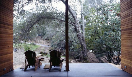
ARCHITECTURETell a Story With Design for a More Meaningful Home
Go beyond a home's bones to find the narrative at its heart, for a more rewarding experience
Full Story
INSIDE HOUZZHouzz Survey: See the Latest Benchmarks on Remodeling Costs and More
The annual Houzz & Home survey reveals what you can expect to pay for a renovation project and how long it may take
Full Story
BUDGET DECORATING14 Ways to Make More Money at a Yard Sale — and Have Fun Too
Maximize profits and have a ball selling your old stuff, with these tips to help you plan, advertise and style your yard sale effectively
Full Story
LIFEYou Said It: ‘It’s Different ... But Then, Aren’t You?’ and More Wisdom
Highlights from the week include celebrating individuality and cutting ourselves some decorating slack
Full Story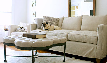
LIFEYou Said It: ‘My Furniture Is the Color of My Pugs’ and More
Design advice, inspiration and observations that struck a chord this week
Full Story


funkyart
UserOriginal Author
Related Discussions
Do any of you still have any antique flower oil paintings in LR
Q
LR Paint Color & Decor Help
Q
Help! I've made terrible mistakes with LR (pics)
Q
Bought paint samples for LR
Q
funkyart
linley1
UserOriginal Author
UserOriginal Author
brutuses
UserOriginal Author
msrose
UserOriginal Author
mldao
UserOriginal Author
mldao
brutuses
johnatemp
UserOriginal Author
redbazel
UserOriginal Author
Kathleen McGuire
mldao
UserOriginal Author
redbazel
Valerie Noronha
UserOriginal Author
jane__ny
UserOriginal Author
mldao
UserOriginal Author
msrose
UserOriginal Author
indygo
bestyears
mldao
UserOriginal Author
redbazel
UserOriginal Author
tuscangirl
msrose
UserOriginal Author
redbazel
mdc08
UserOriginal Author