


Rug Opinions; look, color!
mtnrdredux_gw
10 years ago
Sort by:Oldest
Comments (70)
Related Stories

DECORATING GUIDESNo Neutral Ground? Why the Color Camps Are So Opinionated
Can't we all just get along when it comes to color versus neutrals?
Full Story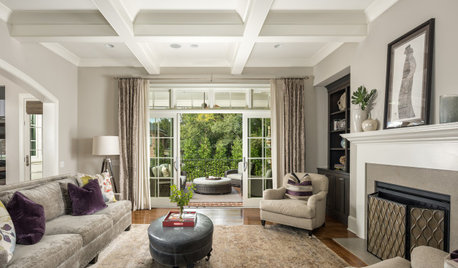
DECORATING GUIDES11 Area Rug Rules and How to Break Them
How big should an area rug be? These guidelines will help you find the right size and placement
Full Story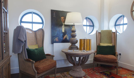
DECORATING GUIDESHow to Choose an Awesome Area Rug No Matter What Your Space
High use, a low door, kids and pets running amok — whatever your area endures, this insight will help you find the right rug for it
Full Story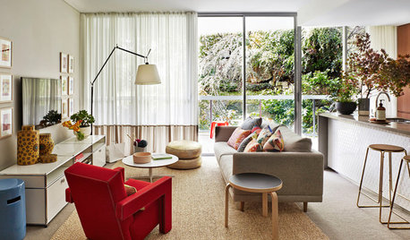
DECORATING GUIDESSize Up the Right Area Rug for Your Room
The size of a rug can make an important difference to the feel of a room. Here are some tips to help you make the right choice
Full Story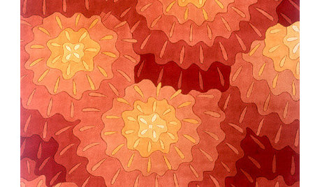
MORE ROOMSGuest Picks: Rugs for Every Room
From colorful and fun to neutral and textured, there's a rug here for everyone
Full Story
RUGS10 Tips for Getting a Dining Room Rug Just Right
Is the rug you’re considering the right size, shape and weave for your dining room? Here’s what to keep in mind
Full Story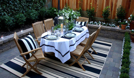
GARDENING AND LANDSCAPINGOutdoor Rugs Have Style Covered
Bring indoor coziness to a patio or porch with area rugs designed for the outdoors
Full Story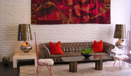
DECORATING GUIDES10 Reasons to Try a Moroccan Rug
Unbelievably plush and durable, these carpets are a design obsession with good cause
Full Story
RUGSCool Threads: Shag Rugs Stage a Comeback
See Why You May Want to Sink Your Toes Into Some Deep-Pile Carpet Again
Full Story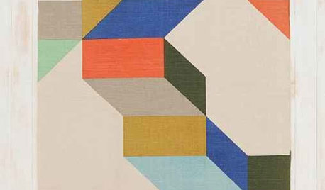
PRODUCT PICKSGuest Picks: Colorful Patterned Area Rugs for All Tastes
From subtly sophisticated to downright swirltastic, these area rugs will please the eye while cushioning the feet
Full StorySponsored
Central Ohio's Trusted Home Remodeler Specializing in Kitchens & Baths


arlosmom
chispa
Related Discussions
Tryin2Grow, Rococogirl or other rug experts - advice/opinions?
Q
Looking for your opinion on pillow color
Q
Looking for Paul Smith "Swirl" Rug colors in an affordable rug
Q
Grout color opinions - Marazzi Treverkchic Italiano Wood Look Tile
Q
katlan
mlweaving_Marji
Design_MACS
Jamie
pricklypearcactus
mtnrdredux_gwOriginal Author
BeverlyFLADeziner
Jamie
chispa
mtnrdredux_gwOriginal Author
oldbat2be
User
mtnrdredux_gwOriginal Author
User
User
Vertise
chispa
oldbat2be
badgergal
Vertise
oldbat2be
francoise47
mtnrdredux_gwOriginal Author
liriodendron
allison0704
mtnrdredux_gwOriginal Author
User
User
mtnrdredux_gwOriginal Author
Vertise
mlweaving_Marji
pricklypearcactus
mtnrdredux_gwOriginal Author
francoise47
allison0704
Annie Deighnaugh
User
Annie Deighnaugh
mtnrdredux_gwOriginal Author
anele_gw
chispa
Vertise
anele_gw
Vertise
anele_gw
Oakley
zen4d
mtnrdredux_gwOriginal Author