


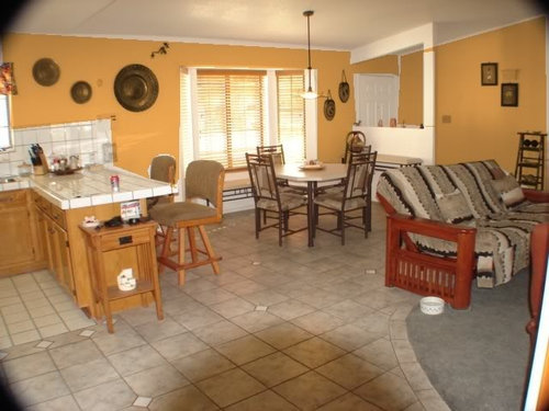
I Need Your opinions....
splats
14 years ago


Sort by:Oldest
Comments (54)
Related Stories

DECORATING GUIDESNo Neutral Ground? Why the Color Camps Are So Opinionated
Can't we all just get along when it comes to color versus neutrals?
Full Story
WALL TREATMENTSExpert Opinion: What’s Next for the Feature Wall?
Designers look beyond painted accent walls to wallpaper, layered artwork, paneling and more
Full Story
FUN HOUZZEverything I Need to Know About Decorating I Learned from Downton Abbey
Mind your manors with these 10 decorating tips from the PBS series, returning on January 5
Full Story
KITCHEN DESIGNSingle-Wall Galley Kitchens Catch the 'I'
I-shape kitchen layouts take a streamlined, flexible approach and can be easy on the wallet too
Full Story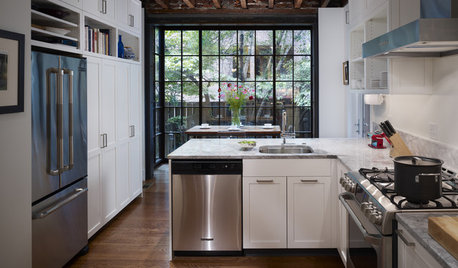
FEEL-GOOD HOME12 Very Useful Things I've Learned From Designers
These simple ideas can make life at home more efficient and enjoyable
Full Story
COFFEE WITH AN ARCHITECTA Few Things I Would Like to Ask Frank Lloyd Wright
It could take a lifetime to understand Frank Lloyd Wright's work — less if we had answers to a few simple questions
Full Story

LIFEYou Said It: ‘I’m Never Leaving’ and More Houzz Quotables
Design advice, inspiration and observations that struck a chord this week
Full Story


graywings123
awm03
Related Discussions
I need your opinion about these roses
Q
I need your opinion. What color goes best with black and white?
Q
I need your opinion
Q
I Need Your Opinions Please.
Q
Oakley
splatsOriginal Author
awm03
graywings123
User
User
covingtoncat
splatsOriginal Author
squirrelheaven
splatsOriginal Author
nicole__
squirrelheaven
holleygarden Zone 8, East Texas
User
splatsOriginal Author
User
holleygarden Zone 8, East Texas
splatsOriginal Author
User
indygo
squirrelheaven
splatsOriginal Author
dana1079
squirrelheaven
Oakley
palimpsest
squirrelheaven
squirrelheaven
indygo
susanlynn2012
squirrelheaven
squirrelheaven
splatsOriginal Author
squirrelheaven
User
Happyladi
squirrelheaven
splatsOriginal Author
squirrelheaven
squirrelheaven
User
splatsOriginal Author
greenthumbfish
readerlearner
dana1079
dana1079
User
ummm