


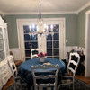
Hallway frustration- Looked good on color cards!
mmqchdygg
14 years ago
Sort by:Oldest
Comments (3)
Related Stories
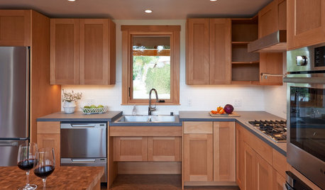
UNIVERSAL DESIGNKitchen of the Week: Good Looking and Accessible to All
Universal design features and sustainable products create a beautiful, user-friendly kitchen that works for a homeowner on wheels
Full Story
ARCHITECTUREWhat the Heck Is 'Good' Design Anyway?
We yearn for it and strive for it, but good home design isn't always easy to grasp. These 8 prescriptions from an architect can help
Full Story
LIGHTINGHouse Hunting? Look Carefully at the Light
Consider windows, skylights and the sun in any potential home, lest you end up facing down the dark
Full Story
PETSGood Dog! Cute Pooches at Home
The dogs of Houzz take you on a tour of their homes and show you where they lounge, eat, play, bathe and nap
Full Story
LIFE6 Tips for Teaching Your Kids to Be Good Neighbors
Everyone wins when your children learn to respect boundaries, get help when they need it and show others they care
Full Story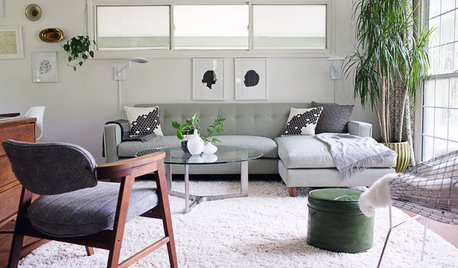
DECORATING GUIDESRevive Your Room’s Look in Just 5 Steps
Not in total-makeover mode? Give your space polish and a pulled-together look with this easily doable plan
Full Story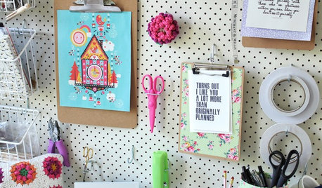
CRAFTS20 Ways to Organize Your Craft Space
Tired of looking for a needle in a haystack? Giving tools and supplies a proper place steps up productivity and cuts down on frustration
Full Story
CONTRACTOR TIPSWhat to Look for in a Contractor's Contract
10 basic ingredients for a contract will help pave the way to remodel happiness
Full Story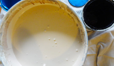
DIY PROJECTSTint Your Own Paint for New-Looking Walls
Dabbling in mixology means you can use up leftover paint and give your walls a custom look in one fell swoop
Full Story
DECORATING GUIDESMood Makers: Luxurious Looks on a Budget
Want a high-end look in your home but feeling choked by your budget? Try these pro decorator tips to give your rooms a luxe look for less
Full Story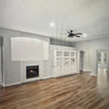

redbazel
dilly_dally
Related Discussions
Whole Wheat - questions about that color card
Q
Will it look good if the living room is painted light green?
Q
Color Frustrated...just venting
Q
Need help with paint color that will look good with this carpet
Q
mitchdesj