


What's up with modern in hotel rooms?
Cloud Swift
10 years ago
Sort by:Oldest
Comments (16)
Related Stories
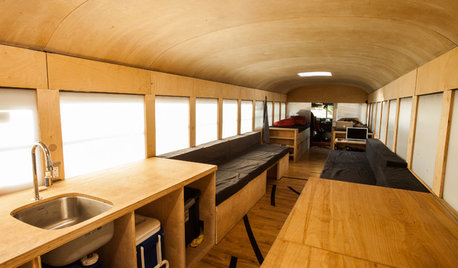
FUN HOUZZBuckle Up for a Modern Mobile Cabin in a Bus
See an innovative off-the-grid living space designed by an architecture student — with room for 6 and a sunbathing spot
Full Story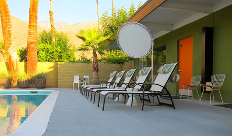
TRAVEL BY DESIGNMaking New Memories at a Midcentury Palm Springs Hotel
Travel back in time at the restored Desert Star while you’re visiting for Modernism Week
Full Story
CEILINGSBreak Up a Bland Ceiling the Modern Way
Banish a boring drywall ceiling by using these techniques to create architectural interest
Full Story
PRODUCT PICKSGuest Picks: Get a Hotel-Chic Master Bedroom Suite
Relax in a bedroom and bath done up in the style of a luxury getaway
Full Story
TRAVEL BY DESIGNTravel in Style: 10 Designer Hotels to Inspire You
Pick up some decorating ideas or just revel in the decor and furnishings of these eye-popping hotels by famous designers
Full Story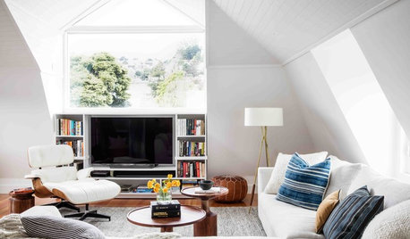
LIVING ROOMSNew This Week: How to Punch Up a Modern White Living Room
Consider these easy combinations to bring personality, color and texture to your neutral backdrop
Full Story
SHOP HOUZZShop Houzz: Modern Dorm Room Dress-Up Sale
Deck out your dorm room with modern furnishings at up to 40% off
Full Story0

SHOP HOUZZShop Houzz: Up to 75% Off Modern Lighting
Enjoy great savings on modern lighting for every room
Full Story0

SHOP HOUZZShop Houzz: Up to 75% Off Modern Furniture for Every Room
Gorgeous furniture + deep discounts = a no-brainer way to update your room designs
Full Story0
DECORATING GUIDESSwitching Up a Colonial Home to Suit a Modern Family
Floor plan labels are thrown out the window as a designer helps a family shape rooms to fit the way they live
Full Story


LuAnn_in_PA
terezosa / terriks
Related Discussions
Ewwww! Coffee pots in hotel rooms?
Q
Boho-Modern Living Room and Dining Room. Thoughts and advice?
Q
What makes your dining room linens modern or contemporary?
Q
"Instant Hotel" fans? And random q re "gift bags"/hotel amenities
Q
golddust
hhireno
work_in_progress_08
Gooster
palimpsest
Annie Deighnaugh
LanaRoma
deegw
Cloud SwiftOriginal Author
Cloud SwiftOriginal Author
peegee
Gooster
LanaRoma
Cloud SwiftOriginal Author