


Layout Feedback: design option 1
adh673
14 years ago
Sort by:Oldest
Comments (8)
Related Stories
KITCHEN DESIGNKitchen Banquettes: Explaining the Buffet of Options
We dish up info on all your choices — shapes, materials, storage types — so you can choose the banquette that suits your kitchen best
Full Story
KITCHEN DESIGNHow to Design a Kitchen Island
Size, seating height, all those appliance and storage options ... here's how to clear up the kitchen island confusion
Full Story
KITCHEN DESIGN9 Popular Stovetop Options — Plus Tips for Choosing the Right One
Pick a stovetop that fits your lifestyle and your kitchen style with this mini guide that covers all the basics
Full Story
KITCHEN DESIGNKitchen Layouts: Island or a Peninsula?
Attached to one wall, a peninsula is a great option for smaller kitchens
Full Story
WORKING WITH PROSWhat to Know About Concept Design to Get the Landscape You Want
Learn how landscape architects approach the first phase of design — and how to offer feedback for a better result
Full Story
REMODELING GUIDESHave a Design Dilemma? Talk Amongst Yourselves
Solve challenges by getting feedback from Houzz’s community of design lovers and professionals. Here’s how
Full Story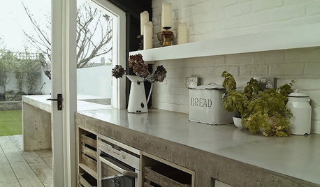
KITCHEN COUNTERTOPSKitchen Counters: Concrete, the Nearly Indestructible Option
Infinitely customizable and with an amazingly long life span, concrete countertops are an excellent option for any kitchen
Full Story
KITCHEN LAYOUTSHow to Plan the Perfect U-Shaped Kitchen
Get the most out of this flexible layout, which works for many room shapes and sizes
Full Story
MOST POPULAR7 Ways to Design Your Kitchen to Help You Lose Weight
In his new book, Slim by Design, eating-behavior expert Brian Wansink shows us how to get our kitchens working better
Full Story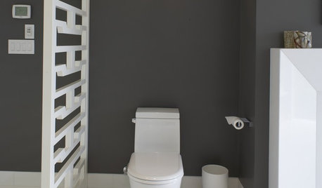
BATHROOM DESIGNHere's (Not) Looking at Loo, Kid: 12 Toilet Privacy Options
Make sharing a bathroom easier with screens, walls and double-duty barriers that offer a little more privacy for you
Full Story

rhome410
rhome410
Related Discussions
Feedback on 1.5-Story Cape Layout
Q
Would Love Feedback on Layout for 1st floor expansion
Q
Kitchen Layout/Design - Your feedback please!
Q
Small Kitchen Layout Puzzle: soliciting design feedback!
Q
adh673Original Author
John Liu
adh673Original Author
rhome410
adh673Original Author
rhome410