


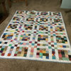
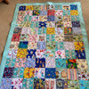
Quilt of Valor color question
16 years ago
Sort by:Oldest
Comments (4)
Related Stories

FEEL-GOOD HOMEThe Question That Can Make You Love Your Home More
Change your relationship with your house for the better by focusing on the answer to something designers often ask
Full Story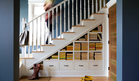
ORGANIZINGPre-Storage Checklist: 10 Questions to Ask Yourself Before You Store
Wait, stop. Do you really need to keep that item you’re about to put into storage?
Full Story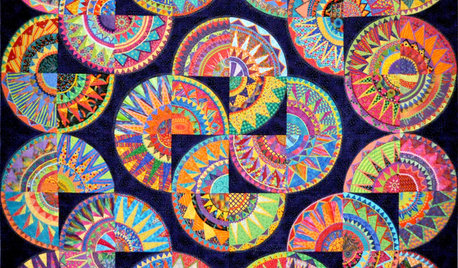
ARTShow News: Rare Quilts Get Museum Time
See 6 intricate designs from a California exhibition and get tips for building your own quilt collection
Full Story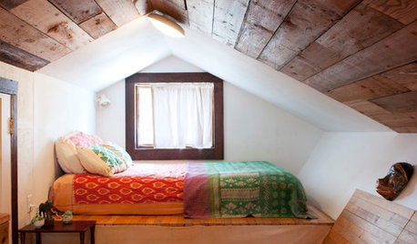
COLLECTIONS15 Reasons to Get Addicted to Kantha Quilts
You can use kantha quilts, made from old saris, throughout your home — on beds, as upholstery and as wall hangings
Full Story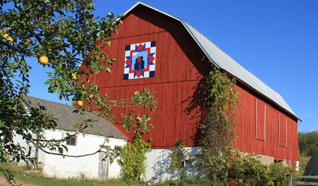
ARTBarn Quilts Piece Together a Community
One man with one beautiful idea transforms Wisconsin’s Shawano County
Full Story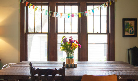
FEEL-GOOD HOMESimple Pleasures: Treasuring the Gift of Grandparents
You can enrich your family life by bringing generations together for shared meals, quilting projects, storytelling
Full Story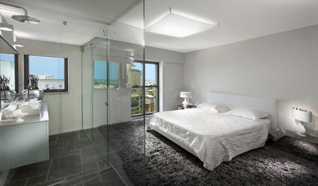
BATHROOM DESIGNThe Glass Bathroom Wall: Love It or Lose It?
There's no question that a glass wall makes a bathroom feel more open. Are they private enough for you?
Full Story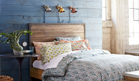
BEDROOMSHouzz Quiz: What Color Should You Paint Your Bedroom Walls?
Cool and soothing, or warm and spicy? Answer these questions and learn what hue is right for you
Full Story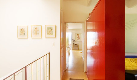
WALL TREATMENTSPick the Right Paint Finish to Fit Your Style
The question of finish may be as crucial as color. See which of these 9 varieties suits your space — and budget
Full Story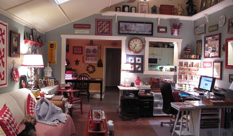


grammyp
gauraladyOriginal Author
Related Discussions
Quilt of Valor #15
Q
Quilts of Valor
Q
Quilt of Valor
Q
Quilt of Valor #8
Q
linda33wi
grammyp