


Multi colored subway backsplash-pics wanted
clweed
13 years ago
Sort by:Oldest
Comments (24)
Related Stories
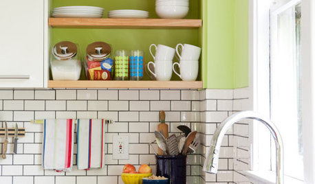
KITCHEN DESIGNSubway Tile Picks Up Gray Grout
Heading into darker territory, subway tile offers a graphic new look for kitchens, bathrooms and more
Full Story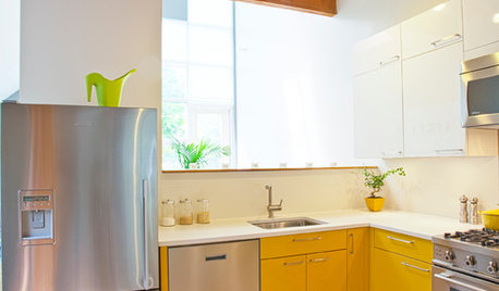
COLORCrazy for Color? Your Kitchen Cabinets Want In
Make over your kitchen in spectacular fashion with just colorful cabinet paint? Now there's a bright idea
Full Story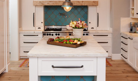
KITCHEN DESIGN10 Gorgeous Backsplash Alternatives to Subway Tile
Artistic installations, back-painted glass and pivoting windows prove there are backsplash possibilities beyond the platform
Full Story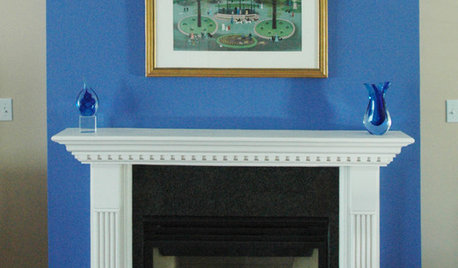
WORKING WITH PROS17 Things Color Consultants Want You to Know
Dithering over potential palettes for your home? A color pro might be the way to go. Here's how it works
Full Story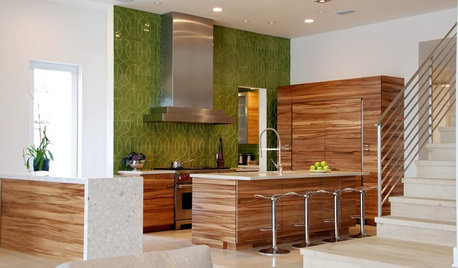
COLORKitchen Color: 15 Fabulous Green Backsplashes
Get the feel of spring all year round with a tiled, painted or glass backsplash in colors from pale celery to deep olive
Full Story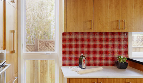
KITCHEN DESIGNKitchen Color: 15 Ravishing Red Backsplashes
Bring some zing to your kitchen with a backsplash of ruby-colored tiles or back-painted glass
Full Story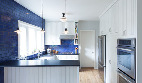
COLORKitchen Color: 15 Beautiful Blue Backsplashes
Blue is the new cool kid on the backsplash block, showing up in shades from pale ice to cobalt
Full Story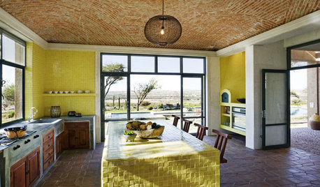
KITCHEN DESIGNKitchen Color: 7 Sensational Yellow Backsplashes
Warm up a white kitchen or add some zing to wood tones with a backsplash that glows
Full Story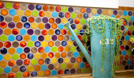
TILE5 Head-Turning Tile Styles for Backsplashes and More
If plain subway tile would derail your bold decorating vision, these dashing tiles can help you arrive at a brilliant solution
Full Story
COLORBest Uses for the Boho Blue Color of 2015
PPG Pittsburgh Paints’ Color of the Year is a bold bohemian blue best used in small doses
Full Story


willtv
lascatx
Related Discussions
Anyone have pics of 2x4 or 2x6 subway tile backsplashes?
Q
BackSplash Choices, long story, lots of pics!
Q
I want handmade subway tile for my backsplash. Like, cheap.
Q
Will Hale Navy work with a beige granite and multi color backsplash?
Q
katsmah
clweedOriginal Author
melissastar
melissastar
ideagirl2
sas95
Gena Hooper
chrismo4
clweedOriginal Author
sas95
lascatx
boxerpups
jtkaybean
katsmah
sas95
SusieQusie60
maggieq
rococogurl
Gena Hooper
sas95
katsmah
formerlyflorantha