


Trim Color and Contrast Wall Color with Knotty Pine
hermitsoul
12 years ago


Sort by:Oldest
Comments (3)
Related Stories
WALL TREATMENTSThese Are Not Your Grandfather’s Pine Walls
The knotty look went from popular to pariah in years past, but today’s designers are finding new and stylish ways to embrace it
Full Story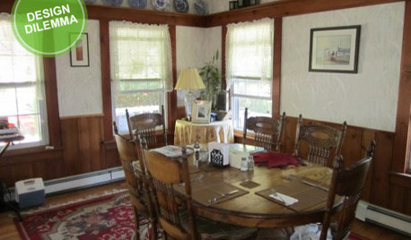
Design Dilemma: Keep or Nix Knotty Pine?
Help a Houzz User Choose a Paint Color for a Cohesive Design
Full Story
WOODKnotty and Nice: Highly Textured Wood Has a Modern Revival
Whether it's cedar, fir or pine, if a wood has a knot, it's hot
Full Story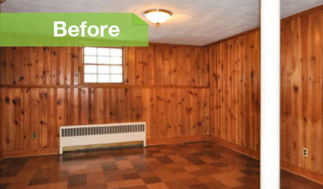
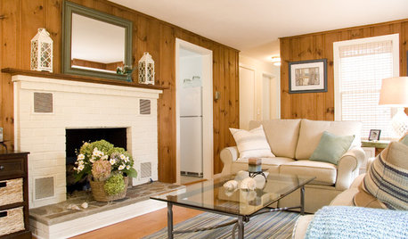
PAINTINGKnotty to Nice: Painted Wood Paneling Lightens a Room's Look
Children ran from the scary dark walls in this spare room, but white paint and new flooring put fears and style travesties to rest
Full Story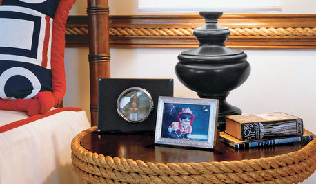
DECORATING GUIDESFeeling Knotty? Add a Little Rope to Your Decor
Neutral, natural and often unexpected, rope is an all-purpose accent on land or sea
Full Story
TRIMTrim Color Tips: Get Your White Trim Right
Set off wood tones, highlight architectural features, go minimalist ... white trim is anything but standard when you know how to use it
Full Story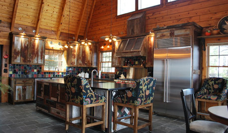
WORKING WITH PROSInside Houzz: New Rustic Style for a Mountain Cabin's Kitchen
A North Carolina couple takes a log cabin kitchen from knotty-pine tear-down to modern-day knockout with rusty tin and reclaimed barnwood
Full Story
COLOR11 Terrific Paint Color Matches for Wood Details
Pair your wood trim and cabinets with the right shade of wall paint to bring out the beauty in both
Full Story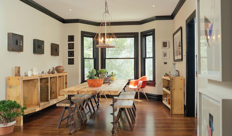
TRIMWhat Color Should You Paint Your Trim?
Learn the benefits of painting your trim white, black, neutral, a bold color and more
Full Story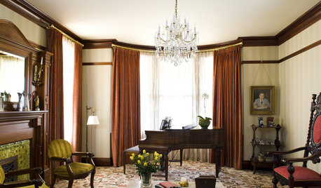
GREAT HOME PROJECTSHow to Bring Out Your Home’s Character With Trim
New project for a new year: Add moldings and baseboards to enhance architectural style and create visual interest
Full Story


User
palimpsest
Related Discussions
help with color for knotty pine walls
Q
Contrasting white paint trim color for BM Mascarpone walls
Q
Knotty Pine Cottage best carpet colors
Q
Clear pine doors with knotty alder trim and cabinets
Q
chickadee2_gw