


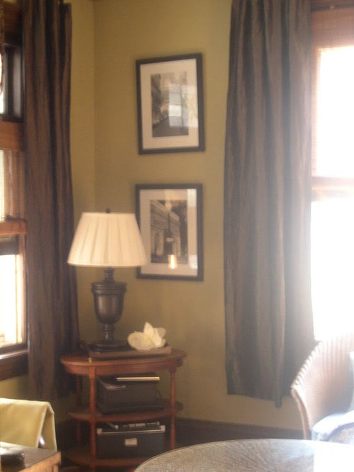
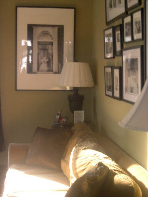
Help Warming up Green & Blue Color Scheme
ttodd
16 years ago
Featured Answer
Sort by:Oldest
Comments (9)

les917
16 years agogracie-2006
16 years agoRelated Discussions
Help.. Blue Granite Pebblesheen - but water color is Green?
Comments (15)You have a beautiful pool and the water color doesn't look green in an objectionable way to me...but I DO see that Day 7 looks greener than Day 1. As an owner of a pool with Ocean Blue PebbleSheen, I can tell you that my pool looks its bluest on sunny days with the sun directly overhead - and it looks to me like your Day 1 photos may have been taken in similar conditions. Your Day 7 photos look like they're taken later in the day, at more of an angle, and with less sun. My own pool looks a tad greener under those same conditions as well. Like your pool, I also have a good deal of landscaping around the pool that the surface reflects as a greener color at certain times of the day and with the sun at certain angles. Part of the charm of Pebble products, IMO, is the ever-changing look/colors...very, very natural. However, to be sure there's not anything else going on, recheck your "balanced" water, especially your FC (free chlorine) and CC (combined chloramines). Be certain that your FC level is appropriate for your level of conditioner/stabilizer. If you already have a stabilizer level that's higher (60-80) - in preparation for your SWG -then be sure you have a higher FC level (approx 7-9)in the interim. Also be sure your pH is in range, as it has a tendency to push upward in new pools, even Pebble ones. In my own pool, the color gets a bit greener if my pH is getting out of range. If I'm not mistaken, I think our start-up for Pebble was to have our pump/filter on 24/7 for 10-14 days. Be sure you're filtering enough now in the heat of the summer. Keep your skimmers clean and don't forget to clean out your pump's filter basket too. Here is a link that might be useful: Chlorine/CYA chart...See Moreplease help with ideas to warm up my living room
Comments (35)First, I hope all is well with your child. Rightfully it is hard to think about furniture when you are dealing with something so major in your family life. YUM! I love the color of your new upholstered pieces, the wall color, and the whole architectural vibe of your lovely home. I have kind of skimmed through the other comments, so if I am repeating things already suggested (and perhaps rejected), I apologize. Part of the reason I think the room feels a bit cold is because of the lighting. Almost all of it is in the corners of the room, not near the seating to create warmth where people will be. I would also ask if you have considered trying the sunroom rug in here, and putting the LR rug in the sunroom? I think the light background would lighten the feel of the space, but also work with the dark walls, particularly since it appears that the rug has black in it (or a very dark navy, which would also work in the room). I would take down the artwork that is on either side of the doorway behind the open french doors. It doesn't allow for nice viewing of the art, and really doesn't compliment the doors, either. They are actually a bit of architectural detail as they sit open in front of those end walls. Take the floor lamp out of the corner, and use it next to the wood chair - ideally between the chair and the couch if you can. Turn the small cabinet against the wall that has the small shelves, making it a part of that vignette, and put the small lamp on there that is currently on top of the tall bookcase near the sunroom, so it will tuck on the left side of the cabinet under the shelves. The lamp that is there now, (which appears to be another of the same floor lamps as the one on the other side of the doorway) can move to the other end of the room. Take the two pieces of art that were behind the french doors and stack them on the wall to the right of the small shelves. Angle the armoire into the corner. Sitting flat on the end wall feels crowded. Move the lamp on the bookcase to the small cabinet, as mentioned, and hang the clock that is on the shelf above the bookcase. It is light, and will add some reflection and sparkle up there. Move the collection of silver candlesticks from the brass table to the shelf where the clock was. I like the chair and ottoman to the left of the couch, at the side of the room that opens into the sunroom. I think it blocks the view of the radiator beyond, and makes the overall look much nicer. Try to find a way to add the other floor lamp here. I think your drapes are pretty, but the rods need to move out further on each side of the windows. The drapes shouldn't be angled, but hang straight, and they look skimpy pushed so close in on the window. I do agree, tho, that I would rather see something with some pattern there. These in the gunmetal might be one idea: daria in gunmetal Consider getting heat-resistant metal paint in a silver or pewter and paint all the detail metal work on the top of the fireplace screen. It will add another point of light in the space, without losing the overall darker feel of the screen which is nice in front of the firebox. I love the silver pillows. I like the brass tables, but I would use them as end tables on either side of the couch, and use the small silver table to the right side of the wood chair. Neither of the brass tables feels large enough as a coffee table. Using a rich coral as an accent color could be a great choice with the upholstery color and the wall color....See MoreBM color fan--warm neutral for LR, grayish-blue for DR? (LONG)
Comments (10)Thank you, voila, for coming out of lurkdom to help me! This HAS been painful in the sense that I really dislike being in limbo, uncertain, and indecisive, which has also been time-consuming since I have been looking at paint colors off and on for 2 or 3 years, and stewing around about them trying to figure this out. To clarify regarding the Carlisle Cream with the hint of pink: this is not the trim color. I will try to see if I can find the name somewhere in my files, but the color of the trim for all of the house and most of the ceilings has a yellowish cast. The Carlisle Cream is only on the ceiling in the DR & MBR (and the paint chosen for the DR will also be used in the MBR which faces NW), as well as the walls of the mudroom, laundry, powder room, and MBath. You are correct that it fights with yellow, because the tiles have hints of yellow tones, and it does not look good there. Except for the 2 ceilings, the Carlisle Cream will be changed to something that goes better with all of the tiles and countertops that probably need a color with some yellow, rather than pink, in it. When we painted our former N facing foyer with Pittsfield Buff, it really pulled together the colors of the 2 small rugs and tile, which are almost the same as what we have now. But that is a whole nuther story. Wythe & Palladian Blues are on my "possible" list, so I will give them further consideration. The HC 139-141 at first glance under kitchen lighting seemed minty, but the lighting in the LR is halogen, so they look different in there. I will need to see them on a sunny day. Another vote for HC 146, 147, and Gray Wisp is good! And I really like your suggestion of Quiet Moments. It is interesting that you say, "all greens seem to go together", which I had heard before. The reason I got a new LR rug was that my old one had multiple colors of green and greenish gold on a cream field, and to me it clashed with the fireplace in daylight. I moved it into the kitchen eating area that has the same slate tile on the other side of the 2-way FP where it only gets light from the NW which is not directly on it as it is in the LR, and it looks perfect in the different light! Also, if I turned the LR rug around, it would look much better upon entering the room, but to me the green from that direction looks awful with the FP green. I think it will be a lot easier to choose the DR paint than that for the LR. I will definitely pursue looking at grayed colors for both rooms, but I would still like to try maybe a rich tan that does not lean to red or yellow and see if that could work in the LR to pull out those colors in the rug, but maybe nothing will do this? I suppose that would only add to the blendy feeling that I am so good at achieving. I had originally imagined having a sort of rich, dark cream, but I guess that would mean yellow, so it is out. A correction regarding the "drapes." They are actually 4 drapery panels on each side of a 7 ft triple casement that help to set off the piano and a small chest near the creamy beige rug, and at each end of a 4 window bank (each 42" wide) next to the chest and behind the mauve wing-back near the FP. They are not directly next to the 9 x 12 "green" rug. The 2 rugs are separated by the sofa, so you do not see much of the Bokhara when entering the LR. I know that all the detail causes many people not to read this, but I welcome comments from anyone who has the patience to work through them to give me additional guidance. Anne...See Morepalladian blue, wythe - help me find a blue green!
Comments (31)Nami, Thank you! Well, to keep things tranquil and serene, if you have white woodwork, you could just go with a soft white or light ivory. I know Pottery Barn has plain, unlined panels that wouldn't be too heavy. I saw them a couple of weeks ago and got them for our dining room. I wanted something that would filter light and not be too heavy looking for the room yet not too sheer. I kind of like things monochromatic in the bedroom but that's just me. You might go to a fabric store and find a nice subtle print. It depends on how dressy you want it to be or how dark. You could also go with the bronzey color of the pillow you see on my bed if you wanted a darker look. I wasn't much help was I?? LOL!...See Moresoshh
16 years agoteacats
16 years agottodd
16 years agoUser
16 years agoles917
16 years agottodd
16 years ago

Related Stories
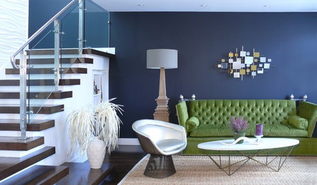
DECORATING GUIDESCool Color Palettes: Enviable Green and Blue Spaces
Freshen up tired interiors with dewy to inky hues that harmonize even as they help each other stand out
Full Story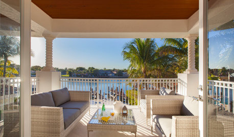
CONTEMPORARY HOMESHouzz Tour: Warming Up in Fort Lauderdale
How do you make a palatial-style home cozier more intimate? With organic touches, a soft color palette and resized trim
Full Story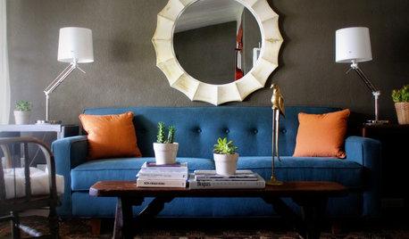
DECORATING GUIDESHot Color Combo: Cool Blues and Warm Brass
It's trending all over, but navy or royal blue with brass or gold just also might become a new classic pairing
Full Story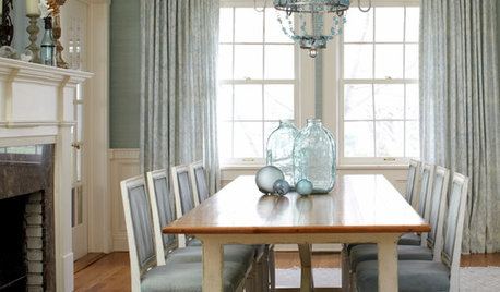
REMODELING GUIDESRoom of the Day: Antiques Help a Dining Room Grow Up
Artfully distressed pieces and elegant colors take a formerly child-focused space into sophisticated territory
Full Story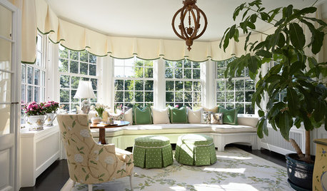
Warm Up a Sunroom Year-Round
Turn your sunroom into a space you can enjoy through all four seasons
Full Story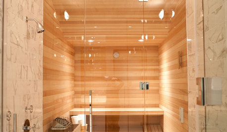
BATHROOM DESIGN15 Ways to Warm Up Your Bathroom for Winter
Keep the chill away in body and spirit with everything from warm colors to high-end bathroom features
Full Story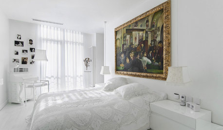
COLORWarm Up to White All Around the House
Explore the many ways to design a white kitchen, bathroom, dining room or bedroom that's far from stark and sterile
Full Story
GARDENING GUIDESWarm Up Your Garden With Orange Flowers
Hummingbirds and butterflies are not the only ones who will notice when you introduce a blaze of orange into your garden
Full Story
COLORCreate Enviable Interiors With Green Design Schemes
Borrow from nature's playbook for your interior decorating with the color thought to boost balance and youthfulness
Full Story
GREEN DECORATING8 Questions to Help You See Through Green Hype
With the ecofriendly bandwagon picking up some dubious passengers, here's how to tell truly green products and services from the imposters
Full Story

soshh