


paint colors for adjacent rooms
kimmarie_2010
13 years ago
Sort by:Oldest
Comments (38)
Related Stories
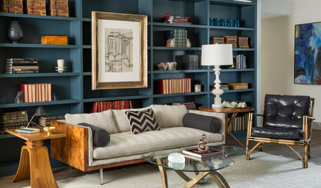
DECORATING GUIDESThose Built-Ins Are Going to Look Smashing in Color
Painting cabinetry in striking hues can bring focus and personality to a room
Full Story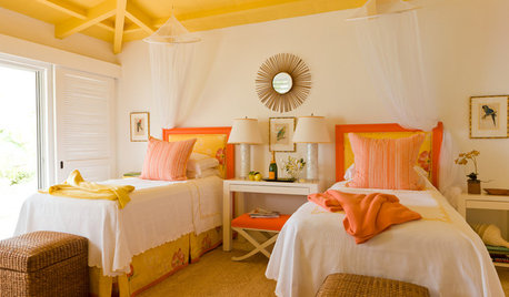
DECORATING GUIDESPaint Color Ideas: 7 Bright Ways With Yellow and Orange
Go with the glow. These sample palettes and room examples show you how to work with two of the happiest hues around
Full Story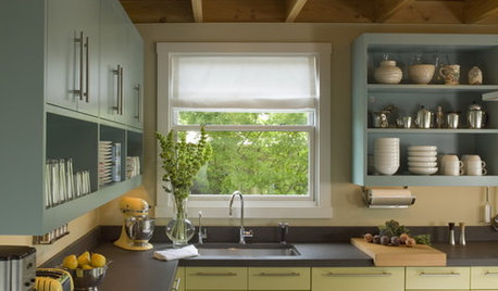
MOST POPULAR8 Great Kitchen Cabinet Color Palettes
Make your kitchen uniquely yours with painted cabinetry. Here's how (and what) to paint them
Full Story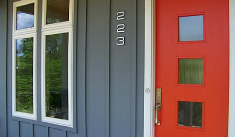
FRONT DOOR COLORSFront and Center Color: When to Paint Your Door Bright Red
Welcoming and intense, a red front door kicks up a home's entryway and is impossible to miss
Full Story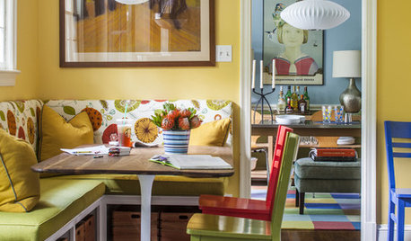
COLORColor Feast: 6 Deliciously Uncommon Dining Room Color Combos
Give your mealtime space a generous helping of hues paired in a most refreshing way
Full Story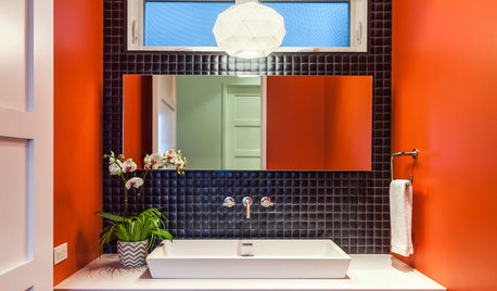
BATHROOM DESIGN7 Striking Paint Colors for Your Powder Room
Whether you opt for a little or a lot, see why the petite bathroom is the perfect place for a fun hue
Full Story
WHITEHow to Pick the Right White Paint
White is white, right? Not quite. See 8 white paint picks for 8 very different effects
Full Story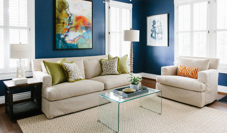
MOST POPULARThe Right Way to Test Paint Colors
Here are 5 key steps to take to ensure you're happy with your wall paint color
Full Story
COLOR12 Tried-and-True Paint Colors for Your Walls
Discover one pro designer's time-tested favorite paint colors for kitchens, baths, bedrooms and more
Full Story
WHITEWhat to Know Before You Paint Your Walls White
A coat of white paint can do wonders in one room and wreak havoc in another. Here are tips for using the popular hue
Full Story


catkin
kimmarie_2010Original Author
Related Discussions
Paint help! Yellow paint for kitchen and ? about adjacent rooms
Q
What rules to follow for adjacent rooms color? Any pictures ?
Q
Balanced Beige--adjacent room at 150% or other color?
Q
City Loft SW for living room, what color for adjacent kitchen?
Q
pussuskattus
catkin
dianalo
pussuskattus
kimmarie_2010Original Author
tracey_b
kimmarie_2010Original Author
Christie Santercangelo
kimmarie_2010Original Author
catkin
igloochic
dawnp
msrose
pussuskattus
bonniee818
dianalo
yellowdog2
juleecat
amysrq
kimmarie_2010Original Author
ttodd
kimmarie_2010Original Author
tracey_b
tracey_b
kimmarie_2010Original Author
kimmarie_2010Original Author
dianalo
kimmarie_2010Original Author
tracey_b
beekeeperswife
kimmarie_2010Original Author
dianalo
kimmarie_2010Original Author
amysrq
ttodd
kimmarie_2010Original Author