


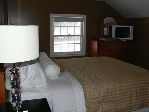
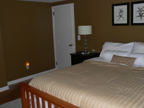
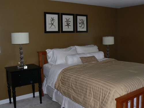
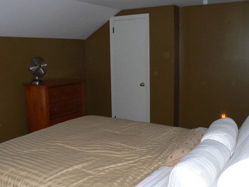
painted BR all weekend..horrid...pics
mcfromct
16 years ago
Sort by:Oldest
Comments (53)
Related Stories
HOUSEKEEPINGTo Do: Choose Your Weekend Project
You know the one — it's been hanging over your head for months. Just pick one from your list to do now, and enjoy the change
Full Story
DIY PROJECTS10 Home Projects to Work On Over Your Holiday Weekend
Make the most of your time windfall by accomplishing one of your back-burner tasks
Full Story
MORE ROOMSWeekend Decorating: 8 Ideas for a Small Entry
See How to Create a Warm Welcome in a Not-So-Big Space
Full Story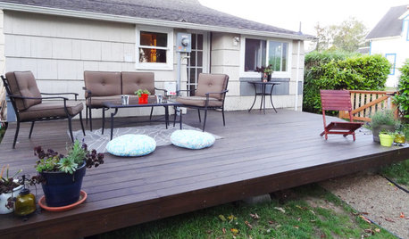
GARDENING AND LANDSCAPINGBuild a Beautiful Platform Deck in a Weekend
Create a polished outdoor space for entertaining by building a basic DIY platform deck in your own backyard
Full Story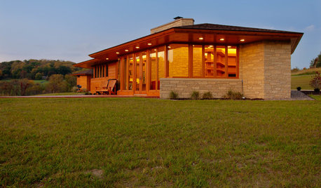
HOUZZ TOURSHouzz Tour: Usonian-Inspired Home With All the Wright Moves
A Chicago couple's weekend retreat fulfills a long-held dream of honoring architect Frank Lloyd Wright
Full Story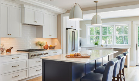
KITCHEN DESIGNPopular Cabinet Door Styles for Kitchens of All Kinds
Let our mini guide help you choose the right kitchen door style
Full Story
MOVINGThe All-in-One-Place Guide to Selling Your Home and Moving
Stay organized with this advice on what to do when you change homes
Full Story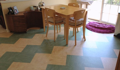
REMODELING GUIDESLinoleum, the All-Purpose Flooring Wonder
Dashing in a rainbow of colors, able to be cleaned with ease and courteous to budgets everywhere, linoleum is a super choice for floors
Full Story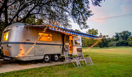
VINTAGE STYLEGet Away From It All in a Glamper
A glammed-up camper can transport you to a happy place, whether in your yard or on the highway
Full Story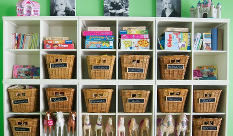
DECLUTTERINGTame the Toy Chaos: Bin Storage for All
New project for a new year: With bins, totes and shelves, a clutter-free playroom can be yours
Full Story


jkinpv
mcfromctOriginal Author
Related Discussions
Update & Progress Pics on DD's Vintage/Shabby BR
Q
2 br w/garage or 3 br no garage?
Q
Help w/ Master BR artwork...part 2
Q
BR color help please...
Q
Jodi_SoCal
susanlynn2012
lionstail
bubbamommie
teacats
Sueb20
skypathway
squirrelheaven
annzgw
jade.d
les917
moonshadow
woodswell
CaroleOH
teacats
mcfromctOriginal Author
squirrelheaven
threedgrad
organic_smallhome
squirrelheaven
oceanna
les917
bungalow_house
beache
teeda_2006
amykath
msrose
moonshadow
bristlingacres
tfm1134
coleen3201118
paddytc
mcfromctOriginal Author
moonshadow
DLM2000-GW
moonshadow
moonshadow
organic_smallhome
paddytc
moonshadow
budge1
moegaff
squirrelheaven
squirrelheaven
mcfromctOriginal Author
moonshadow
tinker_2006
paddytc